Nexus Font Icons
So, you want to make pixel icons for your web site, but don’t want to use generic icons that everyone else is using and you don’t know where to start? You are in the right spot!
I am going to explain step by step basics of the whole design process and implementation of your new custom icons to your web site. Tutorial will cover these areas:
1. For Designers
- Introduction to pixel perfect icon design
- Design process in Adobe Illustrator
- Exporting icons as SVG
2. For Frontend developers
- Setting up local XAMPP web server
- Setting up production environment with git, nodeJs and Gulp
- Setting up this repository to work
- Publishing your icons as web fonts
- File revving
3. Benefits of using this program
For Designers
Design of pixel perfect icons in a vector drawing program like Adobe Illustrator can be quite confusing if you haven't done this before. Most of the tutorials on the web are explaining to you how to draw in 1:1 resolutions, but to be honest - if you are using vectors, there is no need for that. More over, it is much better to use process I will describe here.
Introduction to Pixel Perfect Icon Design
Designing pixel perfect font icons is process where you draw vector graphics and then scale it down to desired font size so that all straight lines aren’t displayed with antialiasing. This is important, because you want your icons as clear as they can be and you don’t want site visitors to guess what you had in mind when you designed them.
As icon becomes smaller, importance for pixel perfect design becomes more important because if you don't make them properly, they will appear smudged. We don't want that.
Another important factor is screen density. At the time when I am writing this tutorial, monitors with 72-96 dpi are still dominant in the world and we want to design something that everyone can understand. Even when 150+ dpi monitors (4K and larger) become a dominant world standard, you will be able to use ideas presented in this tutorial to design clear and understandable icons.
Real Life Example
In the image below, you can see how good and bad icons look in their real size, magnified 4x from screenshot and in real life on regular monitor.
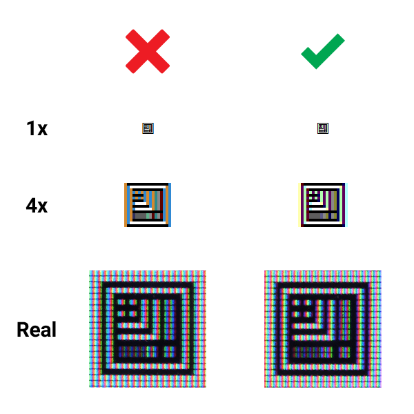
There will always be some minor antialiasing on the edges when vector objects are shown on the screen, but we want to bring that down to a minimum.
Design Process In Adobe Illustrator
Before we start to design new icons, we need to figure out their use case – will we use them aligned with regular paragraph text, which has its own set font size, or will we use them in some special cases like in buttons, headlines or perhaps on their own as larger graphics?
As I wrote earlier - as icon becomes smaller, importance for pixel perfect design becomes more important.
Case 1 – 16px Font Size
This is the most common case, since most browsers set 16px as their default font size for paragraph text. Since Adobe Illustrator is program for vector drawing, we don’t need to design icons in 1 to 1 ratio, zoomed in to the max :) Our art board will be much larger.
Here is the math for default art board:
16^2 x 2 = 512 height
Height of 512 is minimum art board size that we will use. Unit is not important in Illustrator, since it is vector drawing program. You can chose whatever you want – pixels, centimeters, points. I will just write it as “unit” when used in vector drawing program.
For this example, we will make icon on a square art board of 512 x 512 units.
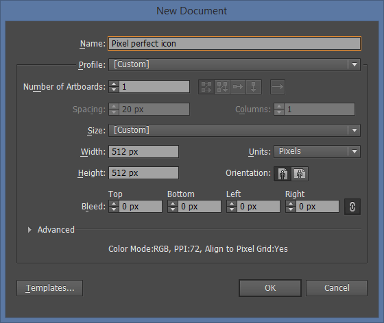
Next step is setting up our grid. We want each grid column to be 1px in finished icon.
512 units height / 16px font size = 32 units grid
Subdivisions are there for better precision and one special usage that I will explain later.
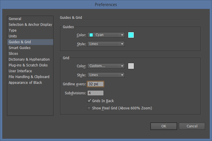
This is the final art board that we will use for our 16px icons.
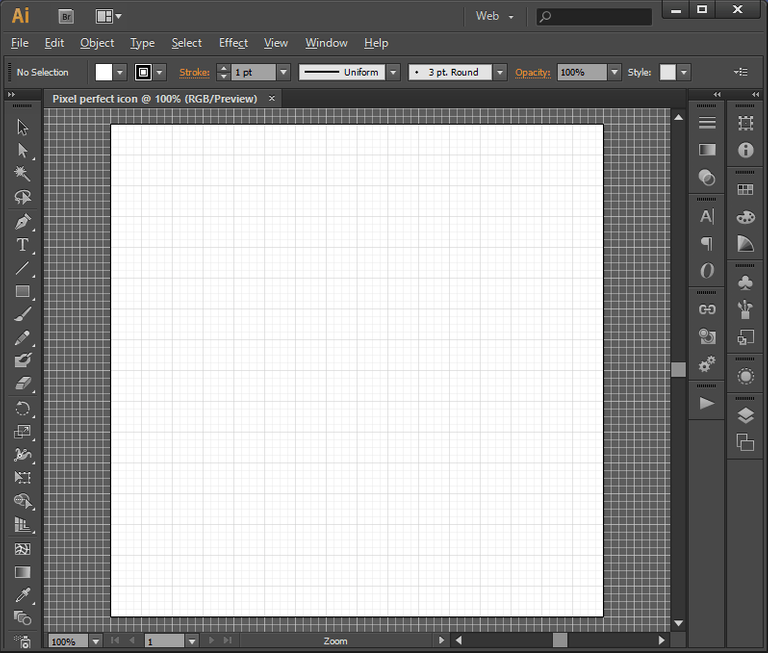
PLEASE NOTE: We will need to recalculate art board and grid sizes for all different icons sizes.
We can now design icons! :) In this prepared example, you will see only test pattern.
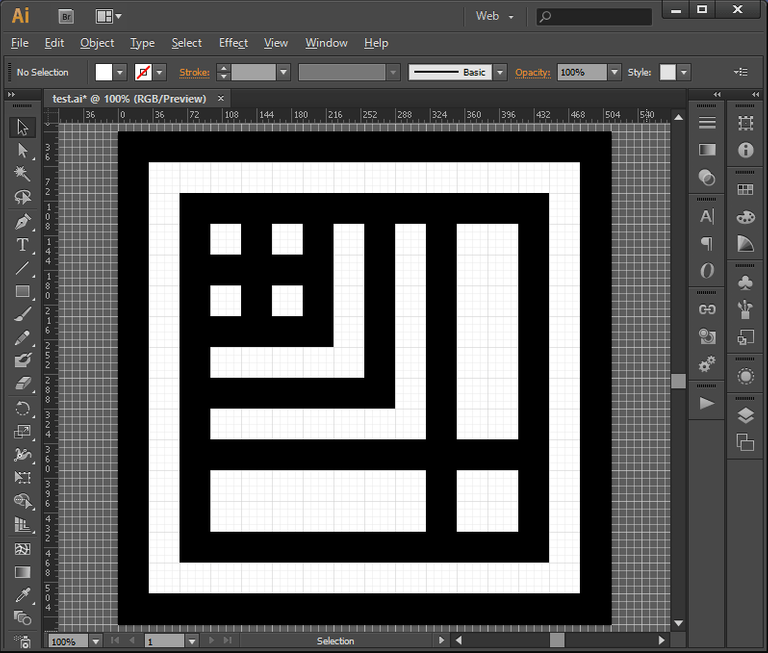
Each line has a width of 32px, which will translate to 1px in 16px icon. Don't be limited by straight lines, you can use curves as well, but in that case use line stroke that is same width as grid. In this case also 32px.
How Can We Use "Flaws" In Antialiasing For Our Advantage?
Simple - we can use thinner lines as well, but the effect is quite different. Line that is 50% thinner than grid width will produce effect of 50% transparency in its place. That is nice side effect of antialiasing which we can use for increased creativity, some interesting patterns and simulated transparency.
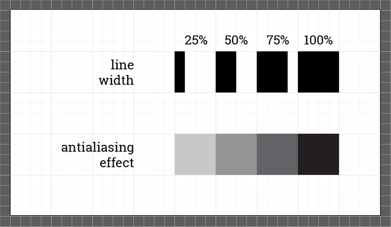
Case 2 – Non Standard Icon Size
We don't need to create pixel perfect icons that are limited to 16px. We can make any pixel perfect sizes we want and this is how we do it.
Same as before, we need to recalculate art board and grid size so that they can be aligned to new pixel size.
For instance, if our new icon is 24px, art board size would be:
24^2 x 2 = 1152
New grid size would be:
1152 / 24 = 48
Simple. Please note that artboard has to be larger than 512px because we want to maintain fine details in final result.
Case 3 – Wide Icons
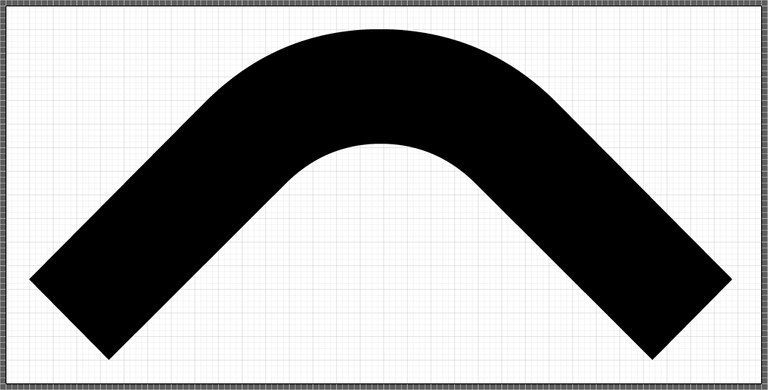
It is not a problem to create icons that are much wider than square art board. Just extend the width of an art board, but keep the height the same. Like this one (16px tall icon).
Exporting As SVG
When your design is finished, there are few rules you must follow before you export your icon as SVG:
- Only vectors are included, all raster graphics are discarded. Don’t use raster images!
- Only flat surfaces are included. All strokes must be converted to fills, use Object -> Expand command.
- Only one color is accepted. If you plan to make hollow objects, use Pathfinder -> Exclude command.
- All fonts must be created as outlines
When you finish all those tasks, save file as SVG and your icon is ready to be included in your new icon font.
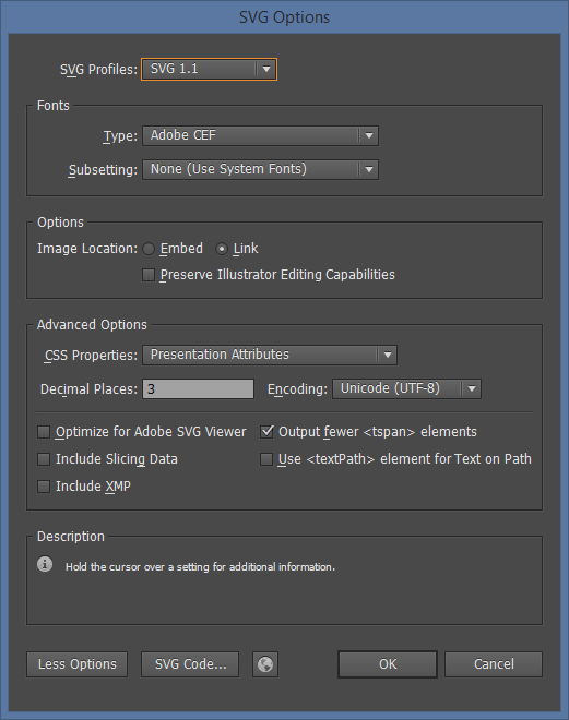
If you are only designing icons, you can stop reading here. Part that follows is intended for frontend engineers that will use your SVGs as Webfonts in their code. If you want to keep on reading, please do - it's really easy to do all of this even if you are not a developer. I am also a designer ;)
For Frontend Developers
These next few steps will explain in detail how to set up everything to work.
Setting Up Local XAMPP Web Server
If you already have web server with apache installed, you can skip this step.
Setting up local web server is easy. You just need to download it from here and install it. There are versions for all popular operating systems.
When you install it, make sure that Apache is running.
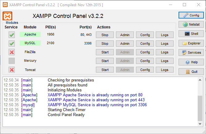
And then type in your browser "http://localhost". If you see XAMPP welcome message, you did everything ok.
Setting Up Production Environment with git, nodeJs and Gulp
There are three tools that we need to set up before we start to create icon fonts.
- Setting up Git
- Setting up nodeJs
- Setting up Gulp task runner
Setting up Git
The easy way - download nexus-icons
If you don't want to set up git, just download archive from github and unpack it in correct folder. It is the same folder where you would clone this repository from GitHub
The hard way and always up to date
If this is the first time you need to work with git, there is no need to worry. There are plenty of git applications that will make your life simpler. I prefer to use SourceTree, since it is quite easy to use. You can download it from sourcetreeapp.com
Also download and install Git from this URL git-scm.com/downloads
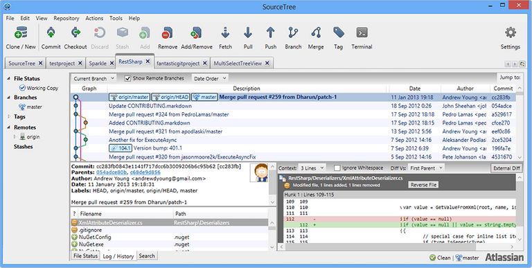
When you have installed Source Tree, you need to clone nexus-font-icons to folder located inside your web server. Go to github.com/Vlasterx/nexus-font-icons and find URL under "HTTPS clone URL".
In Source Tree click on Clone / New icon fill up Source and Destination paths like on this image.
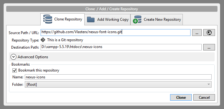
Destination path is where you have installed your web server.
Click on clone and you are finished with this step.
Setting up nodeJs
Node is great tool that is powered by javascript. It has great many packages that make life a lot easier for web developers. Gulp task runner is one of those packages. It is used to run many different tasks like minimizing CSS or JS for production or as in our case – to start many different tasks that will make our icon fonts in the end.
In order to install nodeJS, go to nodejs site, find version for your operating system and install it.
Since node and git use some Linux commands unavailable in Windows, and since we need to use some of them, I would also recommend that you download Cmder and install it on your Windows.
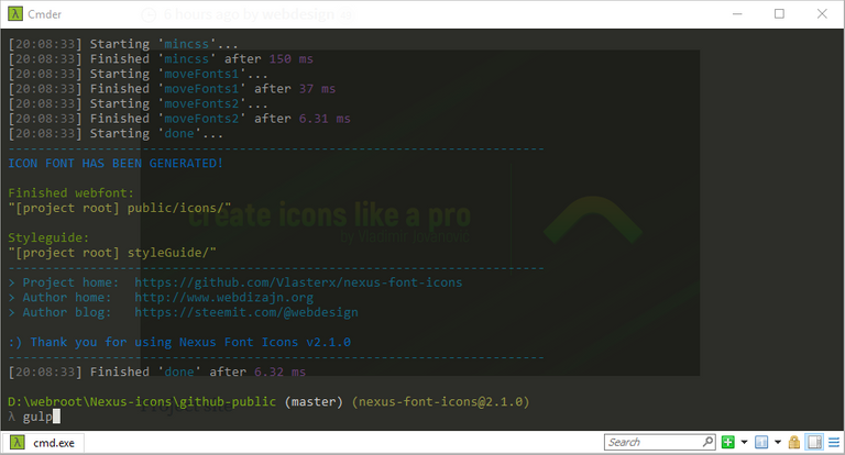
Open up Cmder, go to nexus-icons folder and type these commands:
npm install gulp –g
npm install
Congratulations, you are now ready to make some web font icons!
When ever you change your SVG's, just open command prompt, CD to main folder of this repository and type in
gulp
That's it.
Publishing Your Icons As Web Fonts
Nexus-icons are split in two main folders - Project and Public.
Steps for creating icons:
- Copy all SVG files that you have created into project/icons/
- Open Cmder , go to nexus-icons folder and type gulp
- If you installed everything correctly, your new font is now created and copied to public folder
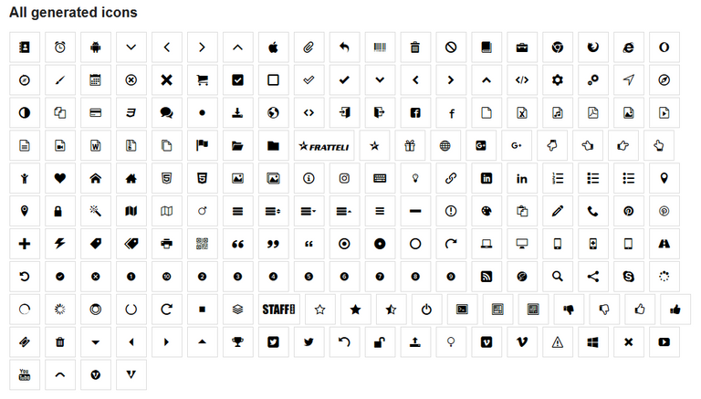
For your convenience, every time you create new icons, Style Guide will be created as well. It will also be located in public folder. Open up your browser and go to project folder ([localhost] / [Nexus-icon-location] /public/styleGuide) and see your new creation.
It will look something like this, depending on your icons ofc.

File Revving
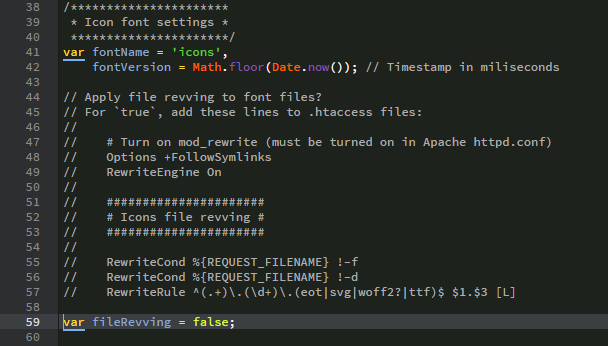
This font building pack can use font revving, which means that it will add different font version for each build. Apache server will be able to read and refresh fonts every time they are rebuilt without user needing to reload a page or empty browser cache, so keep in mind that .htaccess file and copy it on your server together with your new fonts.
If you are using some other server, be sure to keep file revving disabled.
This setting is located in "gulpfile.js"
Inlcuding fonts in your web site
You will have 2 CSS files you need include in your web site HEAD in order to use icon fonts.
<head>
  ...

  <link rel="stylesheet" href="icons/icons.min.css" />
  <link rel="stylesheet" href="icons/icons-glyphs.min.css" />

  ...
</head>
If you want to use SCSS in your code, you also 2 files you can include in your final CSS.
Benefits of using this program
So what are the benefits?
- You have full control over what icons you would like to use in your project. You don't have to force users to download every single icon from some fontpack like Font Awesome. Pick what you like and use it.
- It's fast. After you copy SVG's to project folder, it takes only few seconds to build entire webfont
- It's smaller in size than other solutions. For instance, I have used really great IcoMoon website to generate icon fonts before, but with this solution, with same icons final font files are smaller. Let's compare what happens with 491 SVG's when they are converted to webfont: Icomoon WOFF file size - 93.1KB, Nexus Icons WOFF file size - 43.2KB.
Author
Vladimir Jovanović
web site | Twitter | Facebook | LinkedIn | Steem
Great post and information!
Thank you sharing @webdesign
That's a very good tutorial, thank you. I'm not much of a graphic guy myself, so I learned from this. :D
You're welcome. I have been working on this project for the past year in my free time and now it's finally ready and free for everyone to use ;)
There seems to be a problem with this post on Firefox. I was unable to edit it. It always reports that I am not signed in. Maybe because it is long? If so, what is the character limit? Any thoughts @dan and @ned?
Seems that you need to stay in one tab in Firefox. I had a similar problem when opening a new tab in Firefox recently.