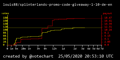
In first tests I noticed that you can hardly recognize the votes in a diagram generated from a new posts, when 7 days are displayed with even scaling.
Therefore I have adjusted the scaling.
Most of the votes are already given in the first few hours and after 1-2 days the curve starts to flatten.
So I stretched the first day in the diagram and compressed days 3 to 7.
This is a diagram generated with the new scaled axis.
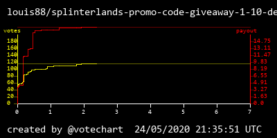
and this was the old version:
You can read more information about my upcoming votechart service here: https://peakd.com/votechart/@votechart/votechart-graph-of-votes-over-time
Any more news?
Love to test this with the #BeerSaturday posts
Congratulations @votechart! You have completed the following achievement on the Hive blockchain and have been rewarded with new badge(s) :
You can view your badges on your board and compare yourself to others in the Ranking
If you no longer want to receive notifications, reply to this comment with the word
STOP