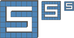
I found the new request from steemia here. The request was for a logo for their mobile app.
They gave a lot of feedback in there post. After some drawing on paper I came up with the idea of a block logo. The blocks are a reflection of the blockchain and the S is cut out which reflects on the “S”teemia.
They currently have no logo, so I cannot compare it.
The logo:

The colors are endless. I kept it simple but in theorie it is possible to give every block a diffrent color. I would advice against it as it becomes clutterd really fast. If you want me to add a specific color let me know.

No lines version:

The small sizes:

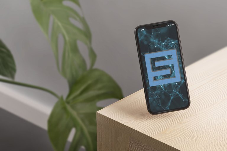
A example inserted into your app:

A loader screen example:

Proof of work:


All the files are in this folder: illustrator AI , EPS , 2000x2000 png, and some extra's. You need something specific ask me.
My dropbox folder with files
Posted on Utopian.io - Rewarding Open Source Contributors
I find it appealing! you did a nice job there!
Thank you brother. But because of these mods i wil stop contributing. This makes no sense.
I dont know what to say man. Try and try to grab some tokens here because it will go strong upwards so it still is worth it :)
tell me more :D
no I'm joking and serious, I have a 50% acceptance rate, in my mind I don't see where I was wrong 95% of the time. :D mods think differently in different times depending on the different personality.
It's definitely and experience bashing your head against people coming over for 2 seconds pissing on your shit and off they go maybe giving a shout as they move down the line and you are screaming behind them "wtf>!"
Fun learning experience and reminding me of high school, but it has steem so whatever.
Yeah I see you have more of that fun experience ...
Cheers mate, good luck :)
Agreed and i personaly don't like contributing anymore. There are judging things with rules they invent on the spot.
Very good work bro..
Thank you very much, sadly enough not good enough for the moderation team
Keep it up bro
I will tnx
Looking realy good @zoef. Very impresed by this.
Thank you very much.
Looks good. I love the block thingy. Remind me of those square lego blocks :D
Haha yeah i was thinking about the block chain. So that is indeed possible
"The blocks are a reflection of the blockchain" - should all projects which use blockchain use blocks in their logo then? :D
No they do not. But is there a reason to not use them. What kind of a stupid comment is this anyway. If you got nothing usefull to say - say nothing. Thats what my mom used to say.
I did what you asked and added it in the topic.
Your contribution cannot be approved because it does not follow the Utopian Rules.
You can contact us on Discord.
[utopian-moderator]
I guess you are wrong, did you even check the post before making the comments?

You can actualy keep the line sizes practicly the same.
Every logo is in the same color (blue-red-green-...). And i added a version of one without the lines like you asked. I add it here again.

you are missing the point a little make the S bigger and black and white it. They have a thing about logos looking recognisable in the most extreme situations ie 16 pixels .... bullshit ... usually people make an icon, a logo and a brand representation, somehow here all of the above needs to be in one place, .....
don't get caught in the bullshit, although I'm not a good example I usually argue the crap out of myself every time :D well that's understandable when work is being criticised unjustly (personal opinion) but still, it's inefficient, don't be human to bot mods :D I'd like to work together but I'm not sure who is at fault and it's not working
so yeah, try to keep away from personal opinions, it's hard and they deserve the hate at least I would justify it for the moderation I've received (70% are crap mods from my view) but it is what it is and it wouldn't be great sitting in their chair, getting hate for doing your bot job :D
I'd help you out since it's a easy fix, so I will repeat it make the logo scale down and still be recognisable and provide a one color version ie black white and outlined.
Cheers...
I can change that with 2 mouse clicks as i seperate as much as possible in my .AI file. And if someone wants to do that to the logo i created they are free to do so. But the mods should not force us to change all this stupid little details. If the project owner asks me to do that i will. But a mod should not judge on those retarded small points.
so a 95% contribution isn't enough we need to cover all fronts just to get 20 bucks>?
how bout a bonus, how about some motivation, how about some examples of how the problems can be solved, yeah it's not your job to teach I forgot, it's quality assurance and ticking of arbitrary rules trying to reject half the entries even good ones from time to time. Because of one rule missed .... that should have probably been rewarded better if available rather than scraping a whole entry because of it.
And please if you are expecting to see something show what you want to see rather than expect people to understand you, @zoef did understand you when you said one color, he probably doesn't know what you mean by it and what you want to see.
well I bet you won't even respond or possibly won't even see the critique I'm giving you
have a good day
Cheers :)
I understood what he asked. I just don't follow the logic. The part of the logo that makes this the logo is the 3d effect if i remove that it is just a S cut out. And honestly that is not how I envisioned it. These mods don't need to impose there views on the designers. They need to respect the artistic freedom.