KISS is a fast launcher following the KISS principle.
Search through you app, contacts and settings lightning fast. No more time spent trying to find the app you need to launch: enter a few characters from the name and press enter. Need to phone someone? Don't meddle with the call log, just give three letters of their name and push the "phone" button.
KISS becomes smarter and smarter as you use it, pushing forward results you're more likely to select.
New Proposed Icon Details



Benefits / Improvements
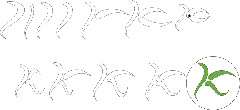
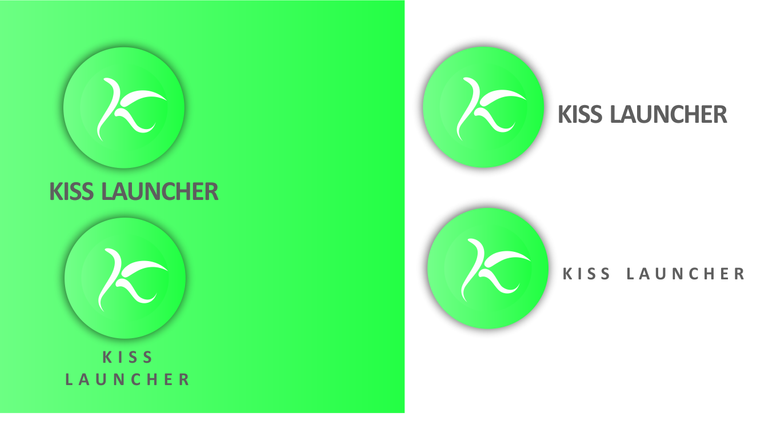
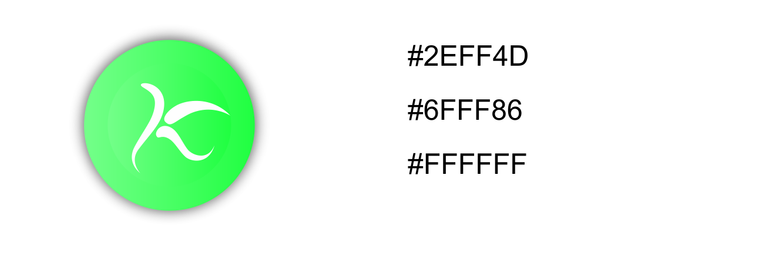
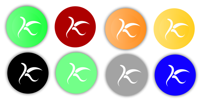
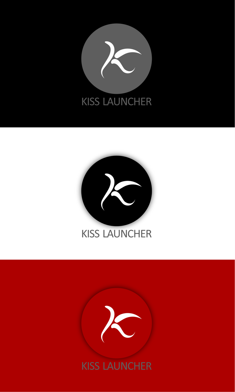
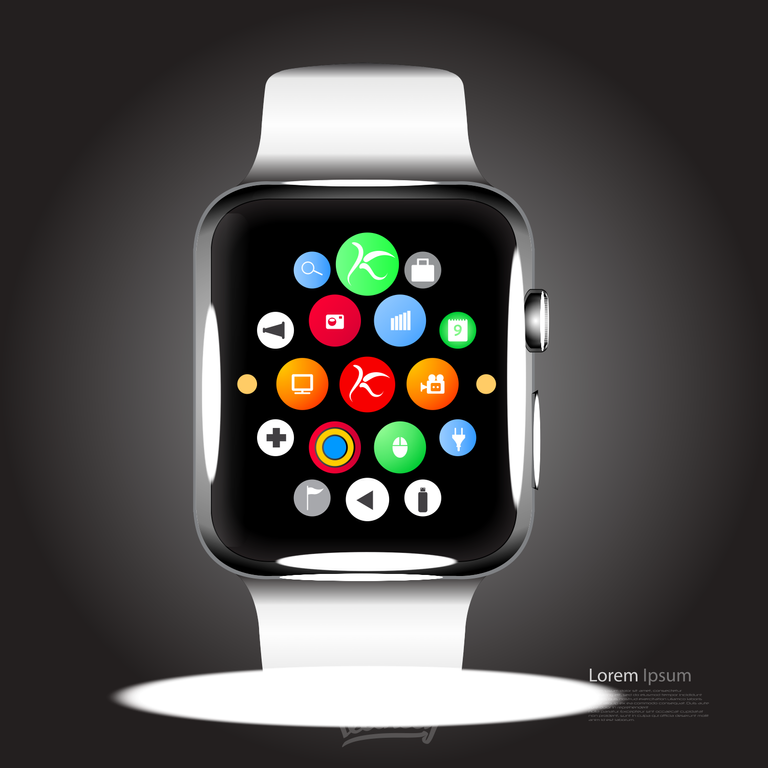
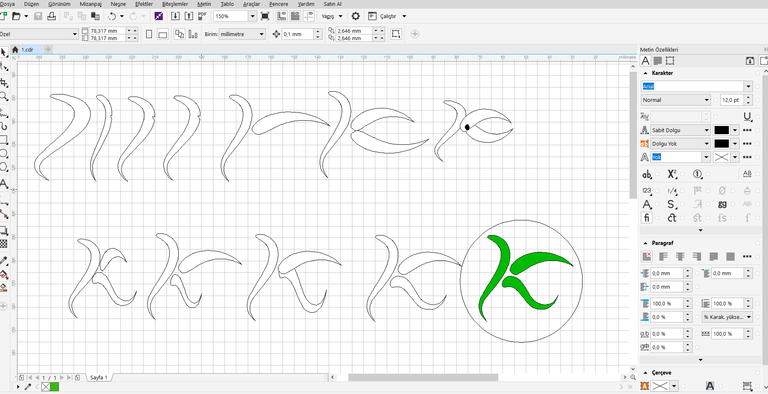
I created a new design that will make a "K" symbol and symbolize the logo's name. Colors are good . The Old logo is good too but just a circle so i made this logo to make some differences
Tools
PROOF
Posted on Utopian.io - Rewarding Open Source Contributors
Posted on Utopian.io - Rewarding Open Source Contributors
Congratulations @uas! You have completed some achievement on Steemit and have been rewarded with new badge(s) :
Click on any badge to view your own Board of Honor on SteemitBoard.
For more information about SteemitBoard, click here
If you no longer want to receive notifications, reply to this comment with the word
STOPYour contribution cannot be approved because it does not follow the Utopian Rules.
You can contact us on Discord.
[utopian-moderator]
Hello @andrejcibik No offense I m just curious about my mistakes,
2.logotype font size can change too (one button)
3.thanks for that i will be careful next time
You should think about project owner as of your client. Do you expect your client to improve the logo he gets from you? I guess not.
My suggesstion: Try to contribute to Task requests and to small projects that have no or very old logos.
This is a new, big project with good logo. Thats why we cant approve your work. Its good, but doesnt help the project
And thats the point of Utopian. To help them
Thank you for this good explaination