
Login button design is inconsistent
Steemit has two view for logging into the site, a dynamic overlay that is part of the react application and a static HTML site. The design for the login button is inconsistent between these two views. I consider the design in the overlay to be the correct one, as the design is the same as for other primary action buttons in the application. In this report I describe how to review the issue.
Testing Environment
- OS X
- Firefox 57.0
Steps to Reproduce
- Go to https://steemit.com/login.html
- Review design of 'Login' button
- Go to https://steemit.com
- Click 'Login' in header to open login overlay
- Review design of 'Login' button
Proposed Behavior
Login button in static login view has same design as the button in login overlay.
Actual Behavior
Login button in static login view looks different than the button in login overlay.
Attachments
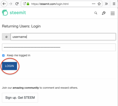
Static login view
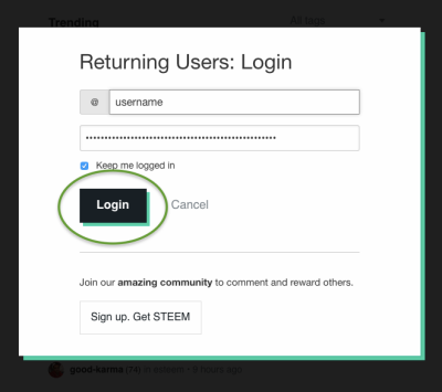
Login overlay
Posted on Utopian.io - Rewarding Open Source Contributors
Your contribution cannot be approved yet. See the Utopian Rules. Please edit your contribution to reapply for approval.
You may edit your post here, as shown below:
You can contact us on Discord.
[utopian-moderator]
Discussed that on Discord (#reviewpost-discussion). Thanks for taking a second look. :)
Thank you for the contribution. It has been approved.
You can contact us on Discord.
[utopian-moderator]
Thanks!
Hey @snug I am @utopian-io. I have just upvoted you!
Achievements
Suggestions
Get Noticed!
Community-Driven Witness!
I am the first and only Steem Community-Driven Witness. Participate on Discord. Lets GROW TOGETHER!
Up-vote this comment to grow my power and help Open Source contributions like this one. Want to chat? Join me on Discord https://discord.gg/Pc8HG9x