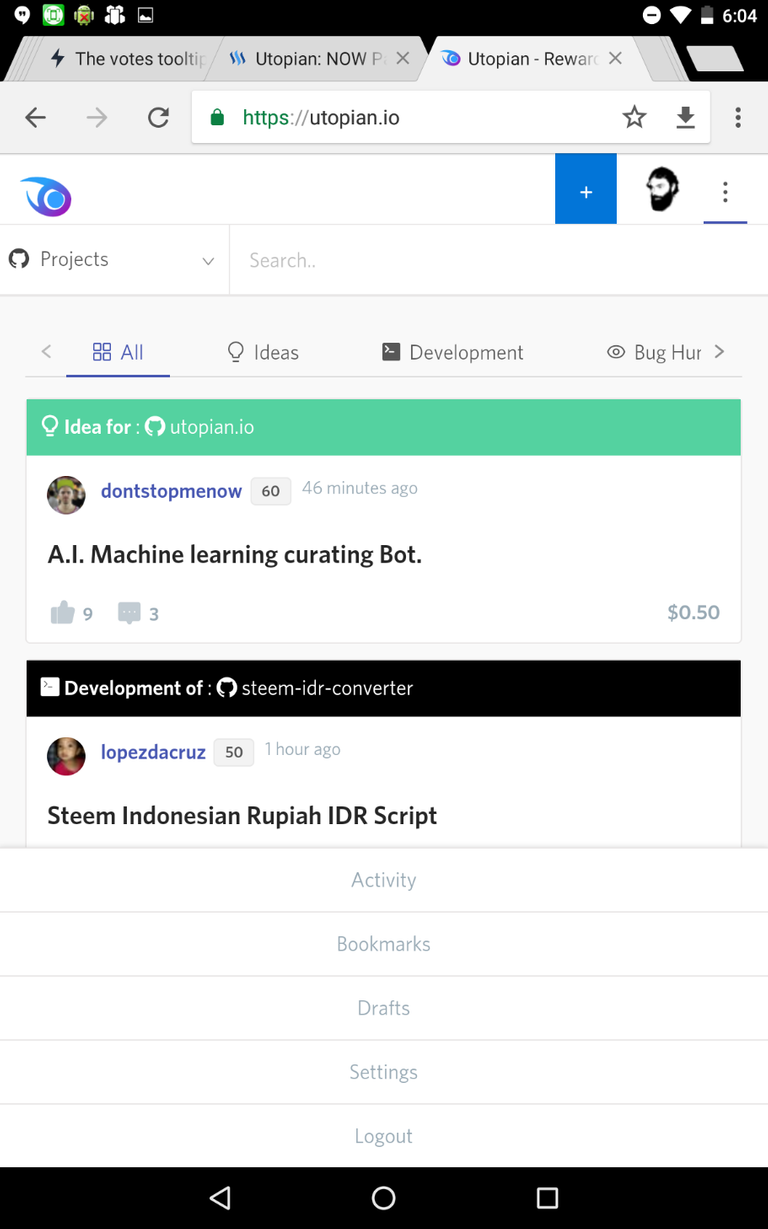
I noticed this bug while browsing Utopian on my tablet and wanted to see what posts are under review.
After I searched for a while, I could not find a way to access the 'Review' page other than to type it in the browser's address bar.

I tested on Nexus 7 (2013)/Chrome, and on Windows/Opera.
Here is how utopian looked on my tablet, notice that there are no links or another way to access Review, Wallet, Sponsors, Moderators:

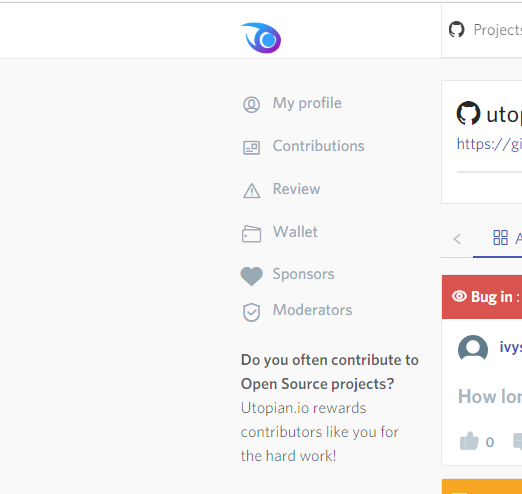
Just to avoid confusion, here is the menu that I am referring to:

After further testing I noticed that the left menu (or it's contents like Review, Wallet, Sponsors, Moderators) is not present at all (not on sub-pages like profile page or contribution) on screens or browser windows smaller than 990px.
How about 2 columns
I know that there is not enough space to keep the left menu on smaller screens. My suggestion is to include the links from the left menu into the 3 dots menu when on screens smaller than 990px.
Here is how this could look like:

Even though there are 2 columns, this solution looks good on even smaller screens:

Open Source Contribution posted via Utopian.io
Thank you for the contribution. It has been approved.
[utopian-moderator]
Thanks a lot @espoem.
Upvoted and Followed! :-)
Interesting. New here and still learning.
Thanks for sharing! :-)
A Big Hug, @sirrius and the best for all the projects!!! ;)