Details
MPAndroidChart is a powerful & easy to use chart library for Android. It runs on API level 8 and upwards. The core features of the library include:
- Compatible with Android 2.2 (API level 8) and upwards
- 8 different chart types: line, bar (horizontal & vertical), pie, scatter, bubble, candlestick, radar (spider web)
- Combined Charts
- Scaling on both axes (with touch-gesture, axes separately or pinch-zoom)
- Dual (separate) Y-Axis
- Dragging / Panning (with touch-gesture)
- Finger drawing (draw values into the chart with touch-gesture)
- Highlighting values (with customizeable popup-views)
- Save chart to SD-Card (as image, or as .txt file)
- Predefined color templates
- Legends (generated automatically, customizeable)
- Animations
- Limit lines
- Fully customizeable (paints, typefaces, legends, colors, background, gestures, dashed lines, ...)
Github link: https://github.com/PhilJay/MPAndroidChart
Playstore link https://play.google.com/store/apps/details?id=com.xxmassdeveloper.mpchartexample
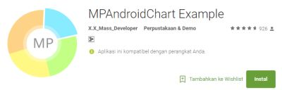
Old logo in Playstore:
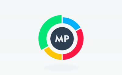
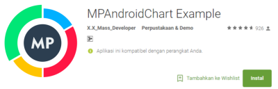
New logo in Playstore
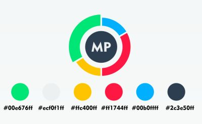
Colors Detail
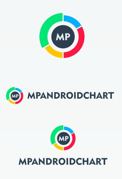
Logomark and Logotype
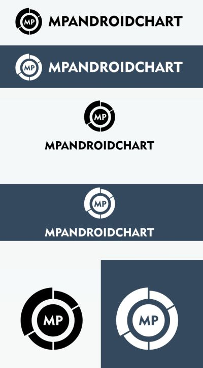
Monochrome Logomark and logotype
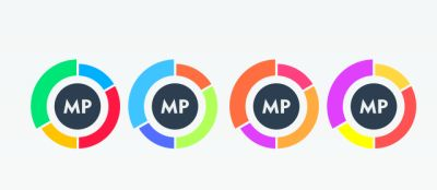
Colors Variation
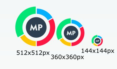
Sizes
Font Geometr415 Blk BT
link font
Benefits / Improvements
in the previous logo is not regular and not good, then I improve the design from the previous to be better. This new logo is inspired from the chart. I used the color of the material to make it more interesting and modern than ever. Then I use Geometr415 Blk BT font.
Tools
I used adobe illustrator CS6 software
Proof of Work
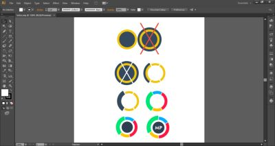
Original files
Vectors and Editable files GDRIVE
Posted on Utopian.io - Rewarding Open Source Contributors
Your contribution cannot be approved because it does not follow the Utopian Rules.
As you can see their current logo also inspired from a chart, so you basically only changed the colors and get rid of 3d flat style.
In the meantime, that 3d flat style and the colors you've changed is already in use in application. So changing those only in logo doesn't make much sense.
You can contact us on Discord.
[utopian-moderator]
Hey @oups, I just gave you a tip for your hard work on moderation. Upvote this comment to support the utopian moderators and increase your future rewards!
Nice! It looks like you’ve put a lot of
work into this, just keep up the good work.