eli5: I did a lot of cool stuff for the EFTG - more than they wanted but less than they need.
Repo: https://github.com/scr53005/eftg-steem/pull/7
INTRODUCTION
I was personally invited to take on this task:
Which is why I spent a little more time and energy than is probably appropriate for a mere logo and mockup; the logo was not just made available in the usual formats formats. I provided:
- a set of three different pixel-sizes of favicons
- .icns, .ico and .png icon files (in case electron is ever needed in the future, hint hint)
- svg format icon and logo
- eps version of the artboard
- a font file with the stylistic adaption of the font
UI, UX and MOCKS
As a UX designer, I know that a static mockup is only half the story, so I built a complete interface using Quasar / Vue.js. Although it is not "fully wired up," it does show some perspectives into the ways in which Quasar and its components can be used to rapidly achieve parity with business-logic. I go into some detail about this below. To do my due diligence, I also built and signed a Cordova app (Android) and Electron binary (MacOS). More about this below.
ICON & LOGO
ICON:

LOGO:

The underlying concept of the logo is to riff off of the idea of the stars and their alignment along a circle as seen in the EU flag. Here are some stages in the design process:

Here you can see the alignment check of the stars in the logotype.
I built many versions of the icon. Most notably, the dastardly .icns and .ico image collection filetypes that are needed for electron.
It is also available as three sizes of favicon (in png format) here:
https://github.com/nothingismagick/eftg-steem/tree/master/quasar/src/statics/icons
Finally, I have also provided SVG versions of the icon as well as an eps of the design board.
The artboard (constructed with Affinity Designer) and the glyphs master file are available here:
https://github.com/nothingismagick/eftg-steem/tree/master/art/artboards
The logo is based on the Monserrat font and the Bold weight. A modified version of the font has been included in the /art/fonts folder, with which the logo can be created in normal document editors and other applications that enables the user to choose and use fonts. Here you can see a screenshot from LibreOffice:
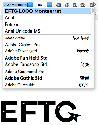
The black logo is exactly what is displayed when the user types "EFTG" in LibreOffice on Mac after installing the Logo font.
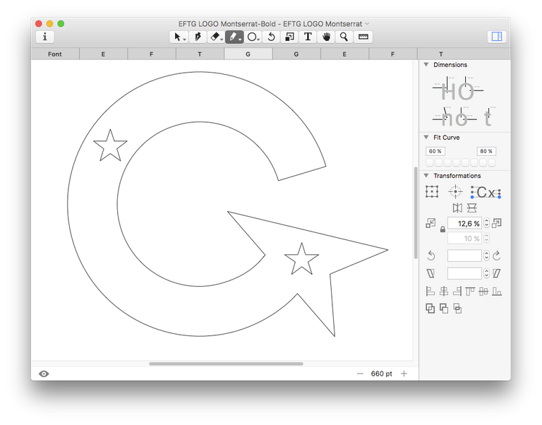
I copied the individual glyphs from Affinity Designer and simply pasted them into the glyph sheet for the respective letters in Glyphs Mini, resized to match the original letters and exported them. Here is the letter G:
TOOLS
I used the beta version of my node module quasar-icon-factory to construct the derivative icons.
All design work was undertaken with Affinity Designer and font modifications were made with Glyphs Mini. Open documents are available in /art/artboards.
COLORS
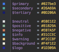
Quasar uses stylus for CSS preprocessing, so all of the colours have been defined in variables. These are quite easy to change out, should modifications be desired. As you can see, I chose a cream type colour for the background (an old painter's trick to use an off-white so that pure white - if used - has a chance to really "pop"). I maintained a slightly muted colour scheme.
FONT
The general font recommended for multilingual application with all web-properties and applications is noto sans, a SIL-OFL licensed font. The reason for that is that it is one of the only fonts available today that has absolute coverage for all glyphs in the target languages. Three font weights have been chosen, and they have been made available in /art/fonts.
MOCKUP
Pretty much everything is interactive because I used real components, and as @sorin.cristescu noticed, it may seem at first that it doesn't exactly follow all of the business logic as described in the Balsamiq wireframe - but I would like to remind you that the task was for an interface design - and the wireframe was just WAY too busy. If there is something that you think is "missing", you'll just have to imagine it (or click ALL of the buttons) - because creating it in Quasar is merely a matter of work and communication. Anything is possible.
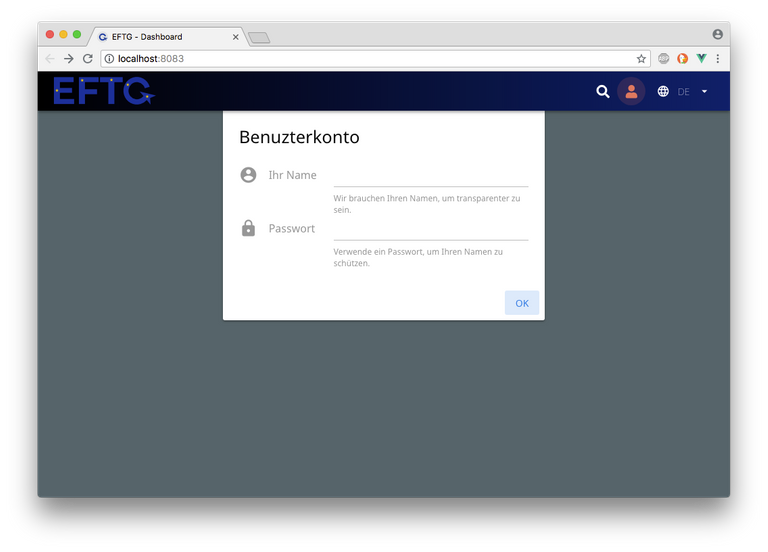
I also added a few things that were not in the Balsamiq wireframe, including a working translation engine with language switcher, a stubbed "login" type overlay and a global search to run full-text search across all available (or filtered) data-sources.
This is why I put a great deal of effort into the user interaction. I did not spend 5 days building the extremely complex logic of multi-faceted fuzzy search or full-text search of the pdfs - just as I did not bother to build a backend login system or GraphQL database interface (which is exactly what this project needs). I imagine that with a decent flow description or flowchart, this would be relatively easily and quickly resolved. However, that is a benefit of working with Quasar: you just get stuff done right, now.
Altogether I think that I spent about 16-20 hours on the Quasar app, and about three of those hours was spent on building the translation engine and strings. (Yes it's in English, French (sorry), and German.) Were this a "real" development contract, I would have spent much more time writing clean code, double-checking the translations, isolating components, writing documentation and testing. Nevertheless, it can serve as a great jumping off point for a further development.
Notes:
- The full-text search isn't wired up
- There is no login (just ux)
- There is no concotenation of records
- PDF files will not be created on the fly
- It is merely a super-charged mockup
- Selecting multiple "issuers" does work, but the logic needs several days of refinement.
Please feel free to visit the current state of the live version of the UI here: https://spa-mat-tixnxfbhjb.now.sh/
Screenshots
Landing screen:
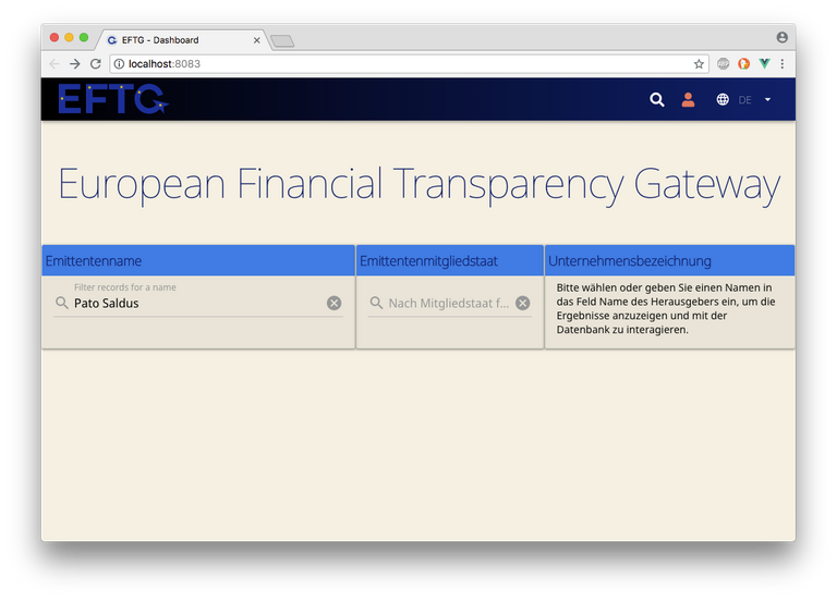
User Login:
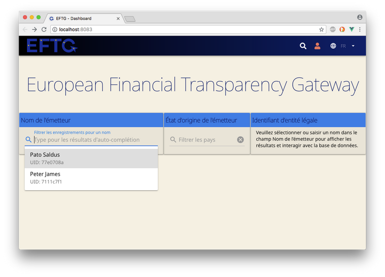
Autocomplete field showing all results (or matches by first letters typed):
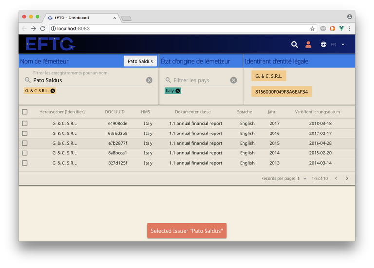
Pato Saldus selected, table becomes visible w/toast message:
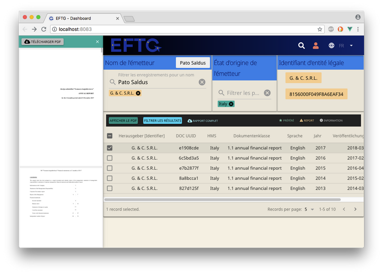
Click on Show PDF button, sidebar opens:
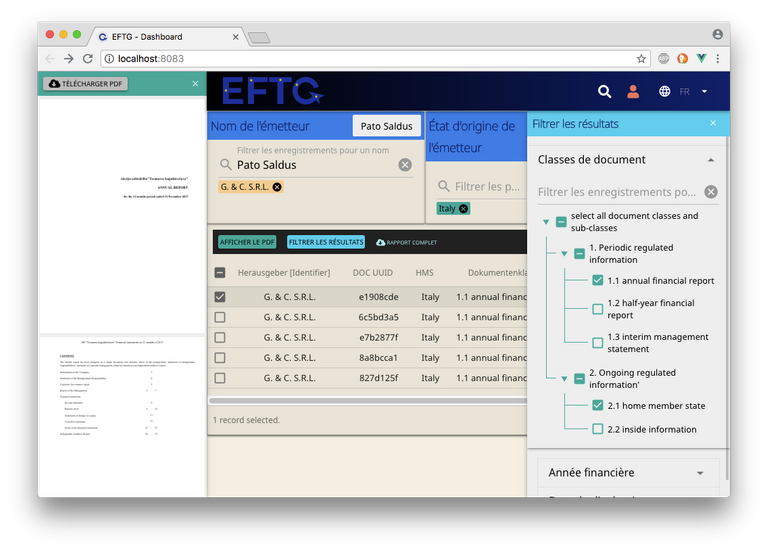
Click on "Filter Results: Document Classes":
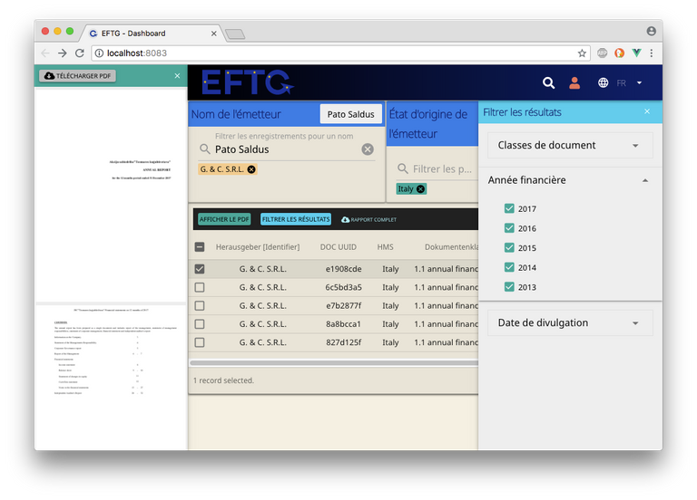
Click on "Filter Results: Years":
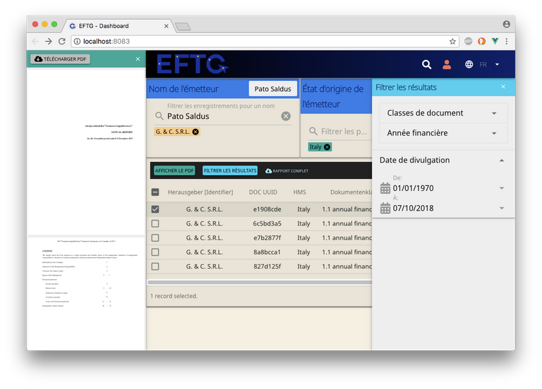
Click on "Filter Results: Date Range":
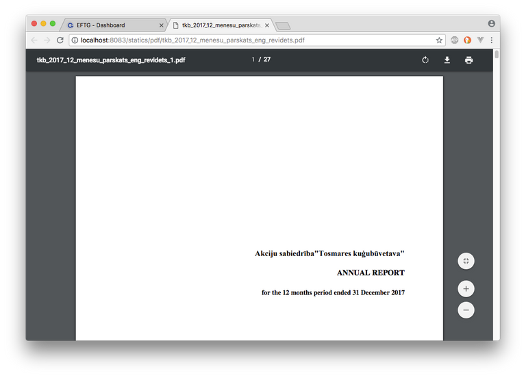
Click on Download PDF:
INDIVIDUAL COMPONENTS
For the most part, I used stock Quasar components and the interaction patterns as provided by Quasar. The only exception is vue-pdf, with which I encountered a few problems because of the way the component designer used the "window" global - which is not available on SSR - so instead of rebuilding the component, I reverted to the SPA form of Quasar. This is something that would need to be addressed for SSR-PWA type delivery.
This also proved to be the problem with the PDF rendering in Cordova and Electron, so there is great value in fixing that component - or building a Quasar native version.
OVER THE TOP
In order to be absolutely thorough, I also built an Electron App for MacOS and a Cordova app for Android. Neither of them are optimised (especially with regard to PDF rendering), but they both install and run correctly. This was to prove a point: Vue.js and Quasar are mature technologies that run circles around Angular and React. How much time did it take to make these two versions of the project? Less than it took to upload the finished artefacts from my lame uplink. SRSLY.
Here are the direct download links to those files from the Github Release page:
Thanks to @kevinmarrec for his nice starter, @sorin.cristescu for putting up with my perfectionism and @christophe51 for his patience.
Licensing
All art assets are CC-BY-ND, the Logo-Font is SIL and the Code is MIT.
2018 © Daniel Thompson-Yvetot

Thank you for your contribution.
Its awesome you have done live mockup. It might greatly help the development.
Contrast of dark blue on dark background is very low and its hard to even see the logo. Small stars turn into "holes" in web size.
It is great you put the logo into the font as well. It would be good to have multiple versions of logo. To try multiple ideas.
Your contribution has been evaluated according to Utopian policies and guidelines, as well as a predefined set of questions pertaining to the category.
To view those questions and the relevant answers related to your post, click here.
Need help? Write a ticket on https://support.utopian.io/.
Chat with us on Discord.
[utopian-moderator]
Thank you for your review, @andrejcibik!
So far this week you've reviewed 3 contributions. Keep up the good work!
Hi Nothingismagick - Many thanks for contributing to our EFTG project. You did a fantastic job. It was pleasure working with someone as motivated and dedicated as you.
Wow, some work went into this!
It looks very professional in my opinion.
I love the logo as well. The yellow starts on an arc was a very good idea indeed.
Well done!
The awesome thing about working within the Quasar Method is that I am using an amazing set of tools that I know deeply. For people on the outside it may seem like it was a lot of work, but I think 20 hours is ok for a highly reactive GUI that is almost MVP. For the logo I was done in about 4 hours, 1 hour of revision and 2 hours making the derivatives.
I am always reminded about the the saying, if all you have is a hammer, everything looks like a nail. Quasar brings a perfectly tuned set of tools; razor sharp and perfectly balanced. I love it!!!
Very good job!!
Hi @nothingismagick!
Your post was upvoted by @steem-ua, new Steem dApp, using UserAuthority for algorithmic post curation!
Your post is eligible for our upvote, thanks to our collaboration with @utopian-io!
Feel free to join our @steem-ua Discord server
Excellent job, Daniel. Too bad we can't have two graphic appearances :-)
Hey, @nothingismagick!
Thanks for contributing on Utopian.
We’re already looking forward to your next contribution!
Get higher incentives and support Utopian.io!
Simply set @utopian.pay as a 5% (or higher) payout beneficiary on your contribution post (via SteemPlus or Steeditor).
Want to chat? Join us on Discord https://discord.gg/h52nFrV.
Vote for Utopian Witness!
Congratulations @nothingismagick! You have completed the following achievement on the Steem blockchain and have been rewarded with new badge(s) :
Click on the badge to view your Board of Honor.
If you no longer want to receive notifications, reply to this comment with the word
STOPDo not miss the last post from @steemitboard:
Congratulations @nothingismagick! You have completed the following achievement on the Steem blockchain and have been rewarded with new badge(s) :
Click here to view your Board of Honor
If you no longer want to receive notifications, reply to this comment with the word
STOPDo not miss the last post from @steemitboard:
Congratulations @nothingismagick! You received a personal award!
You can view your badges on your Steem Board and compare to others on the Steem Ranking
Vote for @Steemitboard as a witness to get one more award and increased upvotes!