hi @midun, thank you for your contribution.
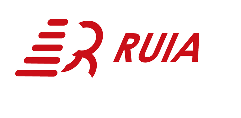
Very nice, another contribution to a well established project that has more than 500 forks, congratulation. The idea of this logo is very clear but i think the execution is little bit poor. this concept is very similar with your previous logo with the strips to represent fast/moving/running:

and of course there is nothing wrong with that but it makes the logo looks generic. I also gave you tips on how to convey "fast/express/moving" in a logo that is using slanted fonts and shapes.
Bellow is the example on how slanted typeface can represent "fast" better.

Your contribution has been evaluated according to Utopian policies and guidelines, as well as a predefined set of questions pertaining to the category.
To view those questions and the relevant answers related to your post, click here.
Need help? Chat with us on Discord.
Hehee thanks for your tips brode.! this's meants a lot to me, thanks for that.
Thank you for your review, @nilfanif! Keep up the good work!