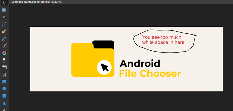
I have seen so many times people made the logomark too big compared to the logotype, remember, you are designing a logo not just an icon. don't just put an effort in the icon, do so in the logotype, put more attention on it.
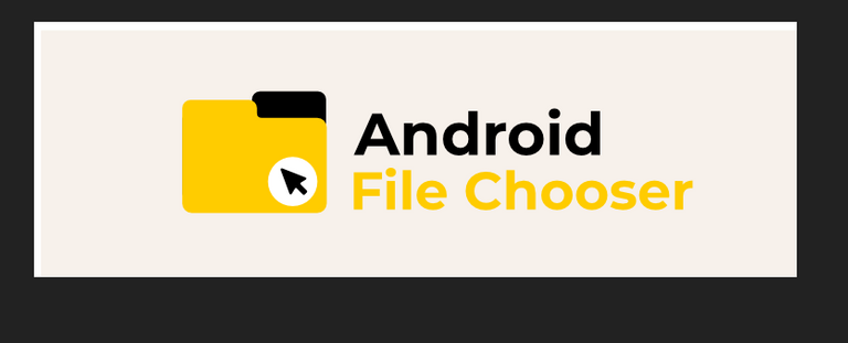
When the logomark and the logotype is not proportional, it will make the the whole logolooks unbalanced. For instance if the project owner decide to use the logo on a banner:


Also, thing to note, the logomark is quite generic, it is basically a flat file icon with an arrow.
Your contribution has been evaluated according to Utopian policies and guidelines, as well as a predefined set of questions pertaining to the category.
To view those questions and the relevant answers related to your post, click here.
Need help? Write a ticket on https://support.utopian.io/.
Chat with us on Discord.
[utopian-moderator]
hi @nilfanif, thanks for the time you give review and moderate my post. In my next contribution I will improve the quality.