Details
Omni Notes, open-source note taking application, designed to be lightweight and simple without giving up smart behavior.
Current features:
☆ Material Design interface
☆ Basic add, modify, archive, trash and delete notes actions
☆ Share, merge and search notes
☆ Image, audio and generic file attachments
☆ Manage your notes using tags and categories
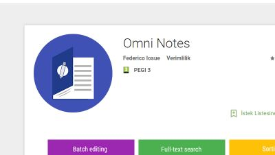
Source: Google Play
Please visit the Google Play here and GitHub here
Manuel Align

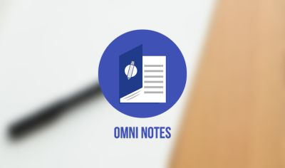
Original Logo

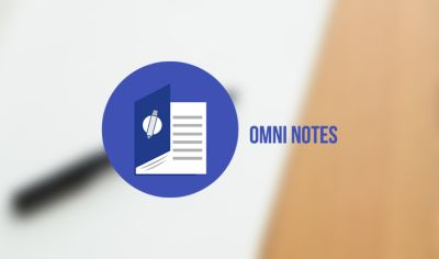
Proposal Logo
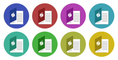
Color Variations

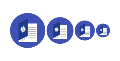
Size Variations
Benefits / Improvements
The new logo has the letter o. There is also a pen on it. The first logo is not so bad. But there are many similarities. The new logo is different from the others. I hope you like it.
Tools
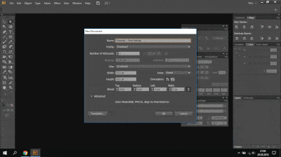
I used Adobe Illustrator CS6 software to design for the new logo.
Process (Working Animated Gif)
Original files
AI,SVG or PNG Files HERE
Font HERE
Posted on Utopian.io - Rewarding Open Source Contributors
Back vote
Awesome, upvoted, fellow and resteem
its look like Microsoft Word Logo, the different is just pencil part
Hmm.. Yes, now I have noticed. There is a similarity. I was sleepless. The moderator now decides.
Thanks for notifying, however similarities can happen in graphic design. It's only forbidden to use others' works or similarity is too obvious to count as plagiarism.
Your contribution cannot be approved because it does not follow the Utopian Rules.
There are several issues regarding perspective, like
book cover is too small for papers,
icon on cover faced directly while cover has an angle,
and those small details under cover are too hard to see, it would be harder to see on smaller sizes..
You can contact us on Discord.
[utopian-moderator]
thanks for the valuable comment..