Details
The public transport companion that respects your privacy and your freedom. Transportr is a non-profit app developed by people around the world to make using public transport as easy as possible wherever you are. Github Link Google Play Link
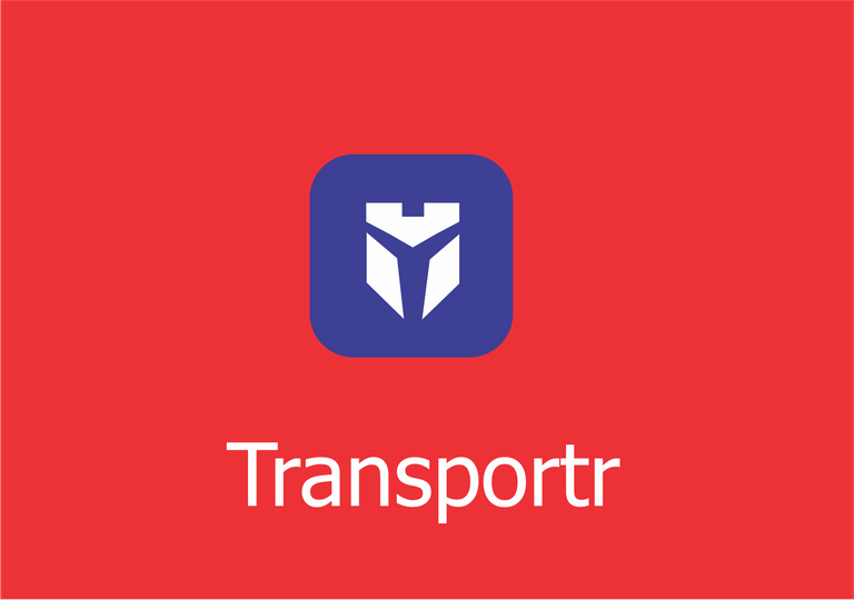
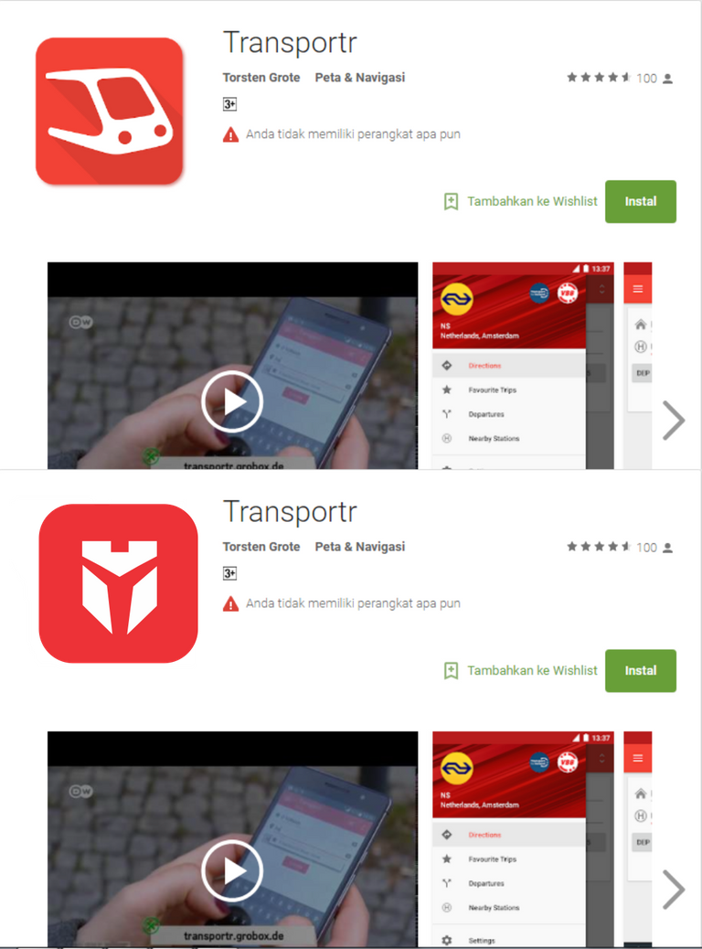
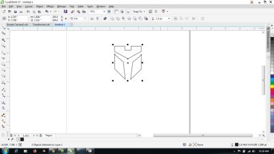
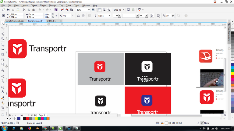
Logo Result:
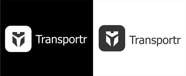
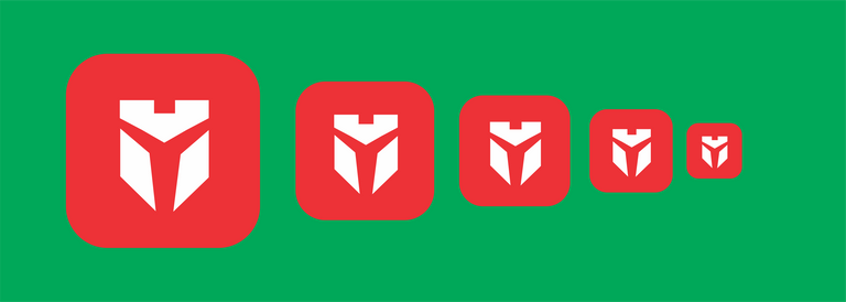
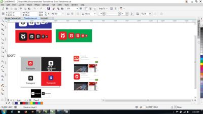
Icon Result:
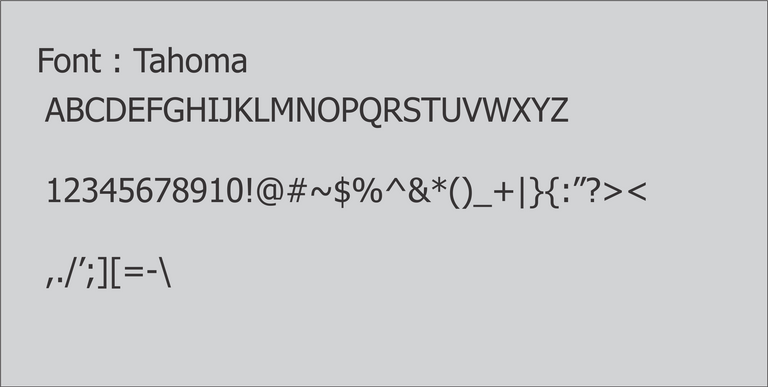
Font:
Benefits / Improvements
On this occasion I tried to design one of the open source applications. I tried with a more elegant look than the original logo. hopefully my contribution is useful.
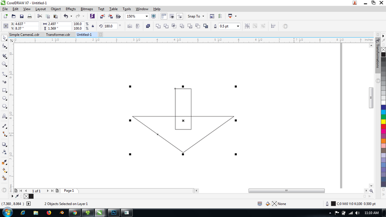
Tools
[Link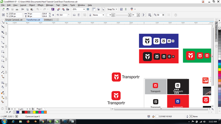
Original files
Download Edit Table : Link
Download Font: Link
Posted on Utopian.io - Rewarding Open Source Contributors
Your contribution cannot be approved because it does not follow the Utopian Rules.
Hard rules broken:
Shapes are not same and not aligned
Suggestion:
You can contact us on Discord.
[utopian-moderator]
Hey @baranpirincal, I just gave you a tip for your hard work on moderation. Upvote this comment to support the utopian moderators and increase your future rewards!
Pinter ente bikin logo bng
thks bro..
pemula jugak aku bro
baru2 aj bisa desain😁