Components
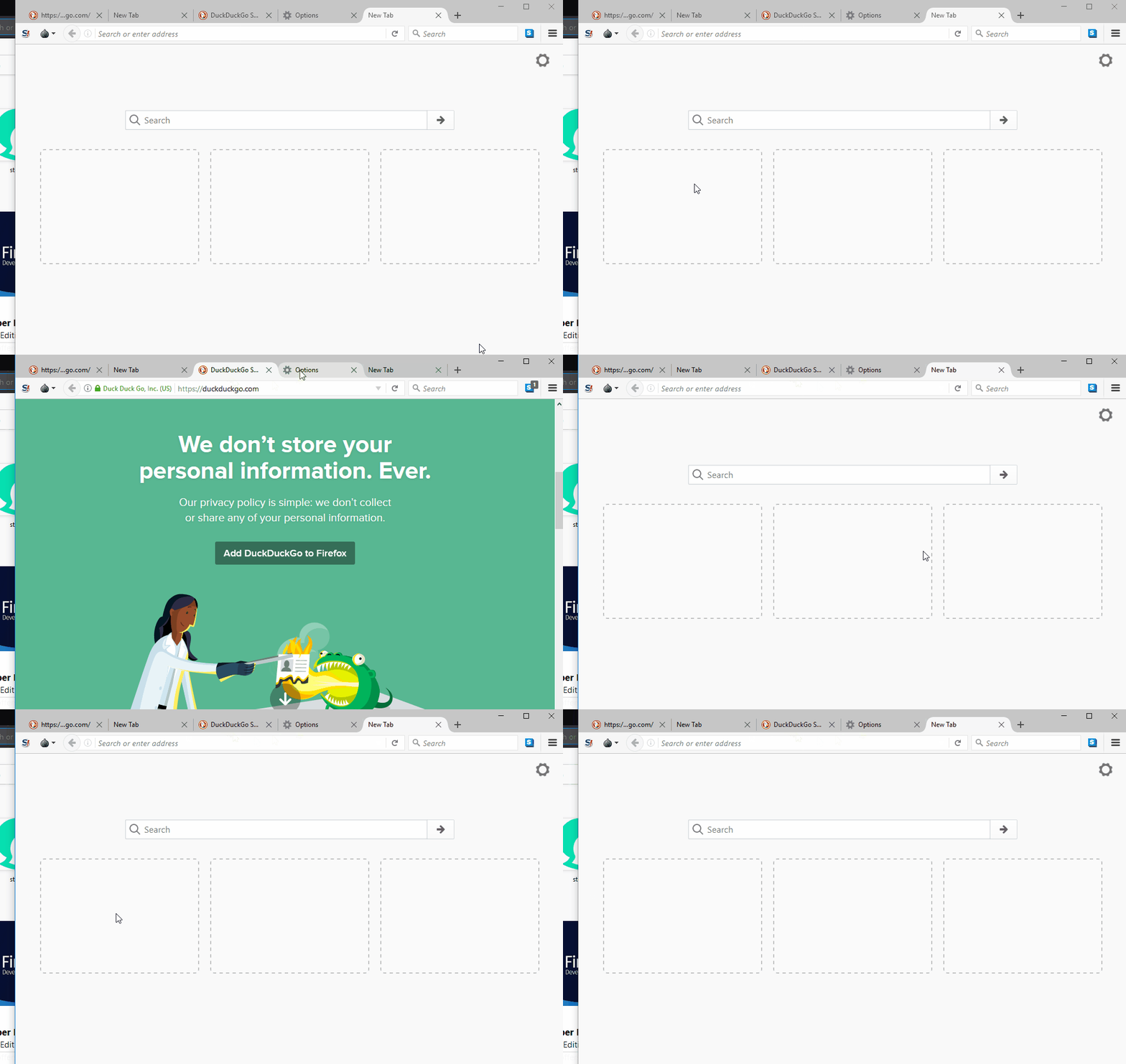
The three rectangular portion in the middle of a new TOR tab
Proposal
Tor is based on Firefox. In Firefox, these three rectangular boxes are used to show Highlights. Which means , in these boxes, there will be links which were visited by the user. But, in tor these three box are useless. They just do not serve any purpose. It should work like Firefox(I have showed that in the mockups).
Mockups / Examples

Current Scenario of the component in TOR:

Benefits
These three rectangular portions are ruining the UI of the browser. If they have any purpose then it should perform those. And if they do not have any use, then it should be removed to give the UI a better look.
Posted on Utopian.io - Rewarding Open Source Contributors
Your contribution cannot be approved because it does not follow the Utopian Rules.
The Github repository of this project is not valid as there are no codes, licenses, etc to see their work. Therefore Utopian will not be able to accept this contribution due to the new updated rules.
You can contact us on Discord.
[utopian-moderator]