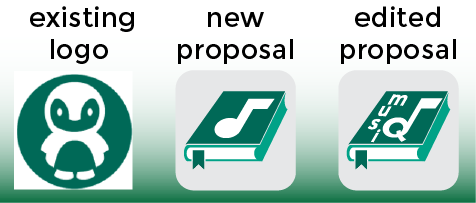
Firstly, thank you for the criticism.
There was a lot of symbols displaying a music note on a book, you are right, i have noticed it now.
I think i made a good design and edited my post, i made a small change over proposal, to look like a logo instead of an icon. By this way, the new logo had a visual identity and my work has some benefits to project owner.
If I look at it from the perspective of improvments, i can easily say that purposed one is more aesthetic, attractive and related to application than the existing logo.

You are viewing a single comment's thread from:
@mlkmsbztrk
Hey I'm the creator of musiQ. I like the new icon, can I use it? I will give you credit in the description on GitHub. Do you have anything specific for the credits or just somerhing like "Thanks to mlkmsbztrk for the icon design"?