A musical encyclopedia.
This application is a musical library, which features a beautiful material design and shows up-to-date information about artists, albums and songs. Always ad-free.
It is not required to have a Last.fm account to use this app, you can still use it only as an encyclopedia, but if you have an account, the app supports scrobbling from many players, including: - YouTube - Google Play Music - Spotify - Pandora - VLC - SoundCloud and more...
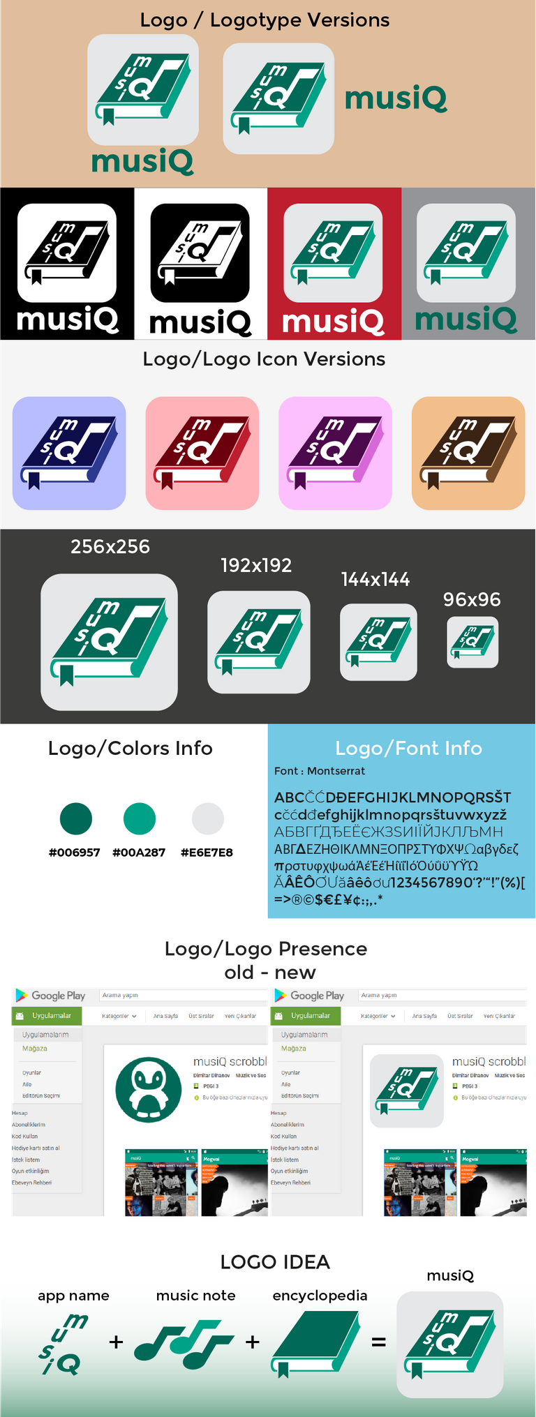
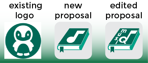
I designed a new logo icon because the existing logo is not related to application.
To bring benefit over , i added a music note and encyclopedia. By this way, the new logo had a visual identity and had been related to application with meaning of musical library.
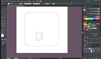
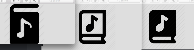
I used Adobe Illustrator CS6 to design for the new logo. And Proof of my works.
Posted on Utopian.io - Rewarding Open Source Contributors
Your Post Has Been Featured on @Resteemable!
Feature any Steemit post using resteemit.com!
How It Works:
1. Take Any Steemit URL
2. Erase
https://3. Type
reGet Featured Instantly � Featured Posts are voted every 2.4hrs
Join the Curation Team Here | Vote Resteemable for Witness
Your contribution cannot be approved because it does not follow the Utopian Rules.
As you can see there are plenty of free to use icons that displays a musical note over a book. You did a good design but I can’t approve it as a logo design. It’s looking more like an icon rather than a logo.
You can contact us on Discord.
[utopian-moderator]
Firstly, thank you for the criticism.
There was a lot of symbols displaying a music note on a book, you are right, i have noticed it now.
I think i made a good design and edited my post, i made a small change over proposal, to look like a logo instead of an icon. By this way, the new logo had a visual identity and my work has some benefits to project owner.
If I look at it from the perspective of improvments, i can easily say that purposed one is more aesthetic, attractive and related to application than the existing logo.
I would ask you to review again, please.. @oups @nilfanif
@mlkmsbztrk
Hey I'm the creator of musiQ. I like the new icon, can I use it? I will give you credit in the description on GitHub. Do you have anything specific for the credits or just somerhing like "Thanks to mlkmsbztrk for the icon design"?