What is skrifa before It is so versatile that you'll have no problem using it for any scenario, as a power user or just as a simple quick note taking app. From text styling to videos and images, Skrifa provides the right set of tools you need to take awesome notes.
Benefits / Improvements
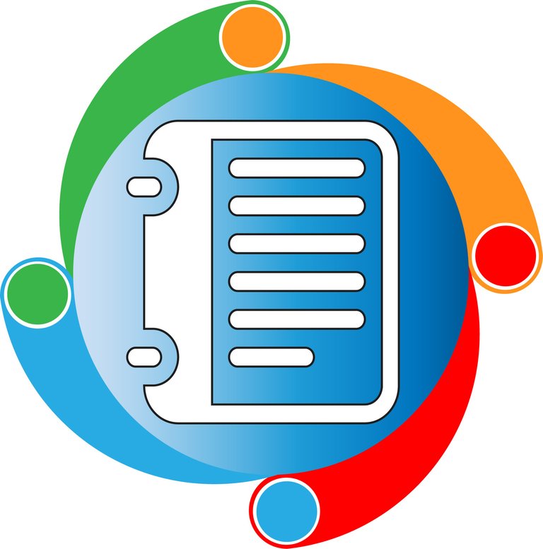
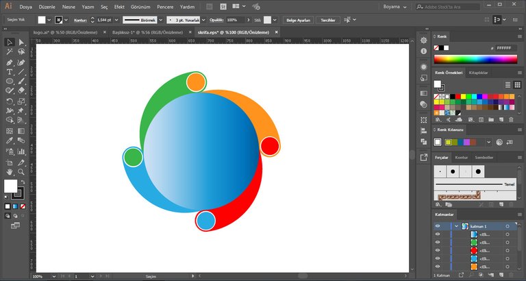
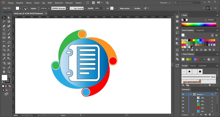
At this time I have designed a logo for this project. I used the circle to remind the old logo. I added a new notebook, I used new colors I created a more modern, creative and appealing display but maintained the original logo's color scheme.
That’s my new logo design;

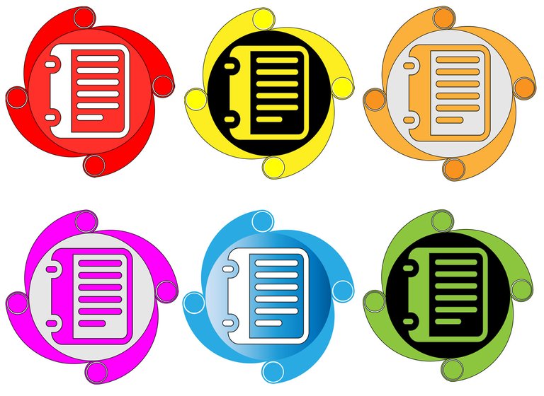
Logo Pixels Variations
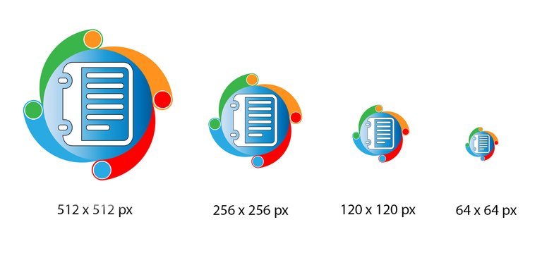
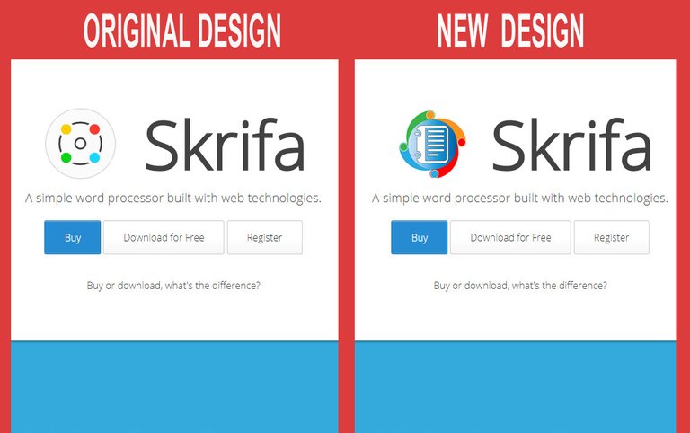
Original and New Logo
Tools
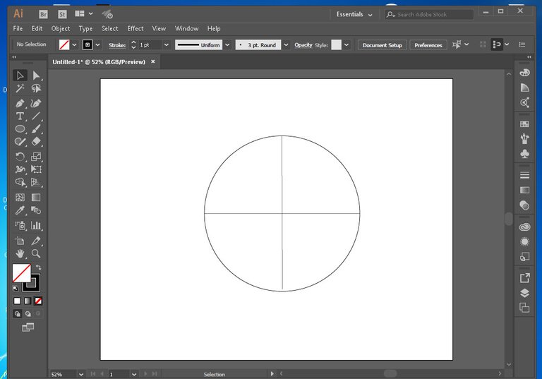
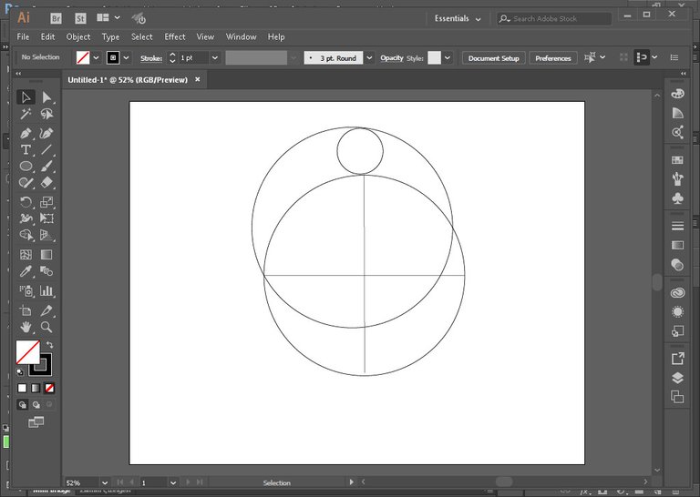
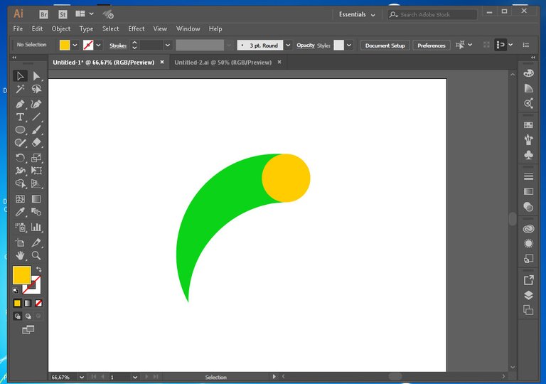
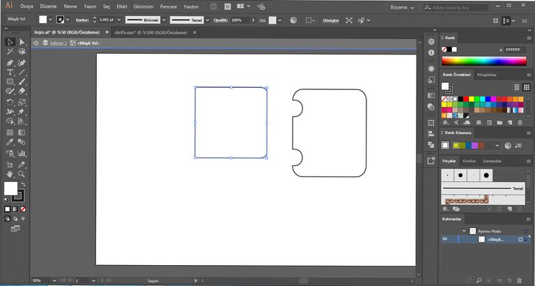
I used Adobe Illustrator CC 2017 version when designing the icon and the presentation as well. Here are some screenshots for design process and proof of works.

PNG: SKRIFA
My Documents is Here: SKRIFA
Github Link : SKRIFA
Web Link: SKRIFA
Posted on Utopian.io - Rewarding Open Source Contributors
Your contribution cannot be approved because it does not follow the Utopian Rules.
You can contact us on Discord.
[utopian-moderator]
Please be careful checked
The icon is in the presentation
I think your personal opinion
Definitely better than the new logo
we can ask a hundred people
Next time @radudangratian
Please make a fair assessment
If you are not satisfied with my decision.You can ask for help on Discord!