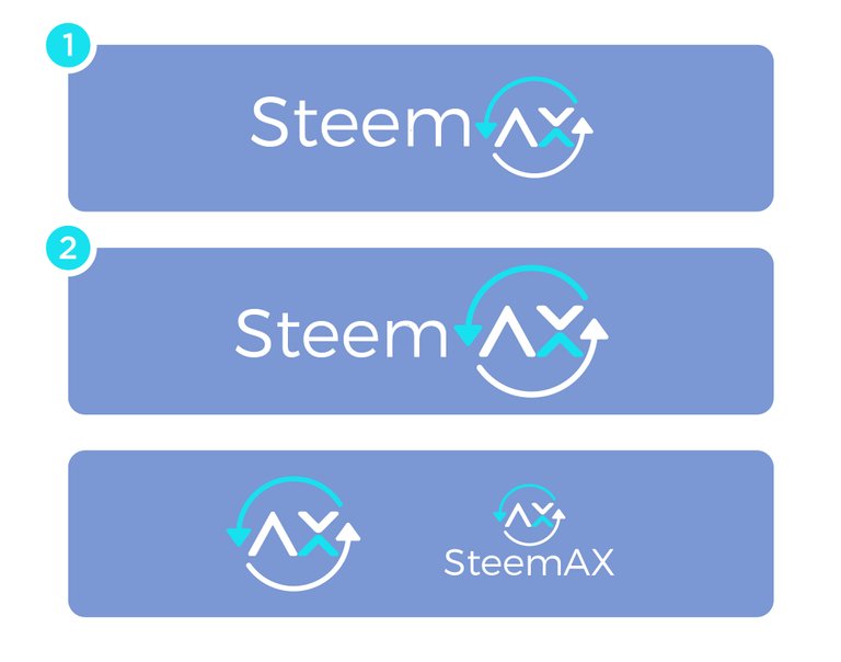
I like version 2. One of the reasons I requested arrows chasing each other is that they represent on ongoing, automated exchange. In version 2 and 4 I feel as if the arrows represent a single exchange. But I like the font and basic shapes of number 2 the best.
You are viewing a single comment's thread from:
Thanks you sir @learnelectronics for your feedback. What about the color? do I keep or change?
Hi Sir @learnelectronics. I have another logo design. No.1 small circle and no.2 big circle.
