Repository
https://github.com/Minecolonies/minecolonies
https://github.com/Minecolonies
Linked Task Request
https://steemit.com/utopian-io/@raycoms/letsdevtogether-ldt-logo-task-request
Communication
I have commented my design for LetsDevTogether(LDT) in the task request here
Details
The team are from "MineColonies" and they arent limited to minecolonies but also other minecraft modifications, and other minecraft related applications. Recently they decided to give their developer group a name, and the name they they come up with was "LetsDevTogether". And now they wanted a logo for LetsDevTogether(LDT).
To know more about minecolonies click here
Logo Idea
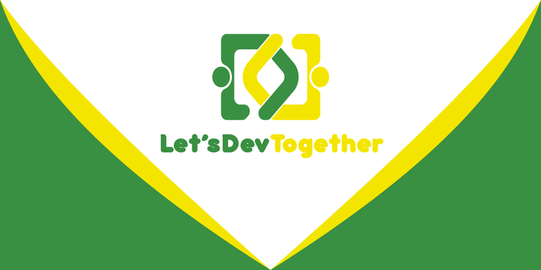
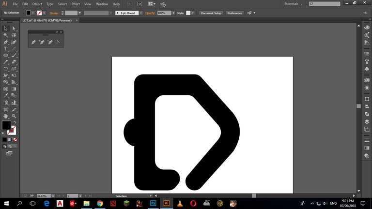
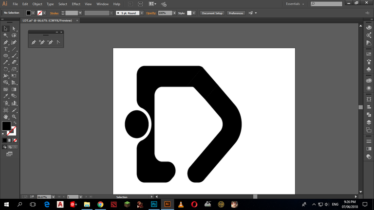
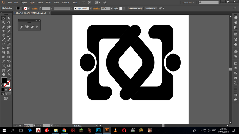
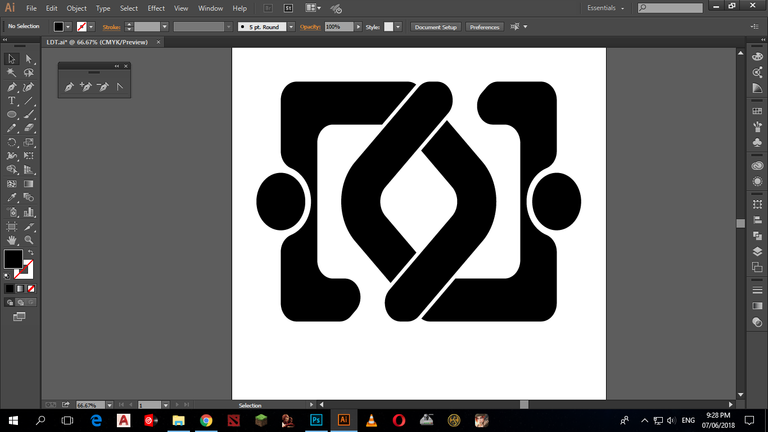
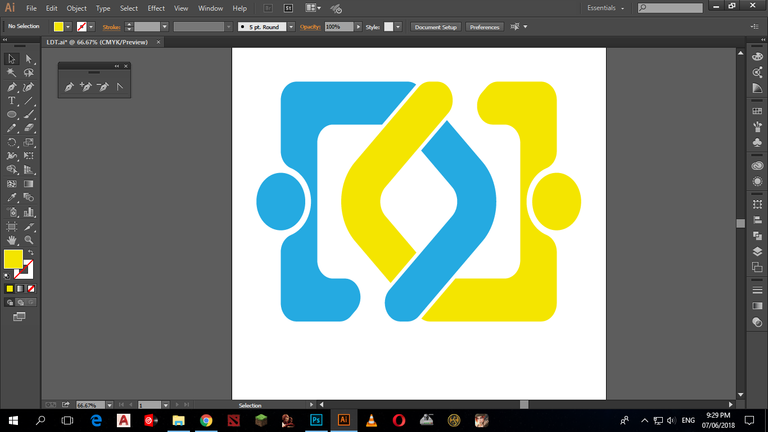
The Idea I came up with was based on a symbols "[><]" You can see 2 persons interlocking their elbows in the design that shows "openness" and a "Family of Coders Spirits" that @raycoms just said in the task request. There are 2 kinds of designs I made the first one is with a globe in the center and then the second design is without a globe in the middle.
Logotype

Logotype without 's
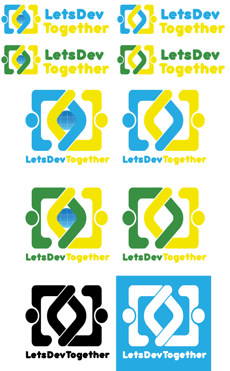
Icon Color Variations
| version one | version two |
|---|---|
Icon Size Variation(Website)
| 64 | 128 | 256 | 512 | 1024 |
|---|---|---|---|---|
Icon Size Variation(favicon)
| Icon | Sizes |
|---|---|
| 16 | |
| 32 | |
| 64 | |
| 72 | |
| 144 | |
| 192 |
Banner
| version one | version two |
|---|---|
 |  |
 |  |
Banner without 's
| version one | version two |
|---|---|
 |  |
 |  |
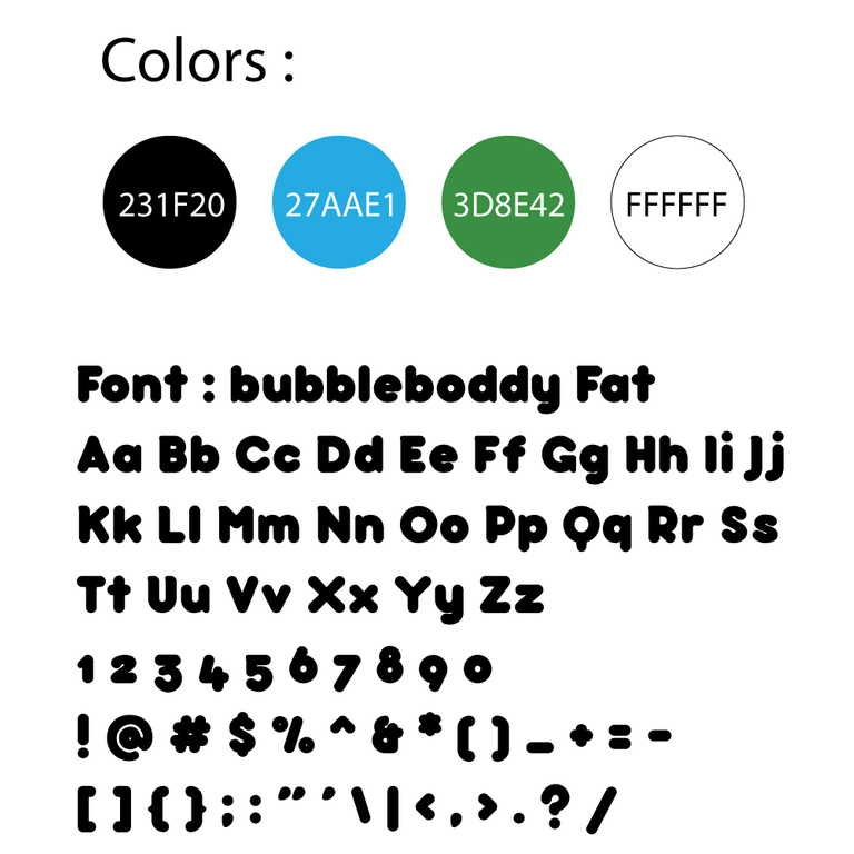
Colors and Font Used
Benefits / Improvements
The designs I made is minimalistic and clean so that it can attract more viewers/people. I have followed the task request and given the files needed. The logo looks good in the project.
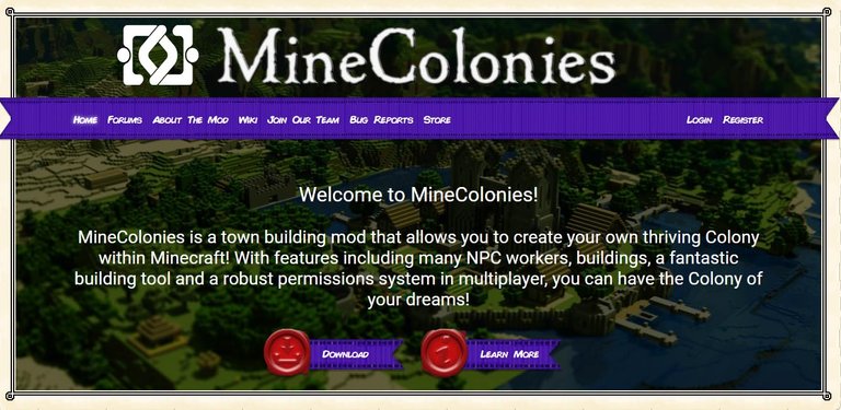
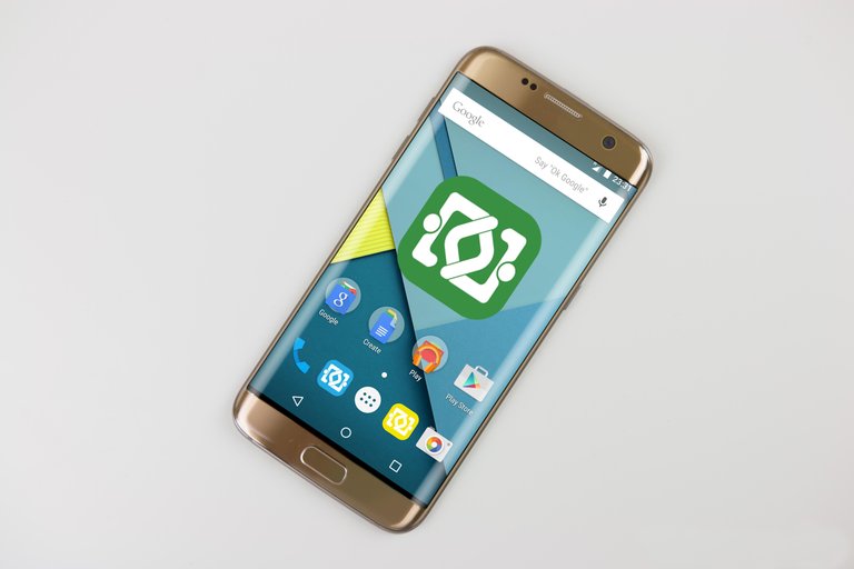
Mockup
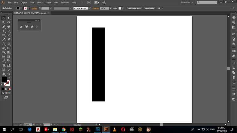
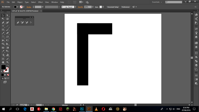
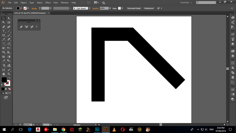
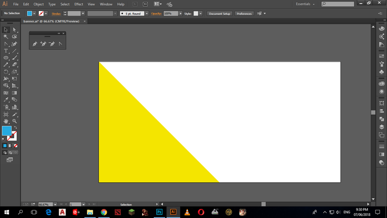
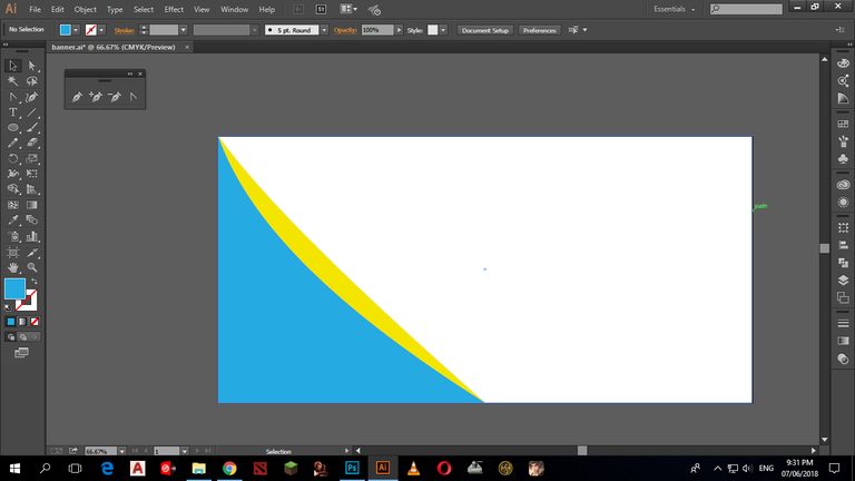
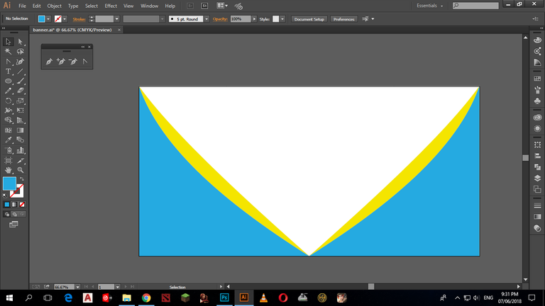
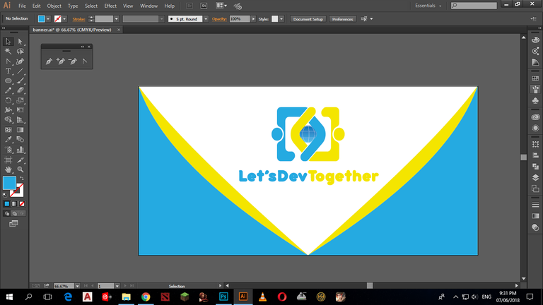
Proof of authorship
| steps | steps |
|---|---|
 |  |
 | 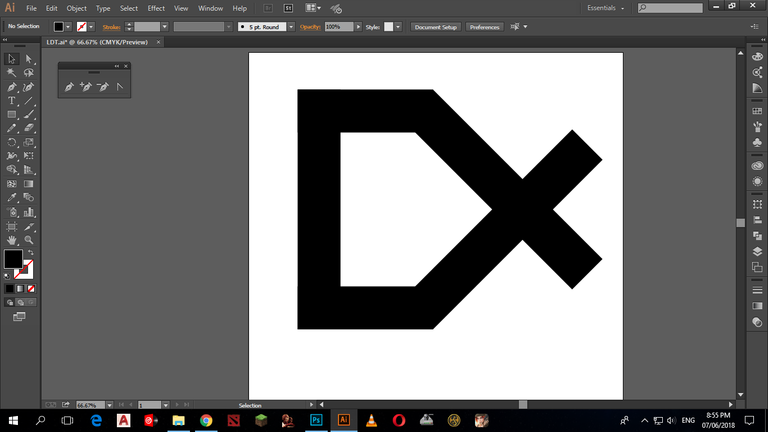 |
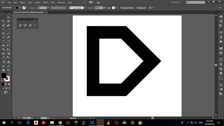 | 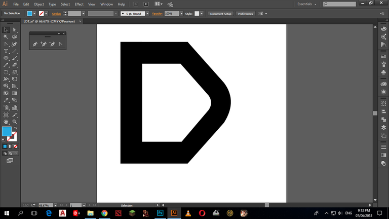 |
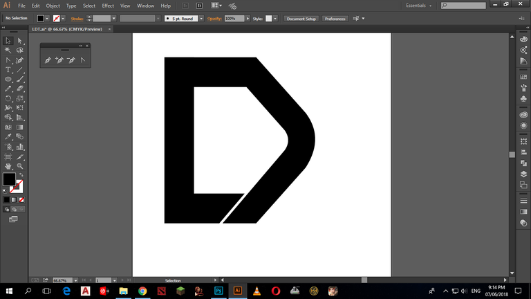 |  |
 |  |
 |  |
 |  |
 |  |
Tools
- Adobe Illustrator CC 2015 for making the designs that gives vector format
- Adobe Photoshop CC 2017 for making the presentation
Original files
Google Drive
font bubbleboddy fat
Golden mobile phone mockup freepik
Proof of Work Done

This work is licensed under a Creative Commons Attribution 4.0 International License.
Hey @jefz ,
Thank you for the contribution. World icon is not understandable on your first logo design version. I think other one better. In my opinion typeface selection is not suitable with logo-mark. Too bold, it could be better if you use thinner typeface. Also, why the circles are not exactly circle. It seems you stretched it.
Your contribution has been evaluated according to Utopian policies and guidelines, as well as a predefined set of questions pertaining to the category.
To view those questions and the relevant answers related to your post, click here.
Need help? Write a ticket on https://support.utopian.io/.
Chat with us on Discord.
[utopian-moderator]
Hey @jefz
Thanks for contributing on Utopian.
We’re already looking forward to your next contribution!
Contributing on Utopian
Learn how to contribute on our website or by watching this tutorial on Youtube.
Want to chat? Join us on Discord https://discord.gg/h52nFrV.
Vote for Utopian Witness!