Repository
https://github.com/hedzr/android-file-chooser
Linked Task Request
Details
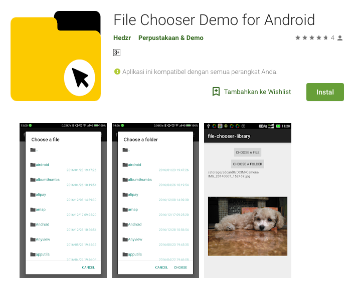
Android File Chooser is an android library for lightweight file/folder chooser. This libray is developed by Hedzr Yeh
![]()
Proof of Authorship
Benefits / Improvements
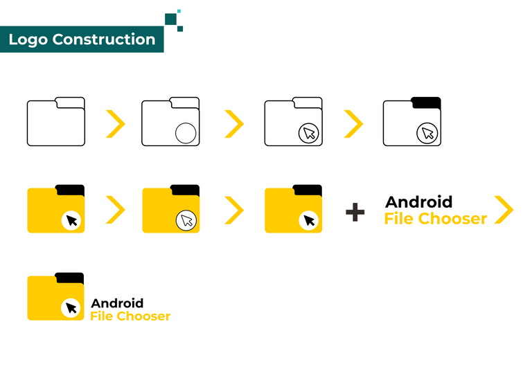
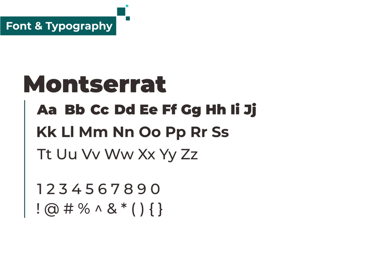
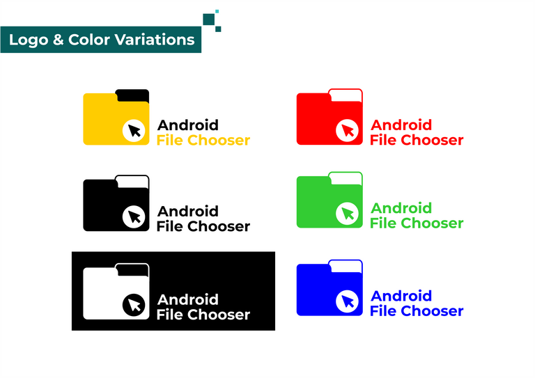
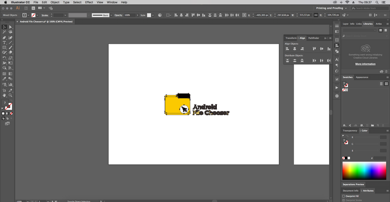
because this project does not have a logo before. I took the initiative to offer this logo to the project owner with the following considerations:
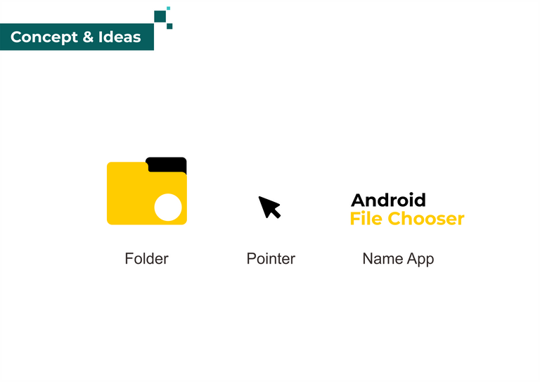
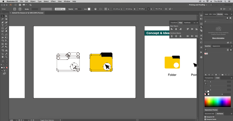
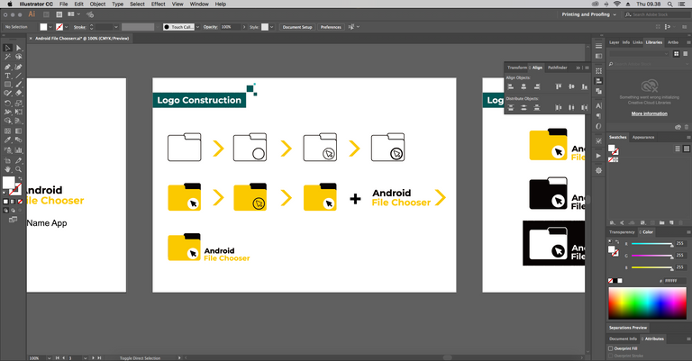
- Showing the folder icon as the main part, to describe the activity of folder / file selection which is the main purpose of this library
- Using the cursor icon as a supporting part that describes the process of selecting files.
- Combine elements of the logo in a balanced way but still make this logo will be seen from the number of library options in github.
- Logo is easy to remember and re-form for other uses
Tools
Using Adobe Illustrator CC 2017 to create the logo and presentation.

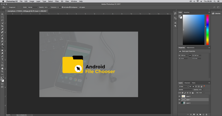
Using Adobe Photoshop CC 2017 to create cover.
Creative Common License
This work is licensed under a Creative Commons Attribution 4.0 International License.


I have seen so many times people made the logomark too big compared to the logotype, remember, you are designing a logo not just an icon. don't just put an effort in the icon, do so in the logotype, put more attention on it.
When the logomark and the logotype is not proportional, it will make the the whole logolooks unbalanced. For instance if the project owner decide to use the logo on a banner:
Also, thing to note, the logomark is quite generic, it is basically a flat file icon with an arrow.
Your contribution has been evaluated according to Utopian policies and guidelines, as well as a predefined set of questions pertaining to the category.
To view those questions and the relevant answers related to your post, click here.
Need help? Write a ticket on https://support.utopian.io/.
Chat with us on Discord.
[utopian-moderator]
hi @nilfanif, thanks for the time you give review and moderate my post. In my next contribution I will improve the quality.
Hey @iqbalhood
Thanks for contributing on Utopian.
We’re already looking forward to your next contribution!
Want to chat? Join us on Discord https://discord.gg/h52nFrV.
Vote for Utopian Witness!