Details
On this day I will contribute by creating a logo, as usual, when I am browsing on google playstore I found a very interesting application that is Unit Converter Ultimate, Unit Converter Ultimate is a simple and easy-to-use unit converter to handle any conversion you'll ever need.
The beautiful Material Design user interface allows for quick and easy conversions from a number in one unit to another. The goal is to keep it simple - you won't be overwhelmed with an excess of options and settings, allowing you to perform your desired conversion as quickly as possible. Perfect for work, school or in the kitchen.
Available unit conversions include:
- Currency (US dollar, CDN dollar, pound, peso, etc)
- Temperature (celsius, fahrenheit, kelvin, etc)
- Length (kilometer, miles, meter, yard, feet, etc)
- Mass/Weight (kilogram, pound, ounce, ton, stone, etc)
- Speed (km/h, mph, knot, etc)
- Area (square kilometer, square mile, hectare, acre, etc)
- Cooking Volume (teaspoon, tablespoon, cup, pint, quart, ounce, etc)
- Pressure (kilopascal, bar, PSI, etc)
- Power (watt, kilowatt, horsepower, etc)
- Energy (joule, calorie, BTU, etc)
- Time (year, month, day, hour, second, etc)
- Fuel Consumption (miles per gallon, liters per 100km, etc)
- Digital Storage (bit, byte, megabytes, gigabytes, etc)
If you're interested in helping translate the app into your language, Unit Converter Ultimate is open source. check out the code on GitHub
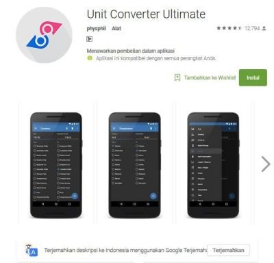
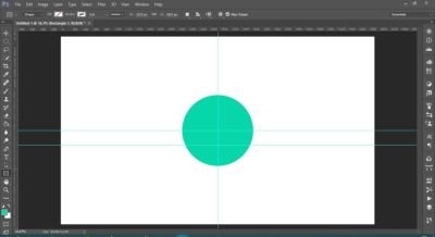
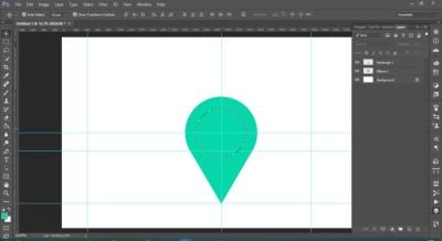
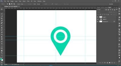
and at this time I designed the logo using rectangle tool and ellipse tool, the first thing I do is make a circle with ellipse tool then I select and minimize the selection part then I duplicate the circle layer that has been selected, after layer dupikat created with circle the smaller one, I lowered it a little more to get the space between the circle, then I made a rectangle and tapered it down to form like an arrow after that I grouped all the layers and deleted the left of the first circle, after all the finished phases I duplicate the result of the merge first and shaping it into a symbol of recover what version you want it to be.
Original Logo
Proposal Logo
Logo Variations
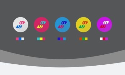
Color Code to Create Logo Variations
- ec4181, 0668d6, e5e5e5
- 37bfc7, e4fe33, cb2862
- 1e12bc, bc125e, 2594d4
- cd4400, 079f48, e2ce21
- f7f9f9, cd002b, bf24d6
Font Used
Century Gothic Regular : Download
Benefits / Improvements
The logo that I created looks simple and elegant with varying bright colors, very different from the original logo which is linked with arrows made in the opposite, the logo I created is very good to look at, and I'm sure. The logo I created can also appeal to google playstore customers to use the Ultimate Unit Converter app, and I hope that with this new logo the better the future will be and continue to make improvements and updates
Tools
When designing something, I always use software from Adobe, Adobe Photoshop. This time I use Adobe Photoshop CC 2015. I often create logos and this is one of my hobbies and loves to do it.
Proof Work
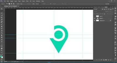
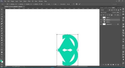
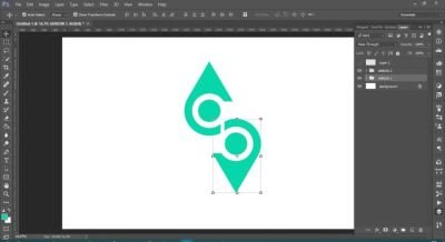
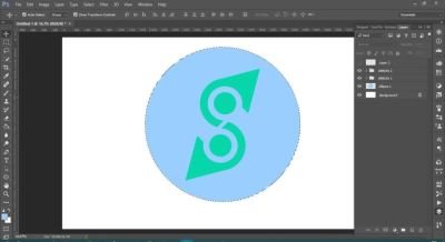
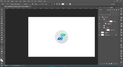
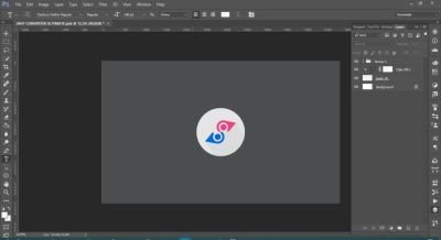
Original and New Comparison
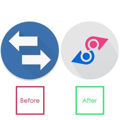
Original files
All files can be downloaded via link:
All files in Gdrive : Donwload
Posted on Utopian.io - Rewarding Open Source Contributors
Hey @healthinfact I am @utopian-io. I have just upvoted you!
Achievements
Community-Driven Witness!
I am the first and only Steem Community-Driven Witness. Participate on Discord. Lets GROW TOGETHER!
Up-vote this comment to grow my power and help Open Source contributions like this one. Want to chat? Join me on Discord https://discord.gg/Pc8HG9x
so beautiful bro @healthinfact
Thank my bro @ath-allsave
Can you explain your decision why you choose the widly adopted map marker icon to represent a unit converter app?
Thank you in advance for asking, when I was thinking how to form the logo of the application unit converter ultimate, I searched for a reference and suddenly I came across an idea with a map marker logo, my map marker erased just a little to the left of the Circle, then erased, as I thought , the logo looks like a unique arrow, then I duplicate it so as to create the logo of my version of application unit converter ultimate.
Ok, let me ask again in a different way. Do you think the map marker is a appropriate symbol for a "unit converter" that has nothing to do with a map?
Do you think the map symbol that has been changed is not perfectly formed, do you still call it a map marker? It looks similar, but I make it because I think it looks unique, because if you look with different angles it looks like a unique arrow
Acutally I think it will always reminds the user about a map related app, so it will lead to misunderstanding, thats why iI think its probably the wrong symbol.
I dont want to make u feel bad about your work or something like this, I just want to help designers on steemit to evolve their skills as you can see in my post here: https://steemit.com/design/@neutronenkind/design-critique-service
Its always very important to think about how something will appear to the user.
Thank you for the contribution. It has been approved.
You can contact us on Discord.
[utopian-moderator]
Thank you @andrejcibik