What Will I Learn
In this post we will be learning how create the following components using the MaterializeCSS framework
- Basic homepage layout
- Navigation Bar
- Slider
- Rows and Columns
- Cards
- Footer
Requirements
- Code editor
- Latest version of any web browser
Difficulty
Intermediate
Tutorial Content
In this tutorial we will create a basic HTML/CSS page using the Materialize framework.
We'll be adding all the components above in order to make our page complete.
For more information on how to get started with Materialize, read this resource.
You can download the full source code for this tutorial in zip format from here.
Step 1. Navigation Bar
To create the navigation bar add the following code to the HTML file of the page
<header>
  <div class="container" id="nav-container">
    <nav>
      <div class="nav-wrapper red accent-3">
        <a href="#" class="brand-logo white-text darken-3" id="logo-link">KONZULTZ</a>
          <ul id="nav-mobile" class="right hide-on-med-and-down">
            <li><a href="#" class="white-text">HOME</a></li>
            <li><a href="#" class="white-text">ABOUT US</a></li>
            <li><a href="#" class="white-text">SERVICES</a></li>
            <li><a href="#" class="white-text">BLOG</a></li>
            <li><a href="#" class="white-text">SHOP</a></li>
            <li><a href="#" class="white-text">CHECKOUT</a></li>
            <li><a href="#" class="white-text">CONTACT</a></li>
          </ul>
      </div>
    </nav>
  </div>
  </header>
Additionally, in the CSS file for the page add the following code
#nav-container {
  margin-top: 30px;
}

#logo-link {
  padding-left: 10px;
}
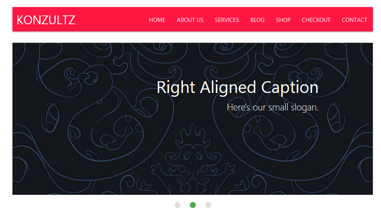
After saving the file, the page displayed in the browser will be displayed like the screenshot below

Code Analysis
In this section we first of all created a <header> tag to hold the contents of our navigation bar.
Inside the tag we created another <div> tag with specified class and id of container and nav-container both of which are responsible clearing the area outside the navigation bar in order to create a better layout.
Then we opened a new <nav> and created a <div> directly under it. The <div> tag contains a class attribute with two values
nav-wrapperfor centering the navigation bar contentsred-accent-3to set the background of the navigation bar to color red.
Next we created a link to display the brand logo and we assigned the tag with class attribute values of brand-logo white-text darken-3 and id attribute value of logo-link. Both attribute values will set the styles of the logo area of the layout.
After the logo area we created a list containing the contents of our navigation bar, aligned it to the right side with the class attribute value right.
Furthermore we set the list to be hidden on tablet and mobile screens with the class attribute value hide-on-med-and-down.
Inside this list we add all menu contents and give them a class attribute value of white-text to set the text colors to white.
Step 2: Slider
We'll be creating our slider in three stages.
The first stage, head over to the HTML file for the page and append the following code
 <section id="home-slider">
        <div class="container">
        <div class="slider">
          <ul class="slides">
            <li>
              <span><img src="images/image_one.jpg"></span> (html comment removed:  random image )
              <div class="caption center-align">
                <h3>This is our big Tagline!</h3>
                <h5 class="light grey-text text-lighten-3">Here's our small slogan.</h5>
              </div>
            </li>
            <li>
              <img src="images/image_three.jpg"> (html comment removed:  random image )
              <div class="caption right-align">
                <h3>Right Aligned Caption</h3>
                <h5 class="light grey-text text-lighten-3">Here's our small slogan.</h5>
              </div>
            </li>
            <li>
              <img src="images/image_five.jpg"> (html comment removed:  random image )
              <div class="caption center-align">
                <h3>This is our big Tagline!</h3>
                <h5 class="light grey-text text-lighten-3">Here's our small slogan.</h5>
              </div>
            </li>
          </ul>
        </div>
        </div>
      </section>
For the second part of the process we'll be adding the CSS styles for the slider.
In your CSS file append the following code
    #home-slider {
  margin-top: 30px;
}
Lastly we'll be initializing an instance of the slider with jQuery, in the JavaScript file for your age append the following code
$(document).ready(function(){
  $('.slider').slider();
});
Save all your files. Your homepage would look like this right now

Code Analysis
First of all we add a <section> tag with a id home-slider for easy identification in our CSS file.
Next we add a <div> tag with class container to clear out the area around our slider.
We then add a new <div> tag with a class slider to specify that the remainder of the content should be displayed in a slider.
Inside the <div> tag we create an unordered list with class slides containing a list of three images enclosed in the <ul> tag.
In the <ul> tag there are three <li> tags and in each tag there is an image plus a <div> tag with class caption.
Inside the <div class="caption"> there are two header elements, the first one holds the content for the main caption for the slider image while the second one holds the content for the tagline to the main caption.
Step 3: Bio
Here we'll be creating a row with two columns. The essence of this section is for us to be able to add small bio about our company/business accompanied by an image on the right side.
To do that, in your HTML file add this code
<section id="meet-us">
       <div class="container">
          <div class="row valign-wrapper red accent-3 white-text hoverable">
            <div class="col l12">
              <h3>Welcome To <span>Wherever</span></h3>
              <p>We provide the best consulting financial & professional business
                solution and strategy for increasing your business growth</p>
            </div>
          </div>
            <br>
            <div class="row valign-wrapper hoverable white red-text accent-3" id="inner-meet-us">
            <div class="col l7 m6 s12">
              <p>Lorem ipsum dolor sit amet, consectetur adipiscing elit, sed do eiusmod tempor incididunt ut labore et dolore magna aliqua. Ut enim ad minim veniam, quis nostrud exercitation ullamco laboris nisi ut aliquip ex ea commodo consequat. Duis aute irure dolor in reprehenderit in voluptate velit esse cillum dolore eu fugiat nulla pariatur. Excepteur sint occaecat cupidatat non proident, sunt in culpa qui officia deserunt mollit anim id est laborum.</p>
            </div>
            <div class="col l5 m6 s12">
              <img src="images/image_four.jpg" height="140px" width="">
            </div>
          </div>
      </section>
In the CSS file add the following
#meet-us {
  padding-top: 10px;
  border-radius: 5px;
  padding-left: -10px;
  text-align: center;
  margin-top: 50px;
}

#inner-meet-us {
  margin-top: 10px;
}
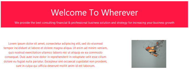
Save the file and check for the result.

Code Analysis
We started with a <section> tag with id meet-us followed by a <div> tag with class container to clear the area around the section and make it more compact.
Next we create a row using the <div> tag and we assign the class row to it.
This is followed yet by another <div> tag with the class col to create the first column in our row class which will hold the header content for this section.
After that we created a new <div> tag with class row to hold the body content for this section.
Inside the new row we create two columns using the <div> tag with a class col.
The first column will contain text in form of a short note about the business and the second column will contain a small image.
Step 4: Main Services
Here we will be working on a section where we can briefly describe the main services and products offered by the business.
All other minor services should be left for the services page.
This section will be divided into three columns, each column will contain a card that will display brief information about each service.
The HTML code to add this column
 <section id="core-services">
        <div class="container">
          <div class="row valign-wrapper red accent-3 white-text hoverable">
            <div class="col l12">
              <h3>We Can Help You</h3>
              <p>We provide the best consulting financial & professional business
                solution and strategy for increasing your business growth</p>
            </div>
          </div>
          <br>
          <div class="row">
            <div class="col l4" id="inner-core-services">
                  <div class="card hoverable">
                    <div style="margin-left: -10px; padding-left: -20px;">
                     <i>
                      <img src="images/service-icon-1.png">
                     </i>
                    </div>
                    <div class="card-content white red-text accent-3">
                      <span class="card-title" style="margin-top: 7px;">Lorem ipsum</span>
                      <p>Lorem ipsum dolor sit amet, consectetur adipiscing elit, sed do eiusmod tempor incididunt ut labore et dolore magna aliqua. Ut enim ad minim veniam, quis nostrud exercitation ullamco laboris nisi ut aliquip ex ea commodo consequat. Duis aute irure dolor in reprehenderit in voluptate velit esse cillum dolore eu fugiat nulla pariatur. Excepteur sint occaecat cupidatat non proident, sunt in culpa qui officia deserunt mollit anim id est laborum.</p>
                    </div>
                  </div>
            </div>
            <div class="col l4" id="inner-core-services">
                  <div class="card hoverable">
                    <div style="margin-left: -10px; padding-left: -20px;">
                      <i>
                        <img src="images/service-icon-2.png">
                      </i>
                    </div>
                    <div class="card-content white red-text accent-3">
                      <span class="card-title">Lorem ipsum</span>
                      <p>Lorem ipsum dolor sit amet, consectetur adipiscing elit, sed do eiusmod tempor incididunt ut labore et dolore magna aliqua. Ut enim ad minim veniam, quis nostrud exercitation ullamco laboris nisi ut aliquip ex ea commodo consequat. Duis aute irure dolor in reprehenderit in voluptate velit esse cillum dolore eu fugiat nulla pariatur. Excepteur sint occaecat cupidatat non proident, sunt in culpa qui officia deserunt mollit anim id est laborum.</p>
                    </div>
                  </div>
            </div>
            <div class="col l4" id="inner-core-services">
                  <div class="card hoverable">
                    <div style="margin-left: -10px; padding-left: -20px; padding-top: 10px;">
                    <i>
                      <img src="images/service-icon-3.png">
                   </i>
                   </div>
                    <div class="card-content white red-text accent-3">
                      <span class="card-title" style="margin-top: 5px;">Lorem ipsum</span>
                      <p>Lorem ipsum dolor sit amet, consectetur adipiscing elit, sed do eiusmod tempor incididunt ut labore et dolore magna aliqua. Ut enim ad minim veniam, quis nostrud exercitation ullamco laboris nisi ut aliquip ex ea commodo consequat. Duis aute irure dolor in reprehenderit in voluptate velit esse cillum dolore eu fugiat nulla pariatur. Excepteur sint occaecat cupidatat non proident, sunt in culpa qui officia deserunt mollit anim id est laborum.</p>
                    </div>
                  </div>
            </div>
          </div>
        </div>
      </section>

 <section>

            <div class="container">
              <a class="waves-effect waves-light btn red accent-3 white-text hoverable" id="service-btn">LEARN MORE</a>
            </div>

          </section>
To add the CSS styles for this section paste this code in your CSS file
#core-services {
  padding-top: 10px;
  border-radius: 5px;
  padding-left: -10px;
  text-align: center;
  margin-top: 50px;
}

#inner-core-services{
  margin-top: 30px;
  margin-bottom: 50px;
  padding-top: 5px;
 margin-left: 6.25px;
 margin-right: 6.25px;
 width: 300px;
}
#service-btn {
  margin-bottom: 100px;
  margin-left: 400px;
}
Save the files.
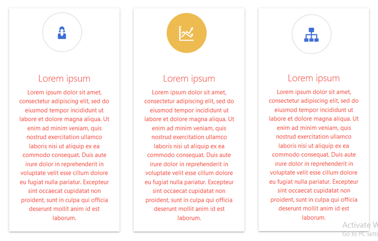
Here are screenshots of the areas we just created


Code Analysis
The opening tag for this block is the <section> tag which signifies the beginning of a new section. It has an id services.
This followed by a <div> tag with class container which is also followed by another <div> tag with a class row signifying the creation of a new row.
Inside the <div class="row"></div> tag we added the code for the header we used in the previous section with a little variation. You can change the contents of the tag to fit the ones you'd like to use as header for the services section.
After dealing with the section header we then create three new <div> tags with a class col . Inside each <div class="col"> we create two extra <div> tags and one <span> tag which is a child element of the second <div> tag.
Both <div> tags are assigned the class value card and card-content respectively while the <span> tag is assigned a class of card-title.
The <div class="card-content"> will contain all the main body content for each card.
The <span> tag will contain the titles of each individual card.
Step 5: Associates
Here we are going to display different brands associated with the business and to do that just append the following code in your HTML file
      <section>
      <div class="container red-text accent-3 white">
        <div class="row hoverable">
          <div class="col l12 m12 s12 red accent-3 white-text">
            <div class="center" style="text-align: center;">
              <h3>Trusted By Our Associates</h3>
            </div>
          </div>
          <br>
          <div class="col l12 m12 s12 red accent-3 white-text">
            <div class="valign-wrapper" style="text-align: center; padding-left: 50px;">
              <p>We provide the best consulting financial & professional business
                solution and strategy for increasing your business growth</p>
            </div>
          </div>
        </div>
        <div class="row" style="padding: 10px; margin-top: 130px; margin-bottom: 130px;">
          <div class="col l2 m4 s6 hoverable">
            <div>
              <img src="images/icon-1.png" id="ass-images">
            </div>
          </div>
          <div class="col l2 m4 s6 hoverable">
            <div>
              <img src="images/icon-2.png" id="ass-images">
            </div>
          </div>
          <div class="col l2 m4 s6 hoverable">
            <div>
              <img src="images/icon-3.png" id="ass-images">
            </div>
          </div>
          <div class="col l2 m4 s6 hoverable">
            <div>
              <img src="images/icon-4.png" id="ass-images">
            </div>
          </div>
          <div class="col l2 m4 s6 hoverable">
            <div>
              <img src="images/icon-5.png" id="ass-images">
            </div>
          </div>
          <div class="col l2 m4 s6 hoverable">
            <div>
              <img src="images/icon-6.png" id="ass-images">
            </div>
          </div>
        </div>
      </div>
      </section>
For the styling add the following code to your CSS file
#ass-images {
  margin-left: -15px
}
Save the file and view the results in a browser.

Code Analysis
After the opening <section> tag we added a <div> tag with a class<row> and inside it we created seven additional <div> tags with class col.
Inside the first <div class="col"> tag we insert the code for the same header we've been using in the previous sections.
This is followed by a <br> tag in order to create the next set of columns for displaying the pictures of various associates.
In the remaining <div> tags we inserted images representing the brands associated with the business.
Step 6: Recent Blog Posts
This section will feature the three most recent posts from the blog page on the website.
The HTML code for this section
  <section>
    <div class="container red accent-3 white-text"">
      <div class="row hoverable">
        <div class="col l12 m12 s12">
        <div class="valign-wrapper" style="text-align: center; padding-left: 300px">
          <h3>Recent Blog Posts</h3>
        </div>
      </div>
      <br>
      <div class="col l12 m12 s12">
        <div class="valign-wrapper" style="text-align: center; padding-left: 375px;">
          <p>Get Updates About Our Activities</p>
        </div>
      </div>
      </div>
    </div>


    <div class="container">

    <div class="row">
      <div class="col s12 m4 l4">
        <div class="card hoverable">
          <div class="card-image">
            <img src="images/blog-1.jpg">
            <span class="card-title">Card Title</span>
          </div>
          <div class="card-content">
            <p>I am a very simple card. I am good at containing small bits of information.
            I am convenient because I require little markup to use effectively.</p>
          </div>
          <div class="card-action">
            <a href="#">This is a link</a>
          </div>
        </div>
      </div>

      <div class="col s12 m4 l4">
        <div class="card hoverable">
          <div class="card-image">
            <img src="images/blog-2.jpg">
            <span class="card-title">Card Title</span>
          </div>
          <div class="card-content">
            <p>I am a very simple card. I am good at containing small bits of information.
            I am convenient because I require little markup to use effectively.</p>
          </div>
          <div class="card-action">
            <a href="#">This is a link</a>
          </div>
        </div>
      </div>

      <div class="col s12 m4 l4">
        <div class="card hoverable">
          <div class="card-image">
            <img src="images/blog-3.jpg">
            <span class="card-title">Card Title</span>
          </div>
          <div class="card-content">
            <p>I am a very simple card. I am good at containing small bits of information.
            I am convenient because I require little markup to use effectively.</p>
          </div>
          <div class="card-action">
            <a href="#">This is a link</a>
          </div>
        </div>
      </div>

    </div>

  </div>

  </section>

      <section>

        <div class="container">
          <a class="waves-effect waves-light btn red accent-3 white-text hoverable" id="blog-btn">VISIT BLOG</a>
        </div>

      </section>
The CSS styling for this section
#blog-btn {
  margin-top: 50px;
  margin-bottom: 100px;
  margin-left: 400px;
}
Code Analysis
Starting with a <section> tag followed by a <div> with class container and another with class attribute value <row> .
Inside the new <div class="row"> we insert the code for the section header.
To add the layout for the blog posts we created two new <div> with class container and row respectively.
<div class="row"> is a child element of <div class="container">.
Inside the <div class="row"> element we created three new columns using a new <div class="col"> .
Inside each individual column we create a card to display the excerpts of our blog posts with an image.
To do this we add a new <div class="card"> tag. Inside the new <div> element we add a we create three extra <div> tags and one <span> tag which is a child element of the first <div> tag.
Both <div> tags are assigned the attribute class values card-image and card-content and card-action respectively while the <span> tag is assigned a class attribute value of card-title.
The <div class="card-image"> will contain featured post image for each post displayed in the card.
The <div class="card-content"> will contain all the main body content for each card.
The <div class="card-action"> will contain the link leading to the full post for each excerpt.
The <span> tag will contain the titles of each individual card.
Step 7: Footer
This is the last section we will be working on. In this section we will be adding a footer section to the page.
The HTML code for this section
<<footer class="page-footer">>
            <div class="container">
              <div class="row">
                <div class="col l3 m3 s6" id="footer-area">
                  <h5 class="white-text">Footer Content</h5>
                  <p class="grey-text text-lighten-4">You can use rows and columns here to organize your footer content.</p>
                </div>

                <div class="col l3 m3 s6" id="footer-area">
                  <h5 class="white-text">Footer Content</h5>
                  <p class="grey-text text-lighten-4">You can use rows and columns here to organize your footer content.</p>
                </div>

                <div class="col l3 m3 s6" id="footer-area">
                  <h5 class="white-text">Footer Content</h5>
                  <p class="grey-text text-lighten-4">You can use rows and columns here to organize your footer content.</p>
                </div>

                <div class="col l3 m3 s6" id="footer-area">
                  <h5 class="white-text">Links</h5>
                  <ul>
                    <li><a class="grey-text text-lighten-3" href="#!">Link 1</a></li>
                    <li><a class="grey-text text-lighten-3" href="#!">Link 2</a></li>
                    <li><a class="grey-text text-lighten-3" href="#!">Link 3</a></li>
                    <li><a class="grey-text text-lighten-3" href="#!">Link 4</a></li>
                  </ul>
                </div>
              </div>
            </div>
            <div class="footer-copyright">
              <div class="container">
              Lorem Ipsum
              <a class="grey-text text-lighten-4 right" href="#!">More Links</a>
              </div>
            </div>
          <</footer>>
N.B: REMOVE THE EXTRA BRACES AROUND THE <<footer class="page-footer">> AND <</footer>>
CSS styles for this section
    #footer-area {
  text-align: center;
}
Screenshot of the footer area

Code Analysis
Opened with a <footer> tag and class page-footer followed by two <div> tags with class container and row respectively. row is a child element of container.
Inside the <div class="row"> we created four new columns using <div> with class col and id footer-area.
In the first three col tags contains <h3> and <p> tags for displaying different information about the business.
The last col tag contains an unordered list of links that can be used to link any vital document or page on the website.
Posted on Utopian.io - Rewarding Open Source Contributors
Thank you for the contribution. It has been approved.
You can contact us on Discord.
[utopian-moderator]
Hey @gotgame I am @utopian-io. I have just upvoted you!
Achievements
Community-Driven Witness!
I am the first and only Steem Community-Driven Witness. Participate on Discord. Lets GROW TOGETHER!
Up-vote this comment to grow my power and help Open Source contributions like this one. Want to chat? Join me on Discord https://discord.gg/Pc8HG9x
nice piece, great article with detailed explanation
Thanks
This looks cool! Thank you for sharing @gotgame.
Thanks
This is cool bro, well detailed.
Thanks bro
Congratulations @gotgame! You have completed some achievement on Steemit and have been rewarded with new badge(s) :
Click on any badge to view your own Board of Honor on SteemitBoard.
For more information about SteemitBoard, click here
If you no longer want to receive notifications, reply to this comment with the word
STOPFollow me @erwinpante and I follow you. thanks