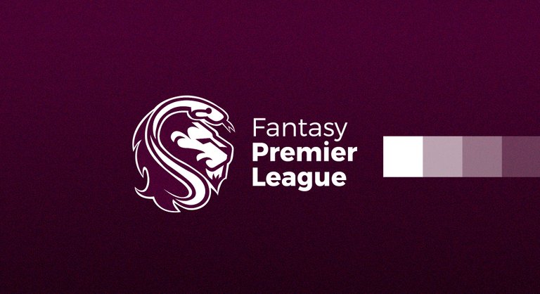
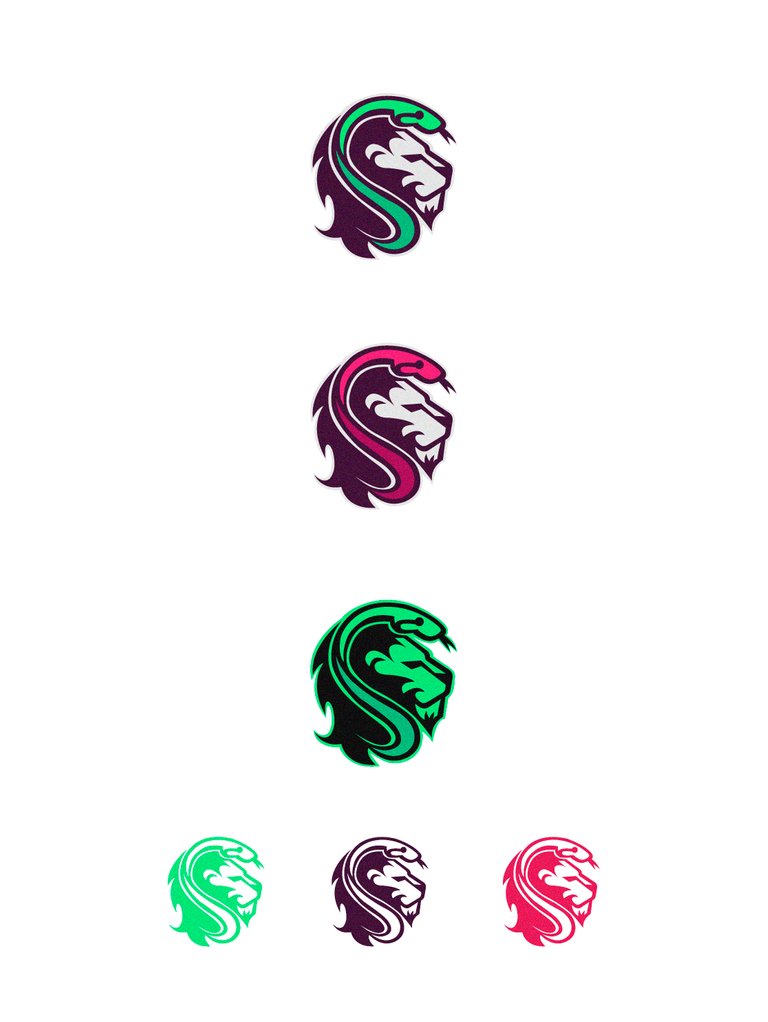
Task request created by @amosbastian, which consisted in the creation of a logo for API Fantasy Premier League. I'll leave the link so you can have a look.https://steemit.com/fpl/@amosbastian/create-a-logo-for-the-python-package-fpl-1535755476488
Also I leave you two links so you can go directly to the repository and the documentation
https://github.com/amosbastian/fpl
https://fpl.readthedocs.io/en/latest/
The history
Fantasy Premier League is a game where you form a virtual team with real players, these players are also part of real teams. Your team must consist of 15 players which will be divided into 2 goalkeepers, 5 defenders, 5 midfielders and 3 forwards, at most you can select 3 players from a single Premier League team. It should be noted that your team must not exceed the budget of 100 million euros, this is so that there is a balance and do not fly your head selected to the best players haha. When you have your team, you will select 11 players, it is good to have a captain and a vice-captain. These players will generate points according to their performance in games, goals, fouls, cards, time on the court, all this influences the score. For example, if your player has sixty minutes on the court is a point, if you exceed this time are two points, fair play is a point, yellow card minus a point and red minus three if your goalkeeper makes a goal are six points. The captain's score is doubled, so be careful.
If you want to know more about this game, click here
The proposal
Recently the owner received many emails from developers, he decided to continue working for this project and improve it. Currently released version 0.5.0
Once I reach a certain release I would like to start actively looking for contributors who can help me improve it. Because of this I would like a logo that will give the entire project a more professional look, so it (should be) will be more easy to attract contributors (and just because it looks cool).
My task was to unite the logo of The Python and Fantasy premier league. A python and a lion.

The truth was a challenge to generate this concept, the truth is that I am not a very good illustrator and, although I have good ideas, sometimes it is a little complicated to bring them to reality. I had to look for many lions and snakes on the web, my first proposal was only a snake with a crown that sent it out of discord for the owner.
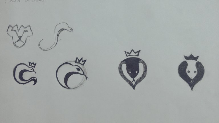
The problem with this is that it was a cobra and we are talking about a python so I decided to discard this idea and started generating others. I thought about joining the mane of the lion and the snake coming out of these forms, I made my drawing, I digitized and I sent my first proposal.
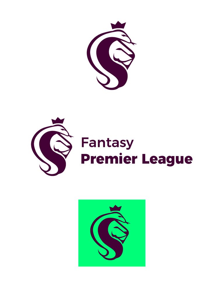
The response was not very positive on the part of the owner and the truth was absolutely right, the snake did not look like a python and the quality was far below. The next day I see that @mrgodby upload his proposal and the truth is that it is excellent and I continue to affirm. I had to work harder, quality already demanded another level. Use the same concept, but in a few words improve the whole design.
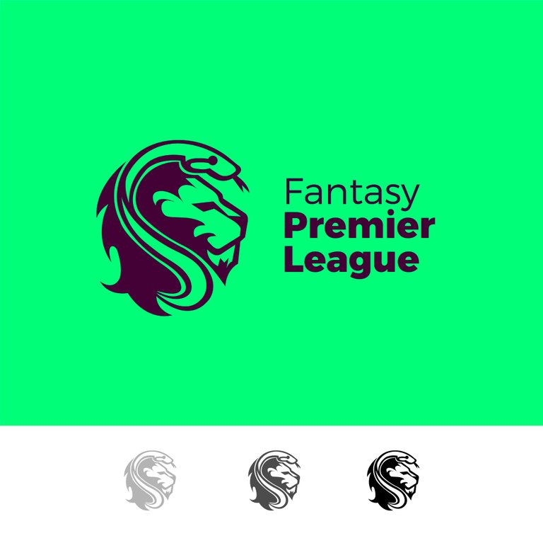

Being a logo for premier league use the same position in the composition of the text. Montserrat is a typography with many variants, sans serif, has strength in its lines and its bold version is robust but does not lose its readability.
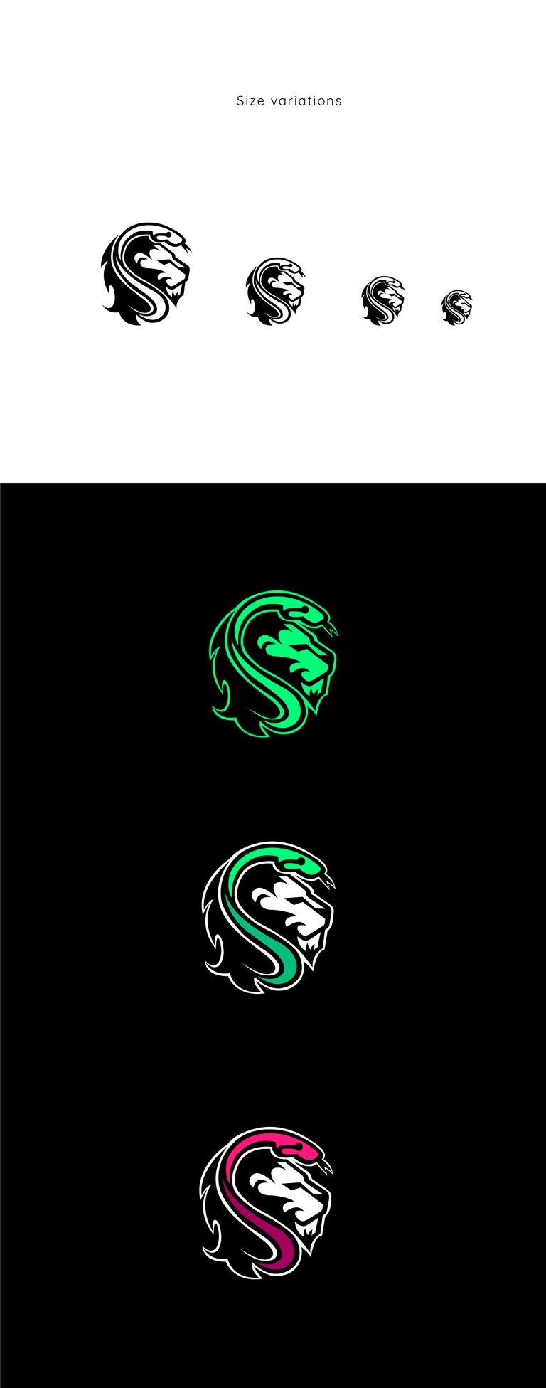

Benefits
The proposal focuses on helping to improve the project. Through a little research, I managed to create an attractive and differential form. My logo offers a new visual identity, it is a modern logo, easy to remember, minimalist and with a great visual impact that adapts to different environments.

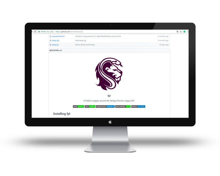
Proof of authorship
I did a speed art in which I show how I digitized my work, the truth is the first time I do this and it has its little mistakes, like the logo of the screen recorder, I did not know how to eliminate it, this is also a month trial version.
This work was created with Ilustrador of Adobe CC


This work is licensed under a Creative Commons Attribution 4.0 International License
Awesome combination with python and lion. I really liked other color variations too and I think you did a great job as the task owner wanted. Single color, on black background successful design in every way. Thank you for the contribution!
Your contribution has been evaluated according to Utopian policies and guidelines, as well as a predefined set of questions pertaining to the category.
To view those questions and the relevant answers related to your post, click here.
Need help? Write a ticket on https://support.utopian.io/.
Chat with us on Discord.
[utopian-moderator]
Thank you for your review, @baranpirincal!
So far this week you've reviewed 7 contributions. Keep up the good work!
I'm really happy with your work, so once again: thanks so much!
You're welcome, it was a pleasure to work for you.
that topmost image is awesome! congrats brother.. :)
Thanks a lot buddy :)
I'm seeing this a lot, I wonder if I'm missing anything. When you define a safe area for your logo, doesn't it suppose to relate to a part of the logo itself?
What 1x means?
I like the process video tho, I'm not familiar with smooth tool. I was like watching the whole video asking myself "Why he keeps breaking those nodes!!!"
I usually define clearspace as "height of logo / 2", so it doesn't necessarily need to relate to a specific element of the logo other than the height.
I often go with the logotype's x-height and it generally about 0.3 of the logo in my designs. But what I mean is do you think is there enough information about clearspace on that screenshot. For example wouldn't it be better if height is also stated as 5x ?
So I would know if I'm going to use it in a website, when I set the logo height to 50 I could add a margin of 10 or if I'm going to put it into a poster I would calculate how much space I need at least.
In my next contribution I will talk more about this.
Okay, please do I'm eager to learn how that x becomes cm, and how does cm correlates various sizes of applications. I just want to know how is that 1 cm applied in websites as well as billboards at the same time with 1 cm clear space. Please enlighten me.
http://brand.opera.com/brandbook/identity-guidelines
https://billysweeney.com/squarespace-branding/
https://www.apple.com/legal/sales-support/certification/docs/logo_guidelines.pdf
Hello @oups, thanks for your interest in this, the sefty area is set so that no other object occupies this space, it is represented in different ways, when I speak of 1x in my case it is equal to 1 centimeter on each side. This rule must be maintained for each thing in which the logo is going to be used, maintaining that space guarantees that your brand will be visible when it is next to others.
Hi @ggabogarcia!
Your post was upvoted by @steem-ua, new Steem dApp, using UserAuthority for algorithmic post curation!
Your post is eligible for our upvote, thanks to our collaboration with @utopian-io!
Feel free to join our @steem-ua Discord server
Hello @ggabogarcia, thank you for sharing this creative work! We just stopped by to say that you've been upvoted by the @creativecrypto magazine. The Creative Crypto is all about art on the blockchain and learning from creatives like you. Looking forward to crossing paths again soon. Steem on!
Hey, @ggabogarcia!
Thanks for contributing on Utopian.
We’re already looking forward to your next contribution!
Get higher incentives and support Utopian.io!
Simply set @utopian.pay as a 5% (or higher) payout beneficiary on your contribution post (via SteemPlus or Steeditor).
Want to chat? Join us on Discord https://discord.gg/h52nFrV.
Vote for Utopian Witness!