Why I never visit the trending page?
Because I never find things I am actually interested. That was easy to answer.
The solution
Arranging the posts in the trending page in a more attractive way and also making the posts there to be actually important to the user. And what is important to every user? That should be answered by each user, but mostly the answer can be reduced to two main things: PEOPLE and TOPICS.
Design proposal:
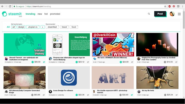
Details:
Clicking on Trending
The first trending posts should be related to the user's favorite topics and the people he follows. Then they start merging with those posts on the favorite topics + people he doesn't follow. And finally some posts according to recommended topics considering the whole Steem system.
Arranging the posts in that order would make sure the trending page gets visited. Because every user would actually see first the authors and topics they really care!
Navigation bar
It should be a customizable navigation bar where the user can see all the trending topics, add up to 5 favorite topics and finally recommended topics:

All
By clicking on All the user can see all the trending topics in the whole Steem system, also select the one they would like to explore. If the users clicks All but doesn't select any topic or clicks All in the select box he would be able to see the trending topics according to the whole Steem system.
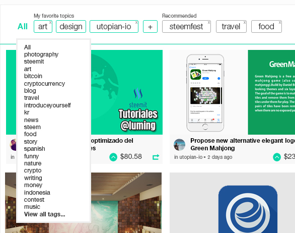
That would be like the actual trending page.
Favorite topics
The topics should be added as clickable buttons and with a smaller button to remove if necessary:

The user can add a topic by clicking the + button. And remove by clicking the x on each button. If they click in the button itself, the posts in the page will appear according to that tag and be arranged like explained before (first people he follows, etc).
Having 5 favorite topics could be taken as standard but it could be expanded to 10 or more topics.
Recommended topics:

This topics will be recommended according to the whole Steem system. And be refreshed every 24 hours. The user can decide to delete a topic by clicking on the x in the upper right corner of the button; inmediatly another topic replaces the deleted one according to importance in the Steem system.
Also, being able to see more posts at a glance, makes it more attractive to everyone to visit and scroll for a while checking what's trending.
Mobile version
The mobile version would work exactly the same, just with a few changes in design to make it work.
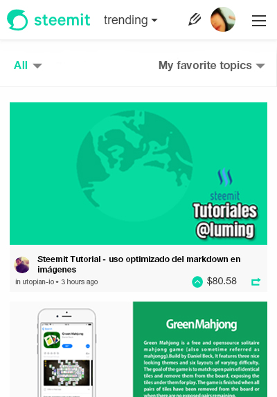
The user can see the post in an atractive way. Showing first the trending posts from people he follows and according to his favorite topics etc. as explained before.
If the user wants, he can tap on All to see what's trending in the whole Steem system.

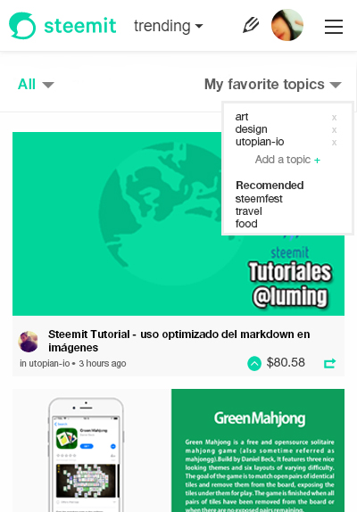
And finally there's the option to tap on favorite topics and add or remove them. Same with recommended topics.
Since I am not a programmer I will leave that part to a professional. The source files (PSD) can be downloaded here.
Posted on Utopian.io - Rewarding Open Source Contributors
Thank you for the contribution. It has been approved.
I will now unlock your post, but please remove the social icons. We are in the process of clarifying the rules in this matter.
You can contact us on Discord.
[utopian-moderator]
I have fixed it! thank you!:D
Thank you! I will as soon as I can have my laptop today!!!
WOOOW!!, you were astonished at the design, seeing the post in this more visual way would give a special touch to the trend system, the idea is super well developed, this would certainly give much more visibility to the publications of other users giving more opportunity to be voted and every user would want to be there for the same: D
Thank you for your comment and all the support!!
Definitely something to look forward to.
Yay! Thank you!
Good job @fabiyamada.
Pd: Voy a tratar de traducir para entender de que va esto, pero igual cuentas con mi apoyo!
yeah!! hahaha se trata de mejorar la trending page de Steemit n.n
that desighn would make me check trending page 20 times a day instead on 1-2 . please make this happen
I actually neeeever check it but I would if it was like this. I hope it is considered :)
Your contribution cannot be approved yet, because it has a distracting banner or other irrelevant large image. See the Utopian Rules. Please edit your post to exclude any banners, at this link, as shown below:
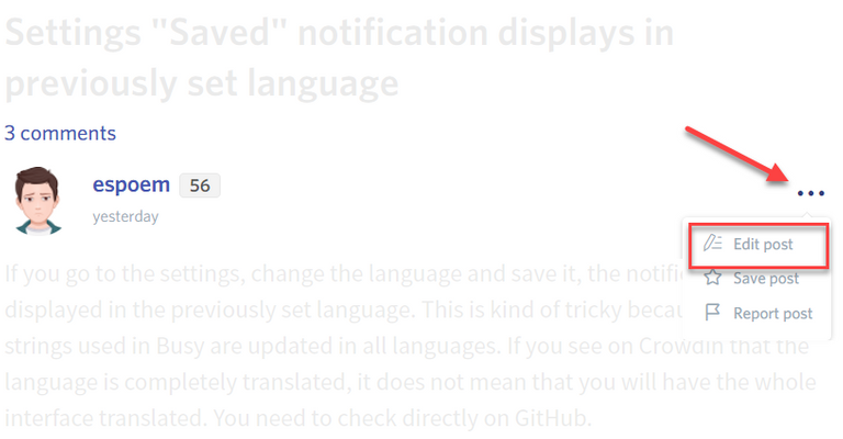
Please remove your social Buttons at the end: "you can find me here ..."
You can contact us on Discord.
[utopian-moderator]
I have checked the rules and it is allowed to add author's social media. But don't worry, of the rule has changed but there's need to update the page, I will remove it as soon as I can get to my laptop again, I am afraid to mess it up if I try in my mobile x.x
Hey @fabiyamada I am @utopian-io. I have just upvoted you at 7% Power!
Achievements
Suggestions
Human Curation
Community-Driven Witness!
I am the first and only Steem Community-Driven Witness. Participate on Discord. Lets GROW TOGETHER!
Up-vote this comment to grow my power and help Open Source contributions like this one. Want to chat? Join me on Discord https://discord.gg/Pc8HG9x