A Quick Overview
This contribution is for the steemgigs' new website. It's like a freelance marketplace but us steemians. And as a freelance graphic designer, I wanted to contribute something to this project in my own creative ways because this might be the new home of graphic freelancers in the future.
Steemgigs' Github Project:
http://github.com/steemgigs/steemgigs
Logo and its variations
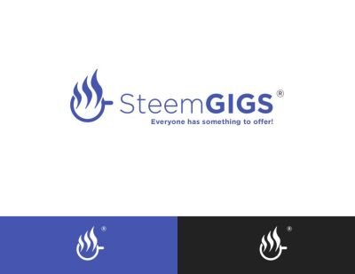
The Idea behind the logo
The logo should symbolizes the vision and the principle of an organization. I've put a lot of thought in making this logo in order to represent the organization.

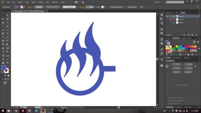
Steam as a symbol of progress, skill and advancement.
The idea of the steam symbol increasing in size, symbolizes freelancers' personal growth skill-wise, the growth of the Steemgigs community and the advancement of steem blockchain.

Cup. symbol of individuality and the daily grind of every freelancer
a cup of coffee has always been a major part of hardworking people. grinding and hustling everyday to earn and sustain themselves. Also every cup of coffee has a different story. many of us individuals have our own challenges that keeps us up at night and burn the midnight oil.

Steam. the equivalent of Steem currency, the fruit of labor
This means that this organization revolves around the steem blockchain. This also represents what Steemgigs can offer to the freelancer community. It serves as a marketplace to everyone who gives their service in order to earn.
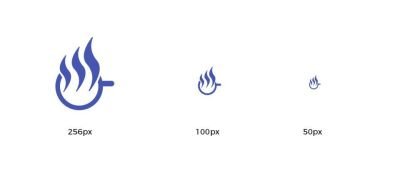
Size variations
Color palette
For the color palette, I chose the original colors that they are currently using for consistency.

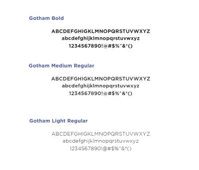
Type Used
Benefits / Improvements
Identity and Memorability
Since SteemGigs still doesn't have a logo, I created a logo that will give the organization the identity they need. The simplicity of the logo will have the memorability factor. This means whenever people see this logo, It will be easy to remember that this stands for SteemGigs.
Flexibility of the logo
I made sure that the logo could be incorporated in many ways you can imagine. Whether you put it in a black and white background, The white and purple are interchangeable. Even when you scale it down or make it big, it will always be identifiable. You can even use this as an app icon.
Tools Used
- Adobe Illustrator CC 2014
- Adobe Photoshop CC 2014
- Computer (Windows 8.5)
- My brain
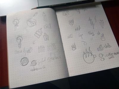
My Logo Process
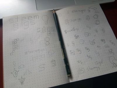
Sketch/Brainstorming
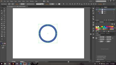
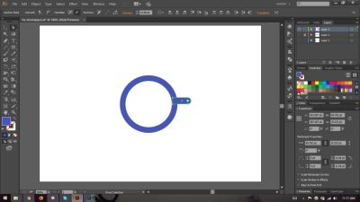
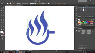
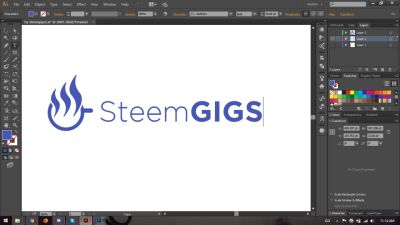
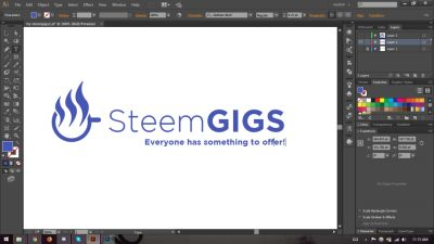
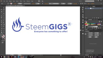
Vectoring


Original files
AI Files, PSD Files, Images and Fonts are already Included.
https://drive.google.com/open?id=1IX8Nwm3sfaw0s1EVUrCQ6m21ZtibPZSB
Conclusion
And That's It! I hope you I helped in contributing to the organization. Feel free to message me if you guys need some minor refining. Thank you for reading this post!
Posted on Utopian.io - Rewarding Open Source Contributors
Best idea is coffe. Eh eh eh. That is a part in freelancer life. Xd
Haha thanks! It is indeed
Hey @embity I am @utopian-io. I have just upvoted you!
Achievements
Community-Driven Witness!
I am the first and only Steem Community-Driven Witness. Participate on Discord. Lets GROW TOGETHER!
Up-vote this comment to grow my power and help Open Source contributions like this one. Want to chat? Join me on Discord https://discord.gg/Pc8HG9x
amigo me encanta.. muy creativo original. felicidades
gracias!
wow i like it dear!! you are good at this!
Thank you! glad you liked it.
Nice entry man!
Dili nani entry uy. contribution lang ni :D Free labor hahaha
atay, wlay donors ani? hahaha
Thank you for the contribution. It has been approved.
You can contact us on Discord.
[utopian-moderator]
@embity please remove all banner.
Got it
Gran trabajo. De vez en cuando es bueno para los desarrolladores obtener un poco del profesionalismo de un diseñador grafico.
Gracias!
The logo looks like a flame also, for me it could represent or symbolizes our burning desire to further steem growth by consistently producing quality contents.
Thats another good way to look at it. Good eye!