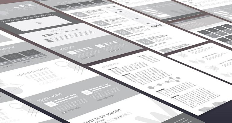
The way people take in information and how it usually is presented is quite frequently not the same thing.
A top-down listing approach is usually the worst way to present something important, especially if something important is smack in the middle of the list and there is little or nothing to differentiate it from the rest.
People take in patterns and make judgments to dive deeper into something that catches their eye; they scan pages, they very rarely read every line on a page, especially summary pages such as the Steemit Trending/Hot/New lists.
Keywords & images are patterns, but even recognizable groups of words are blocked together to form patterns. A substantial portion of the human brain is reserved for pattern recognition, and a considerable part of that dedicated computing power is allocated to facial and expression recognition.
So how do we tap into that and eliminate crud that obfuscates content?
Well, there are a few common ways to do it while working within constraints like screen size, font sizes, spacing, etc.
Think of a traditional newspaper (yes the old fashioned paper one) they have a limited media size, and can't use phonebook sized fonts to cram as much text into an issue as possible (even if some try, to the detriment of the reader).
But there are a few conventional methods they use; Blocks, remember what I told you about blocks above? People recognize them as important, and the focus of a reader will jump effortlessly among blocks if sufficient spacing is made between them, to focus on each recognizable sub-block such as images and headlines.
So how do you build blocks on constrained screen real estate?
Well, there are a few ways; you group information that is essential for the reader to get focus interest (is the information they scan relevant or interesting enough to trigger focus and a click). Spacing is key between objects; lean enough not to break the block and to preserve the real estate, but thick enough to maintain readability and avoid clutter.
With the above in mind; its advisable to present different types of content in different ways; i.e., a MEME or photograph post should have a block layout with the larger image as a focus, and would smoothly flow in threes across the screen (left to right) with some descriptive text and meta below each image. An article post with only an illustrative image would have less emphasis on the image and more descriptive text. Text only articles can be afforded more descriptive text to increase their visibility, rather than being assigned a placeholder image.
If you have articles as part of a series; group them into a "central block" with a leading article (newest) and older (supportive/related) articles linked as subblocks, but contained within the same "central block." This method would have the added benefit of large volume publishers (news/market updates etc.) not pushing less frequent publishers off the list. Plus having subject matter posts from the same author cling together increasing their visibility as well as reducing the need for individual author meta for the subblocks.
PS:
It's unfortunate for the content creators to be limited to a search engine (one size fits all) look and feel for presenting their creations since it leaves readers looking for something new with a rather dull feeling as opposed being tickled silly by new and excellent content.
Some UX is better than others in the "steemverse" for sure, but what do you think about the above suggestions? Are the ideas posted above, although limited to presentation only, something that would benefit, i.e., steemit/busy, etc.?
Are you a content creator, aggregator, developer or "just" a consumer that like to read new stuff?
Let me know, and I'll crunch your ideas into the next iteration of this series of STEEM UX posts :)
/Danny

Hi, we noticed that you used a combination of Utopian.io moderated tags ( #utopian-io and #ideas) even though your post is about your thoughts and not about new features for an open source project.
Consider reading about Utopian.io at http://join.utopian.io if you want to use the Utopian tags.
An interesting take on steem UX:
https://steempeak.com/
Congratulations @dfroberg! You have completed the following achievement on the Steem blockchain and have been rewarded with new badge(s) :
Click on the badge to view your Board of Honor.
If you no longer want to receive notifications, reply to this comment with the word
STOPDo not miss the last post from @steemitboard:
Greetings @dfroberg! Your post was randomly chosen and was resteemed because you are one of our followers. Enjoy your free resteem!
Shareables - We resteem anything we find shareable. Always strive for quality content. Go on express and harness your blogging potential!
God bless from us @Shareables!
Yeah, I like the way you think about Steemit's UX. I asked somebody before about update features on Steemit and talked about the apps built on steem. Yes, they could help in raising the value of steem but it maybe better if the Steemit platform itself will have some feature updates in UX as well.
I mean, it's still a beta so the anticipations are everywhere.