Details
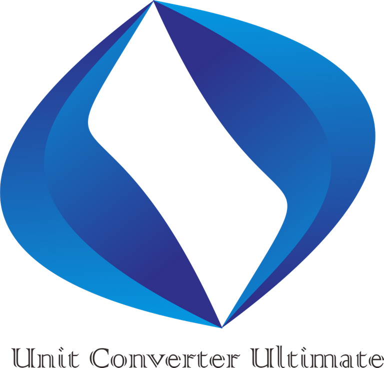
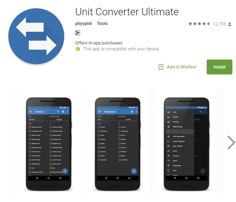
On this occasion I will contribute by creating a logo, just like when I was browsing on google playstore I found a very interesting app and I really like seeing this app and the name of this app is Unit Converter Ultimate is the icon of the open source package and high resolution. it will be there installed on Android devices and used with many launchers. All circles and packaging icons use the use of insets and dropshadows and fine gradients.
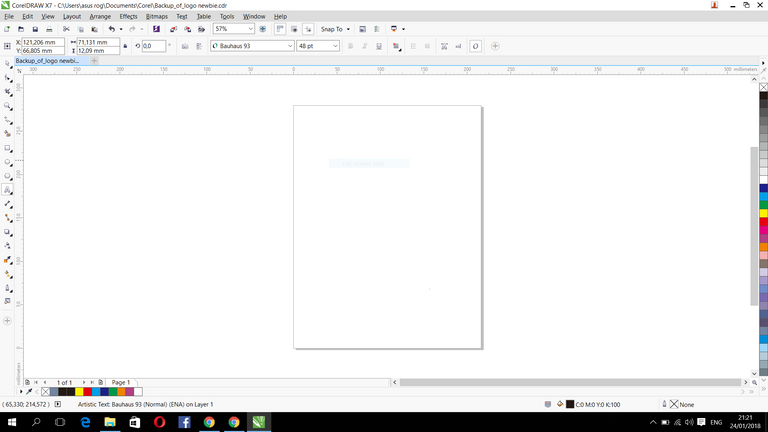
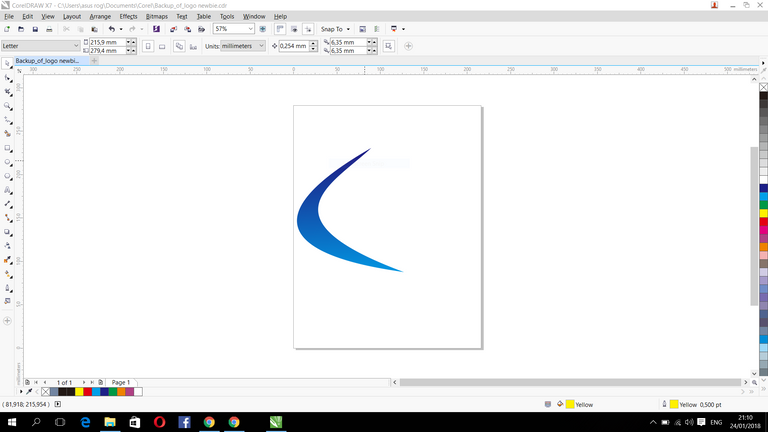
I created this logo using coreldraw, first I drew a line using the outline of the pen, and then I made the shape I wanted, after I made one piece and then I duplicated it to one more part, and I gave the logo a color.
Original Logo
Proposal Logo
Sizes

Font Used
SOURCE SANS PRO : > [Download]
(https://www.fonts.com/font/monotype/colonna)
Benefit / Repair
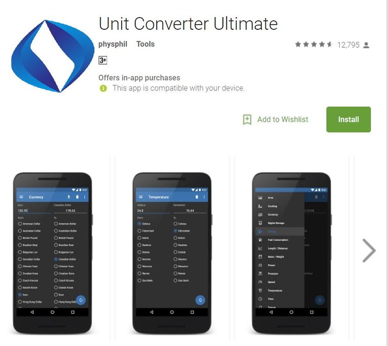
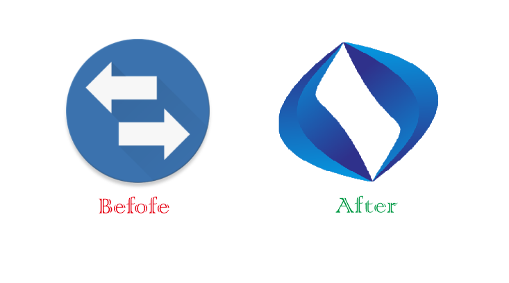
This logo proposal is designed to replace old logos that look less representative of apps, new logo more simple, elegant, cool, and represent this application. For more details please see the comparison before and after the logo / icon is installed.
Tool
When designing something, I always use CorelDRAW X7 software. I often make logos and this is one of my hobbies and loves to do it.
Proof Work


Original and New Comparison
Original files
Download Editable File Here
Github Link and Google Playstore
Posted on Utopian.io - Rewarding Open Source Contributors
Hy @civileng
What is your thinking about the forms you used, what do they mean to you?
In the original logo the arrows show, the app is converting something.
That's someting im missing in your logo.
Should be a constructive critique. Even your logo looks better than the original one, it isn't as informative.
Kind regards
@ricksmitth
Thanks for the constructive comments.
If I make a back arrow it will certainly be the same as the original logo, then I made my version by replacing it make a circular model @ricksmitth
Your contribution cannot be approved because it does not follow the Utopian Rules.
You can contact us on Discord.
[utopian-moderator]