Repository
https://github.com/utopian-io/utopian.ioLinked Task Request
https://staging.busy.org/@mcfarhat/actifit-graphics-task-enhance-logo-and-actifit-report-card
Details
Hello, this is my first participation in a task of @utopian-io. Here are the final designs of the following four objectives, in which I focused:
- Optimization and improvement of the current logo of @actifit
- Improved Report Card design (image)
- Design and improvement of the report Card (Markdown-like format)
- Presentation of an alternative to each type of activity in the @actifit app
1. Optimization and improvement of the logo design of @actifit



The designs presented above are my final design for the logo of @actifit. As can be appreciated, it has a red-black color gradient. The logo design is available in sizes 48x48, 128x128 and 400x400 in PNG format (transparent background). Similarly, the same sizes are presented below, but with the current color scheme used by @actifit.



Below is the improved logo in 350x350 size with a white background and two different colors.
.png)
.png)



In addition, I made new pictograms designs, exactly twenty of them. Those pictograms are related to each type of activity supported in the mobile app of @actifit. The idea was to give a more customized design for each user of @actifit. Below is a sample of seven of the twenty new different pictograms. (Scroll right to see the samples)
2. Improved Report Card design (image)
Below is the final design for a new image of the Report Card, the original report card elements are still present in the new design (logo of @actifit, the name of the application, title of the report card, rewarding fitness activity and a link to the Playstore where you can download the app).
As you can see, the image is a direct link to the android application of @actifit.
3. Design and improvement of the @actifit report card post on Steemit (Markdown-like format)
Below is an example based on this post in order to show the improvements in the post of each user in his "My Actifit report Card".Additional new designs of three title-like banners and six pictograms related to some personal data from each user where added to the template.
Today I finally got back on my bike again, I kind of missed it! Today I spotted this bike path leading to where the city redirected the Turia River - the current park used to be where the river used to go along but they redirected it because of the constant floodings and turned it into a park. This is one of the best things about Valencia. Again an area I haven't seen before, thank you @actifit for making me explore my favorite city.

HeightXXX cm |
 |
WeightXXX kg |
 |
Body FatXX % |
 |
WaistXXX cm |
 |
ThighsXXX cm |
 |
ChestXXX cm |
 |
4. Presentation of an alternative card to each type of activity in @actifit
Based on the 21 different activities supported in the @actifit app, 20 additional pictograms where crafted. Now each user could get a customized report card image if he/she reported a single activity on the @app. (scroll right to see the samples)
In a next contribution, all possible combination of report cards for up to five different alternatives will be uploaded. It has to be noticed that C21,2 + C21,3 +C21,4 + C21,5 templates should will be done, and despite I really like this particular task, it will take some time for me to finish all of them. But I think that the final outcome will be worth both the effort and the time.
The images presented previously (and more) can be accessed in .svg format for a more detailed customization of them.
Benefits / Improvements
The work presented previously gathers the task proposed by @mcfarhat, improving the design and presentation of the logo and the report card. In addition, an additional proposal is presented to give a greater versatility for any activity in the application.
Proof of authorship
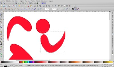
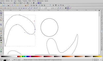
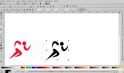
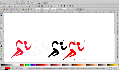
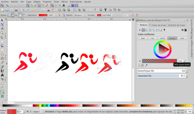
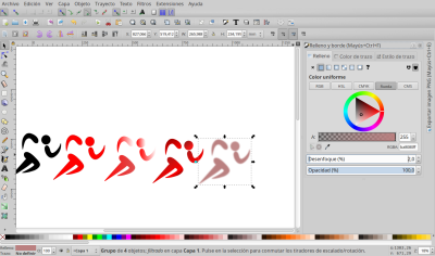
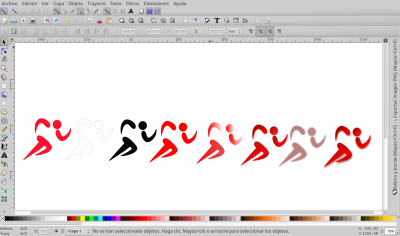
Below is a sequence of images of the logo design and the report card.
Initially, the @actifit logo was manually vectorized to obtain a higher quality image. Then I designed a gradient of red-black to improve the visual appeal of the logo. This step is one of the most complicated, since the brightness and contrast must be considered in order to achieve a good loocking design. As you can see in the last image above, there were several tests with the color and texture of the initial logo.
With respect to the report card one of the most complicated deeds is to show the logo and the most important titles in a more orderly and "homogeneous" way. Below is the sequence that was carried out.
Tools
"Inkscape 0.92.3 Draw freely" was used.
















)









Your contribution has been evaluated according to Utopian policies and guidelines, as well as a predefined set of questions pertaining to the category.
Need help? Write a ticket on https://support.utopian.io/.
Chat with us on Discord.
[utopian-moderator]
Thank you for your review, @nilfanif!
So far this week you've reviewed 2 contributions. Keep up the good work!
This contribution was revisited because of project owner decided to use this work. Thank you for this contribution.
Your contribution has been evaluated according to Utopian policies and guidelines, as well as a predefined set of questions pertaining to the category.
To view those questions and the relevant answers related to your post, click here.
Need help? Write a ticket on https://support.utopian.io/.
Chat with us on Discord.
[utopian-moderator]
Hey @chrstnv
Thanks for contributing on Utopian.
We’re already looking forward to your next contribution!
Want to chat? Join us on Discord https://discord.gg/h52nFrV.
Vote for Utopian Witness!