Hello @learnelectronics
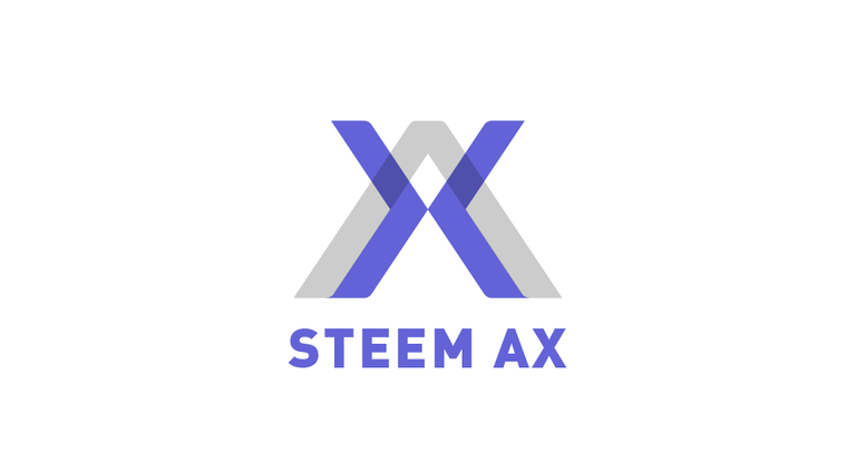
I have made my logo proposal using a differente perspective of your concept, because there are too many proposals of the same idea already.
The letter X is composed using two arrows that are opposing and symbolize the exchange of upvotes. Colors can be change if you want.


I like it! It is very strong and different to the others
Me like it <3
@learnelectronics please give me your feedback
Hello @learnelectronics I really need to have your opinion to know what to do next. Should I make a official post of my contribution? Would you like to ask for modifications?
Thank you. This is good work. I like ideas that are outside the box. :) I am interested in two arrows chasing each other because that represents the meaning and utility of the web app, as best as I can see it, which is an ongoing exchange. The two arrows opposed to each other might mean a single exchange. SteemAX allows the user to set the duration for automated exchanges, which can be as much as two years. To me the arrows chasing each other in a ring best signifies this and is primary to my motivation in seeking this design. Don't get me wrong though. I do like your design. :)