Thank you for the contribution. It has been approved.
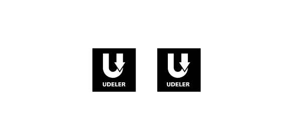
- Hello! I know you aligned text to the symbol in your logotype version but when you look at the logo from a distance, the text below it seems to be more closed to the right side. The reason is that, the arrow takes small space then "U" on your logo design. For this reason, sometimes in such situations you can align it according to your eyes. (suggestion)

You can contact us on Discord.
probably because the arrows are more to the right.
thanks mod