Your contribution cannot be approved because it does not follow the Utopian Rules.
Hard rules broken:
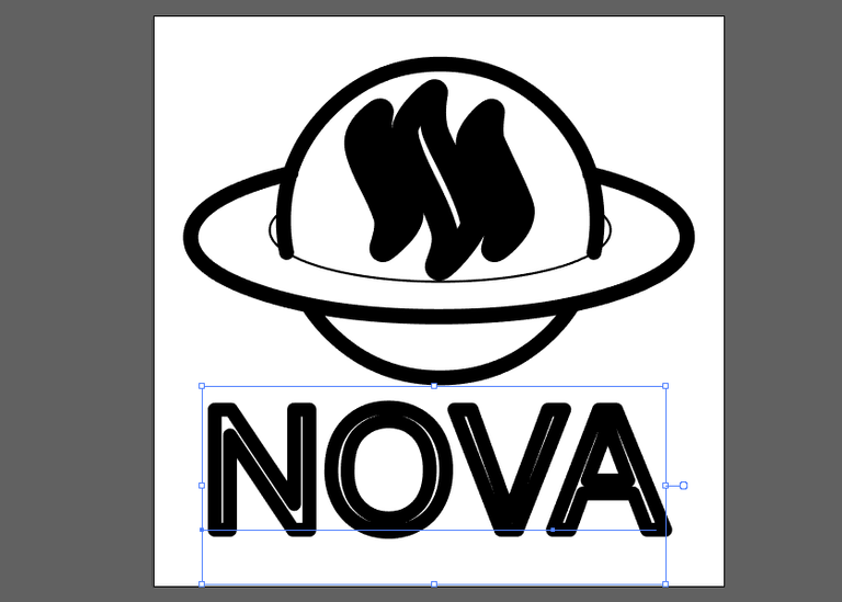
- Lines are too thick, in small sizes your logo design is not understandable
- Any text or fonts must be converted into shapes or “outlined”.

- Graphics contributions can be delivered in .psd, .ai, .cdr or any other universally accepted file format except logo designs. Those must be delivered in a vector file (e.g. .eps/.svg/.pdf) for flexibility and scalability, and .png file format.
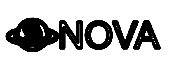
When I opened .svg format of your logo design it looks like that:

Suggestion
- You should pay more attention when you provide source files
- You can think about color variations of your logo design
- Nice effort in blender btw
You can contact us on Discord.
It looks perfectly fine to me. Opened it in Google Chrome, Firefox and in Inkscape. Looked perfectly fine in all those. Of course if you scale it down you have to make sure you scale the line widths as well.
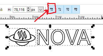
In Inkscape you would do this by making sure this button is highlighted.

its your responsibility to expand lines in order not to have this bug.
Empty text is hard to read in small size.
Doesnt look clear in small size. I agree with his decision.