Hey @loydjayme25 ,
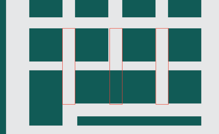
Thank you for the contribution, In my opinion your logo design little bit complicated. I think that you can give same idea with using less squares. Also, spaces between the squares should be equal. Please pay more attention on "alignment" and "spaces" on your design. I suggest you, try to use as few elements as you can on logo design if you make for mobile applications.
Your contribution has been evaluated according to Utopian rules and guidelines, as well as a predefined set of questions pertaining to the category.
To view those questions and the relevant answers related to your post,Click here
Need help? Write a ticket on https://support.utopian.io/.
Chat with us on Discord.
[utopian-moderator]
Thank you so much sir @baranpirincal for moderating.
mayaman na this
Hey @baranpirincal
Here's a tip for your valuable feedback! @Utopian-io loves and incentivises informative comments.
Contributing on Utopian
Learn how to contribute on our website.
Want to chat? Join us on Discord https://discord.gg/h52nFrV.
Vote for Utopian Witness!