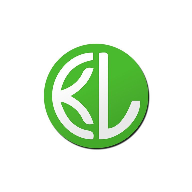
I designed a logo for KISS Launcher app. This application allows people to easily clean their screens and it provide to be able to easily access the function people need.
I think current logo is seems unrelated with application's function. When I first looked at the KISS Launcher's logo I did not make any association about contest. So, I decided to design a new logo.I used same color because green tones gives confidence to people and I think green is positive color in application design. People feels that the application is easy to use and they will get positive results by using app.
Programs which I used for design
- Adobe Illustrator
My logo design for KISS Launcher

Ideas of logo design
First of all I tried to show "launch" on logo and I wanted to use "K" and "L" . I explained below...

Different sizes,colors and backgrounds!
I paid attention about sizes and different colors. "Does my logo works in small size?" and "How my logo design looks with alternatives colors and backgrounds?"


Old / New comparison of KISS Launcher app
And there, I think that my logo design gives more trust to people, more related with function and content of application. In addition, it looks more professional than old one.

Process of my work
I wanted to share the working process with you step by step. I put the original files below. You can ask everything you want to ask!
Thank you...


Posted on Utopian.io - Rewarding Open Source Contributors
you are doing well
Thank you...
Your contribution cannot be approved because it does not follow the Utopian Rules.
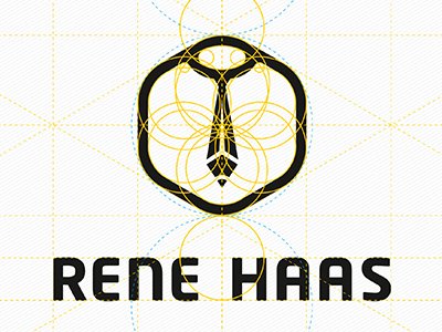
For inspiration how to construct logo:

You can contact us on Discord.
[utopian-moderator]
I fixed problems with geometry of my symbol. I used grids and basic geometry when constructing my logo.Also, I made more visible the "K" letter and I made more versions of my logo.
https://utopian.io/utopian-io/@baranpirincal/new-logo-for-kiss-launcher-2-mistakes-fixed
Thank you for your detailed and explanatory presentation.
Hi~ Are you developer?
Hi, I'm not. I am visual communication designer.
I have my apps in Android and iOS market.
Nice work, and thank you for your follow.
If you want to help me trough steemit please resteem this post :)
https://steemit.com/life/@bannanadjoe/wedding-by-steem-and-steemit-hochzeit-durch-steem-and-steemit
Thank you