Components
I am suggesting some changes within the onboarding process on Steemit. By onboarding I mean the steps You are taking when You click an account activation link after Your account has been approved and You are directed to the Steemit to receive the key and log in for the first time.
Now
After the account is approved and we can log in for the first time and finish creating your account using the link from the approval email - there is basically 2 - step onboarding process that requires clicking the link and then enter account name and at the same time receiving the private key. If someone is interested then Steemit rules are accessible to read by clicking the upper button.
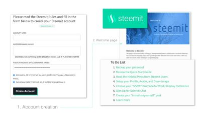
After that we get the message with success info and are being redirected to Welcome page where a long list of links is accessible for us to scroll through. It’s not filterable and it is seems like a page is a little overloaded. For me as a new user, it was quite hard to decide where to start and where is the most important stuff I need to read first.
Proposal
Why
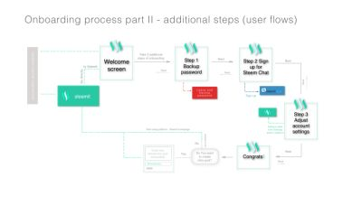
After going through all this and finding out that To Do List is very important at the beginning I decided to come up with ideas for expanded onboarding process and fit in To Do List into 3 additional steps creating user friendly, easy to navigate screens with more understandable flow of information.
I present mockups for onboarding steps which might not be (and are not currently) labeled as obligatory. Nevertheless in my opinion they are very useful steps about which new users should be informed more firmly because they can benefit from those information A LOT!
I believe there is a room for much bigger improvements, but this process should be gradual and changes suggested in here might be easily implemented since they are based on existing content with no revolutionary add ons, but with refreshing data structure, design and overall user experience improvements.
Benefits / What will improve
User interfaces shouldn’t be very complex, but Steemit is not JUST another social media platform. And even if it was, nobody should expect a new user to understand new interface and new rules without a very clear guidance and step by step tutorial to help them at least access the new environment smoothly and without any doubts or fears.
Yet user onboarding is often created on the fly or even forgotten.
It’s one of the most important processes because can lead to frustration or if successfully implemented and optimized properly can lead to more enrollments and generally make users more happy.
Nate Munger, Intercom:
“Some new users expect you to welcome them and show them around the place, while others prefer you to get out of their way as soon as possible and let them figure things out for themselves.
On top of that, users don’t necessarily want to do the things you need them to do in order to be successful. You need to balance the user experience of onboarding with the friction of necessary steps such as account creation, user education, and data gathering. No small challenge”
Indeed the challenge is quite big! Steemit team made good job so far of course. But it can be so much better though. So with community future in mind I did some conceptual work and a lot of thinking about process optimization.
New old concept
I could have come up with fancy custom illustrations, icons etc., but decided to follow the direction set by Steemit for this stage of development. I have in mind concepts for next stages, but for now the most important stuff. And while it is beneficial, it is at the same time EASY TO IMPLEMENT for Steemit developers:
- used same text and styles like for buttons etc.
- users are informed but the amount of information is limited
- basically what already have been there was organized differently and distributed within smaller pieces - screens giving it different structure
- this structure encourage and enable users to do more at the beginning, which :
- - improves their safety (backup the password and set the NSFW)
- - gives a greater understanding how the platform works
- - and by gathering the required information allow users to find their place in the new community (full account settings and access to chat)
- - no painful surprises in the future and instant community support is what users gain in the end
Mockups
So instead of 2 initial steps and being redirected to Welcome page, there is first screen asking if You want to go straight to the platform or take 3 steps that will improve the user experience. If yes, the 3 following steps will be taken that might be overlooked later on and often are:
*** INITIAL SCREEN
After receiving their key and confirming the willingness to log in, user is presented with initial screen where is encouraged to take 3 additional steps which help them start the Steemit journey from a better place or can skip all of those and jump into main interface as it is right now.

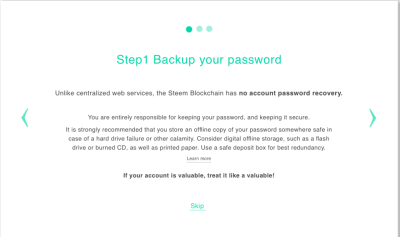
1.FIRST STEP
User is encouraged to backup his password and informed about consequences which are particularly harsh and exceptional (not like in ANY other platform ppl are accustomed to)
2. SECOND STEP
User can go directly to sign up for community chat and get instant support and connect with community members in the new way (THIS IS TEMPORARILY NOT VALID - BUT I BELIEVE STEEMIT CHAT WILL BE RESTORES SOON!)

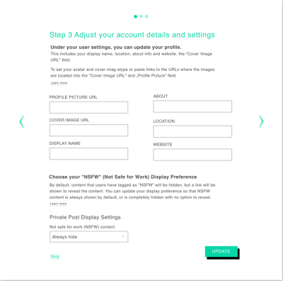
3. THIRD STEP
User can set up account details and be guided through the process of adding images which differs from other traditional social media platforms (links attached). Also NSFW option is presented as a part of safety policy which are also different for decentralized space like Steemit and can be surprising for unaware users in the future. It’s good to avoid that!
***CONGRATULATIONS SCREEN
From there user is encouraged to create intro post which can be very beneficial for the whole community and many newcomers often forget, neglect or are not aware of this practice.
Also can access: Quick guide and Helpful posts from Steemit users (how it is currently)
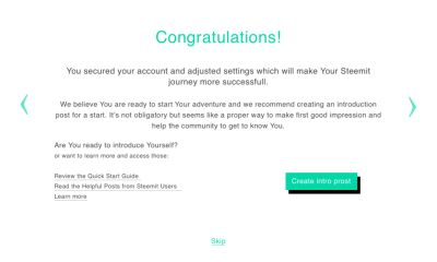
All the screens have call to actions which allows user to get back to previous screen or skip particular step. Links to proper tutorials for each screen are provided.

Posted on Utopian.io - Rewarding Open Source Contributors
Thank you for the contribution. It has been approved.
You can contact us on Discord.
[utopian-moderator]
Can you contact me on discord? My user is favcau#8655
Hey @anushka I am @utopian-io. I have just upvoted you!
Achievements
Suggestions
Get Noticed!
Community-Driven Witness!
I am the first and only Steem Community-Driven Witness. Participate on Discord. Lets GROW TOGETHER!
Up-vote this comment to grow my power and help Open Source contributions like this one. Want to chat? Join me on Discord https://discord.gg/Pc8HG9x