DEXEOS is about to have a major UI/UX change.
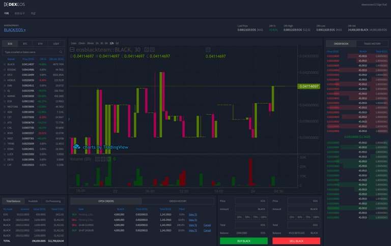
I have included some sneak peak pictures of what our future UI/UX will look like.
By the way, thank you everyone for your feedback regarding what we should change about our exchange’s UI/UX.
We really appreciate all of your feedback and suggestions.
Furthermore, we have specifically been focusing on improving our usability and screen composition.
Official DEXEOS UI/UX update preview:


The key UI/UX updates include:
- Ability to use the entire screen
The current UI has left and right margins, therefore, you have to scroll up and down to use some of the components, such as buy/sell.
In the new UI, all the screen components fit into one screen, this means no left and right margins.
- Added Token Search Function
As the number of tokens listed on the deck increases, more and more users are uncomfortable finding specific tokens.
In the new UI, you will be able to use a search feature at the top of the token list to find a specific token.
- Overall UX Changes
The overall UX has changed, while actively utilizing tab functions for each use element, including token lists, balance, and order books.
I hope the UI/UX update makes it easier for more people to trade.
Happy Trading!
Dexios: https://dexeos.io
Telegram: https://t.me/dexeos_io
These changes sound good. It's been working fine for me as is also though.
keep up the good work