A few days ago I saw a chart in Twitter claiming that if from 01/1950 to 05/2017 the 25 best and 25 worst returns of the market were removed, then equity performance would be significantly better. That was attributed to volatility drag. As it turns out, the author of that article was fooled by a black swan. Let us see how and why.
Fooled by a black swan
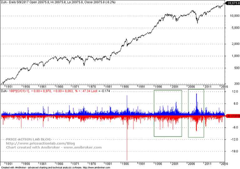
Below is a chart of Dow Jones (log scale) since 01/1950 with daily returns on the bottom.

The black swan is the 1987 crash, a daily return of -22.6%. If we assume normality (not the case) that was a -20-sigma event. Note that in CERN, a 5-sigma event was required to detect the Higgs particle. So this market phenomenon was extraordinary.
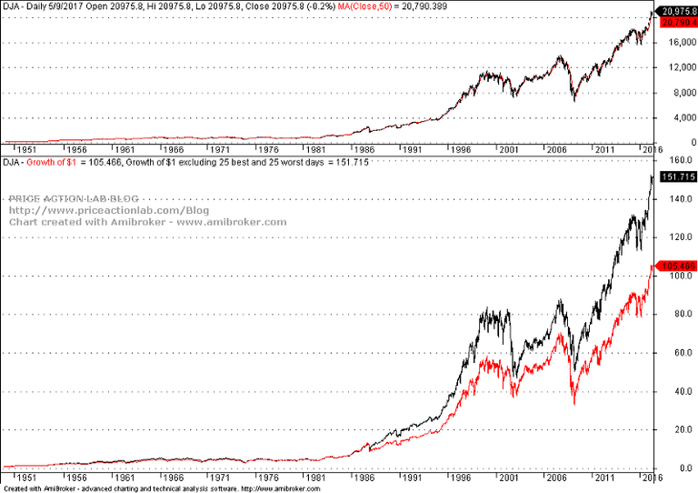
This black swan in 1987 has caused many distortions in price series and also misconceptions for those who do not account properly for this outlier. Below is the chart that was the basis of wrong conclusions by that author.

It was claimed that if the 25 best and 25 worst returns are not included, $1 has grown to $151.715 by May 9, 2017, as compared to only $105.466 for buy and hold. This is a substantial difference of 44% that was attributed to volatility drag.
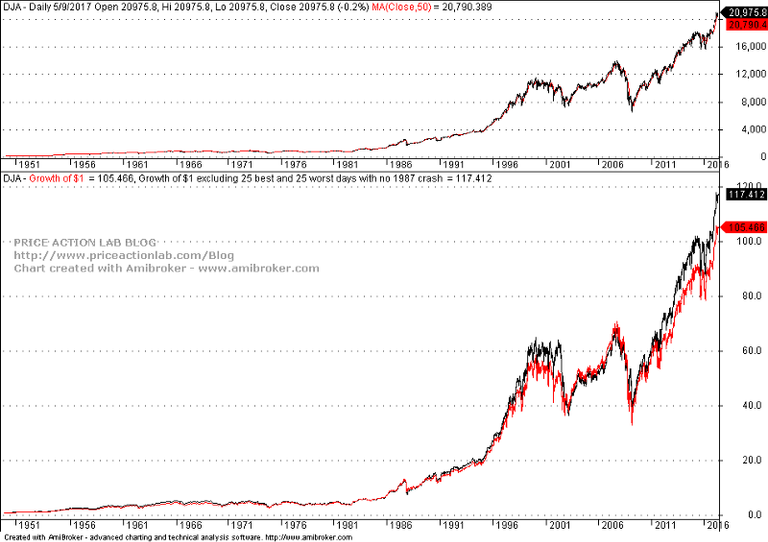
But if we remove the 1897 crash, this is what we get:

Now the difference is only 11%. It may also be seen that in the 2000s the red line (buy and hold) rises briefly above the black line (adjusted equity). This is actually due to low volatility drag. But the large difference was not due to volatility drag but due to a black swan.
But a black swan increases volatility
Yes, but the net effect of volatility drag depends on long-term market bias. The examples often presented with equal up and down returns are not realistic and serve the purpose of selection bias. The stock market has a long-term upward bias that compensates for most volatility drag in the absence of black swans.
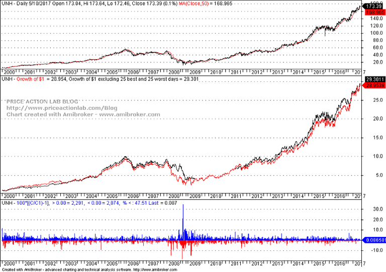
Let us see a counter-example to illustrate this: UNH, a Dow component. On October 13, 2008, the stock rose 34.75%. This is the opposite of a black swan. Below is a chart since 01/2000 with growth of $1 for buy and hold and after removing 25 best and 25 worst returns.

Here the difference between the adjusted equity curve and buy and hold is only 1.2%. This is around the typical volatility drag if there are no black swans or clusters of large negative returns.
Volatility clusters
The good news is that volatility clusters and large negative returns are usually counterbalanced by large positive returns, as shown in the first chart of the DOW above. In the absence of a negative outlier, such as the 1987 crash, the volatility drag remains low if markets stay on an uptrend and there is a positive bias. Note that the recent volatility crash will also reduce the drag.
Why this is important
Some authors who present similar arguments think they support active investing since timing may result in missing large positive and negative returns and thus reduce volatility drag.
However, in the absence of black swan, it appears that the effort required doing that and the transaction costs are not worth the benefits. On the other hand, no timing method can forecast a black swan and avoiding it is only a matter of luck. Therefore, market timing and tactical investing cannot be justified on this basis. On the contrary, those who try to do this, possibly send customers who know math to passive funds.
What about systematic market timing
Systemic market timing can avoid volatility regimes and volatility drag with end result being an increase in returns. Usually volatility increases near the bottom of a downtrend and timing turning points can result in outperformance of benchmarks.
However, there is a caveat here: timing must be precise and not many or too few large positive and negative returns avoided. If too many, then performance deteriorates naturally due to missing action and if too few it is still affected by volatility drag. The problem is that “how many” changes in different market regimes and turns this to a difficult problem.
This article was originally published in Price Action Lab Blog.