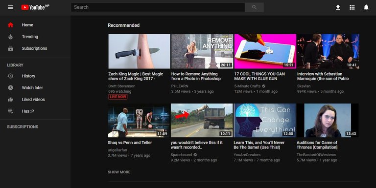
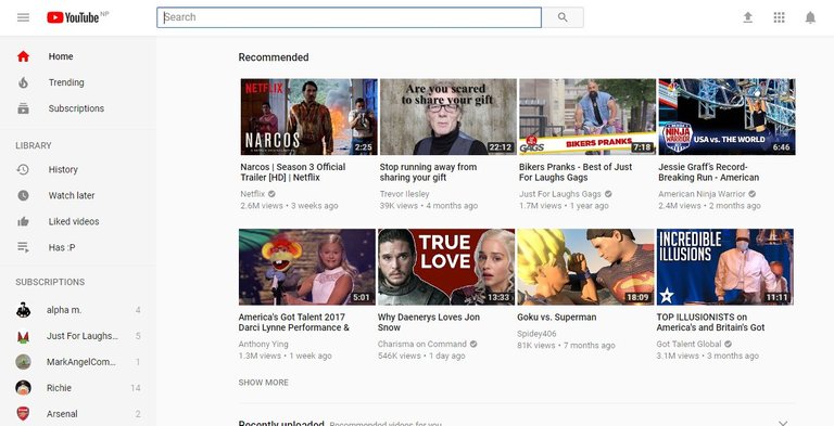
I just noticed that Youtube has changed it's design and made a cleaner design. Also, Youtube added some features in the design which I think everyone is going to love. So, here the look of the New Clean Design and Dark Theme

Changes I loved
The removed the old Boxed Design and made it a cleaner one. The background is now elegant and is not much bright and they also changed the font which looks much better. The looks less populated and there is actually space between the contents which makes it look really good. The Menu on the left looks much more sleek than before and fits perfectly with the design.

New Feature - Dark Theme
Youtube has added new Dark Theme for people who love less background light while watching video or browsing them. This will help your eyes and put less light into your eyes while browsing the video in low light or at night. That's a move that Youtube should have pulled long time ago.
Just Click on your profile and then Dropdown Menu will drop and then click on theme Dark Theme to turn it on.


Future Features
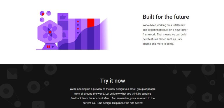
With the new Hover View added few weeks ago and now the Dark Theme we can only wait and see what Youtube is going to offer us. Youtube have stated themselves that they are working on New Design built on a faster framework and they will try add more features in the future.

thanks for the updates...
upvoted...!!!