10 Secrets Hidden Inside Famous Logos
1: Hyundai
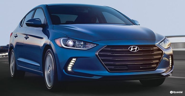 image Source : shutterstock.com
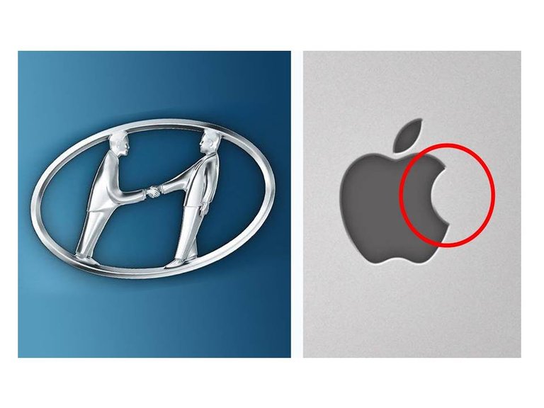
Bet you think the H logo is just the first letter of the South Korean car manufacturer Hyundai? Of course you do! But it actually represents two figures: the happy client shaking hands with the Hyundai salesman, cleverly projecting the subliminal message of a successful car purchase.
2: Apple
 image Source : shutterstock.com
It was Rob Janoff who was tasked with creating the apple logo back in 1977. Janoff bought a bag of apples and spent the week sketching them, trying to represent the perfect angle where the fruit couldn´t be mistaken for a cherry. This was when he added a bite mark and stumbled across the similarity between Bite and Byte. This was definitely a selling point for Steve Jobs.
3: Vaio
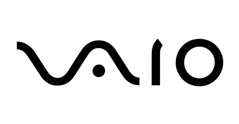 image Source : shutterstock.com
The first two letters in the computer company's name symbolize a digital waveform and the io is designed to look like a 1 and a 0, representing binary and the mix of analog and digital. Also the melody that sounds on startup actually derives from the dialtone sounds on a telephone keypad on typing V-A-I-O
4: Amazon
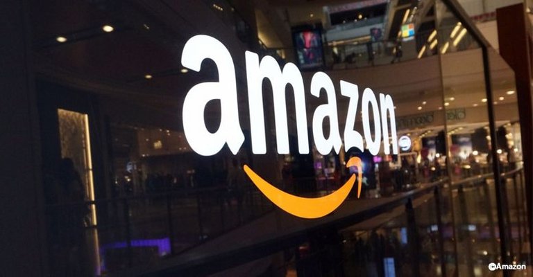 image Source : shutterstock.com
Always aiming to please, Amazon designed their logo to represent a smile, projecting a sense of satifaction in their brand. Not only that, but the arrow also starts at ´a´ and finishes at 'z' implying that the company stocks every product you could possibly desire.
5: Toyota
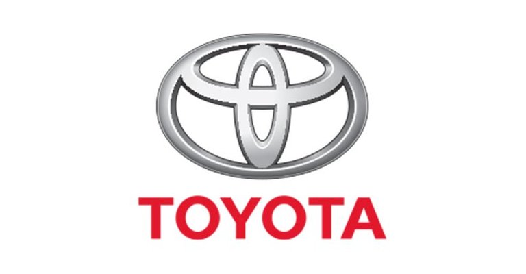 image Source :shutterstock.com
T-o-y-o-t-a. All the letters of the companies name can be found within the logo. But what does it represent? You're thinking A big strong buffalo's head or a cowboy with a hat, right? Wrong! It actually represents a needle and thread! This Japanese car manufacturer actually began making weaving machines and keeps its logo to this day!
6: Continental
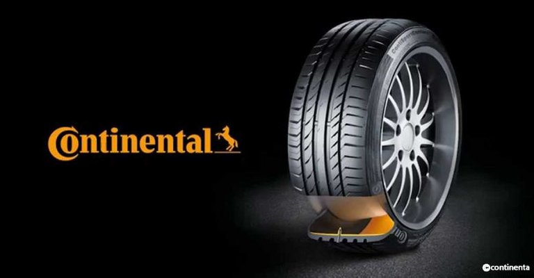 image Source : shutterstock.com
Sometimes overlooked, the continental logo is simple and clever. The first two letters are designed to symbolize a car wheel.
7: Toblerone
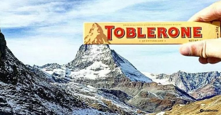 image Source : shutterstock.com
This awkward-to-eat chocolate treat doesn't just have a simple mountain in its logo. Toblerone is made in Bern, Switzerland, so it´s no surprise to see one of the Swiss alps in its logo. But it also hides a secret bear hidden in the mountain, as Bern is known as the city of bears and the bear symbol is heavily decorated throughout the city.
8: BMW
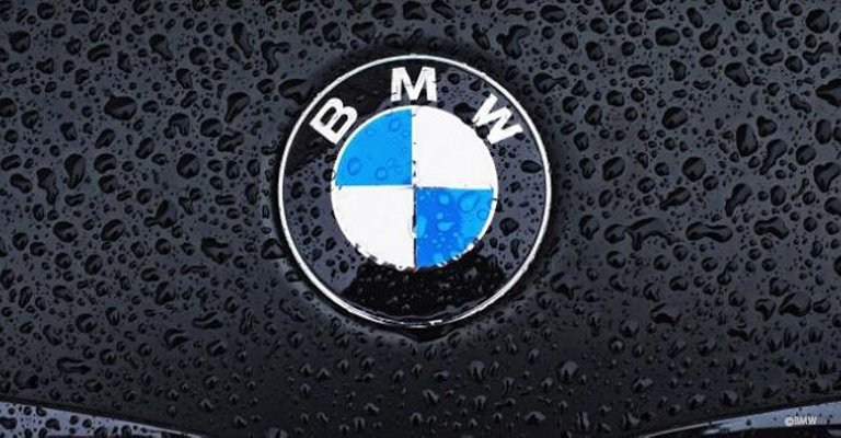 image Source : shutterstock.com
The German motor company started out making airplanes in 1916 and many think that the checker pattern in its logo represents the spinning propellers of an airplane. But it is actually just the design of the Bavarian flag, the part of Germany where the company originated.
9: Domino's Pizza
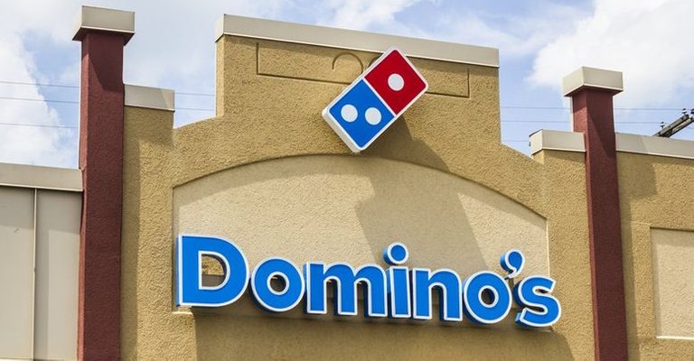 image Source : shutterstock.com
In 1960 College dropout Tom Monaghan borrowed $900 to by a tiny pizza placed called Dominic's. 5 years later he bought 2 more locations. The former owner refused Tom the permission to use his name in the franchise so Tom turned it into Domino's. The dice in the logo represent the first restaurant that he bought, followed by the next two, and he had planned on adding numbers on every new opening. That was before he realized how big the franchise would become.
10: Unilever
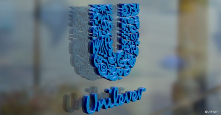 image Source : shutterstock.com
Who is Unilever, right? It's actually a huge corporation which owns over 400 famous brands. You've only got to look on the back of any of these popular products to find their logo hiding there. (Axe, Lipton, Ben and Jerry's, Dove, Heartbrand, Hellman's) But that's not all, the actual unilever logo is made up of 25 smaller logos, each with a rich meaning. A strand of hair or an icecream representing various brands, to more obscure references, like this bee...
Which of these logos surprised you the most?
Comment Below!
Hi! I am a robot. I just upvoted you! I found similar content that readers might be interested in:
https://www.youtube.com/watch?v=xSVYhd1iBbM