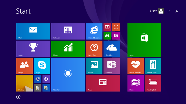
The 8.1 start menu in my opinion was a great concept for touch devices
Most of the hate of the start menu comes from
- desktop/non touch screen device users
- people that prefer the classic start menu
honestly keeping the option to get the classic menu back would have been the solution, so people that like the legacy start menu are happy, and the ones that choose to go to the new start menu are happy too.. with a flip of a switch.

Congratulations @mozila! You have completed the following achievement on the Hive blockchain and have been rewarded with new badge(s):
Your next target is to reach 600 upvotes.
You can view your badges on your board and compare yourself to others in the Ranking
If you no longer want to receive notifications, reply to this comment with the word
STOPCheck out the last post from @hivebuzz:
Support the HiveBuzz project. Vote for our proposal!