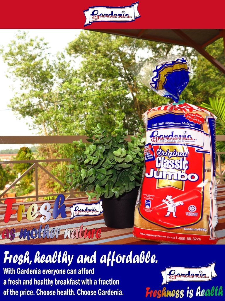
I'm taking a course called advertising copy writing this semester. For our first assignment we were asked to create a creative ad for a list of fake clients. I say fake because it's for learning purposes only. Needless to say, I chose "Gardenia Bread" because it's the cheapest and easiest option haha, so enough chatter! Here's my ad.

Nice job. It could be improved if the colour on "Fresh as mother nature" had a stronger contrast to the background, making it more readable. Aside from that, it is pretty decent ad. I'd give it a 7/10
Thank you haha, I was actually worried it would be too wordy for an ad
Yeah it may be a little wordy but it depends on your target market. If it is newspaper ad, the words are fine but if it is internet ad, then the whole thing needs an overall to focus on grabbing attention from a peripheral POV
Looking at it really do reminds me of my mum that she will always bring bread to any outdoor activities.