First off - Awesome, awesome, awesome! I always was a pretty huge fan of MTG and Yu-Gi-Oh, so this obviously instantly got my interest!
The one thing that bothers me most after opening a few packs is the fact, that the difference between the different rarity levels is rather small.
This especially strikes on smartphones. But a modern game definitely has to be smartphone-friendly imo!

I think at least legendary should look special, shiny, whatever. You need to be flashed when you open a pack with a legendary. Maybe even make a little animation when you open a legendary card.
What also is weird is the fact, that the element "Life" looks different that the other elements. It took me a few packs to realize that it is a own element and not a gold rarity or something like that. I don't know if this is on purpose for game technical reasons or just because you thought a white border would look stupid with the elements white color. However it's irritating imo.
Also Summoners should somehow look different than normal monsters.
Other than that I only can complain about the fact that I didn't get a single legendary yet :P
Greets,
Martin
P.S.:
Now translating this into german like discussed!
Upvoting this for visibility over the screens from booster openings!
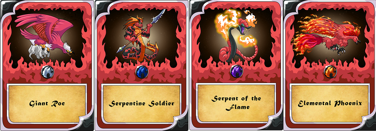
Fire nation Unit!
I played Yu-Gi-Oh and loved it a lot. You are right but I am sure they know how to progress, it's only the beginning. I also would love to see something shinny when opening a legendary and something different when opening epics, something like on Clash Royale