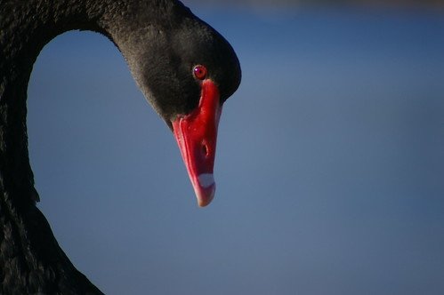
It can be light and dark, although it doesn't have to be. Not sure what you mean in the last part of that question though? I suppose I'm thinking about it more in terms of design where you can use minimalism in shapes to create other forms within the frame. This is a great example by Disney:
 (source)
In photography, it might look something like this:
 (source)
Oh Okay I think I understand. The latter part of my last question was whether or not it was a contrast of themes or concepts.