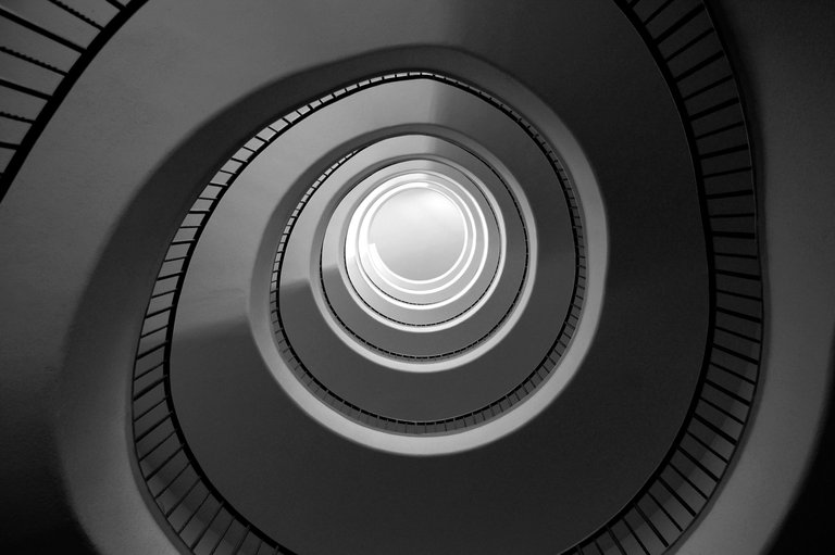
If you'd like a straight answer it's an interesting photo for sure but plenty of people take that picture. It's ready-made for you. I felt the same about this one by @lgm-1:

It's a lovely picture but as far as creativity goes, it's also a bit ready-made and showcases the engineer and architects' creativity more than the photographer's.
I agree about the ready-made composition. Unfortunately it's super common (and difficult to avoid) when it comes to 'postcard' photography of famous buildings / bridges etc. Not disagreeing with you there. This particular image though took some strategy in capturing the movement of light (clock hands at 8 and 12) as the sun moved past the facade mid-morning. Without it, the railing silhouette fades into the background and the gradient from top to bottom becomes very flat. Anyway, just my quick 2 cents on this one ;) Again, thank you for your critique @pfunk
Ah well good job for timing it right, I know sometimes a skill in photography is seeing a subject or scene and knowing that a different time of day would be better for the light, then waiting or coming back.
Even though it could also be seen as "readymade" I really wish you had entered the one looking up at the tower in Florence from within the courtyard, as I doubt as many people would think to create that composition. The battlements make it look like a postage stamp for a neat effect.
Thanks man. I'm glad you like that shot. Wish I had made it my top 3! Also, it's super helpful that you're articulating all the pros and cons of the challenge in these comments.
On the courtyard image... I'm actually putting together an album of "Looking Up" where you get a lot of those postage-stamp-style silhouettes. Keep an eye out ;)
I do agree @pfunk infact this photo was nice as was nice as well the photo in Siena, Italy that the same person published.The only thing is that he published 11 photos in the same post and you had to choose the first 3 I suppose!
That's correct, only the first three are considered.