
Designers know that design is more than good looks. Design also covers how users engage with a product, whether it’s a website or app. It’s like a conversation. Navigation is a conversation. Because it doesn’t matter how good your site or app is if users can’t find their way around it.
Why Bottom Navigation is so Important?
Steven Hoober in his research of mobile devices usage, found that 49% of people rely on a one thumb to get things done on their phones. In figure below, the diagram that appears on the mobile phones’ screens are approximate reach charts, in which the colors indicate what areas a user can reach with the thumb to interact with the screen. Green indicates the area a user can reach easily; yellow, an area that requires a stretch; and red, an area that requires users to shift the way in which they’re holding a device.
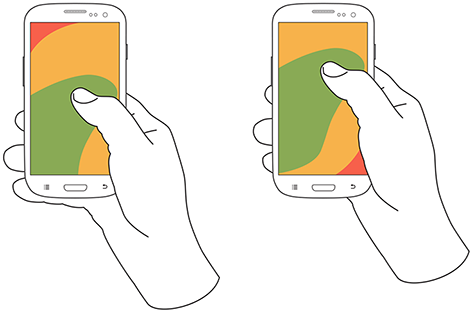
It’s important to place top-level and frequently-used actions at the bottom of the screen, because they are comfortably reached with one-thumb interactions.
Tab Bar
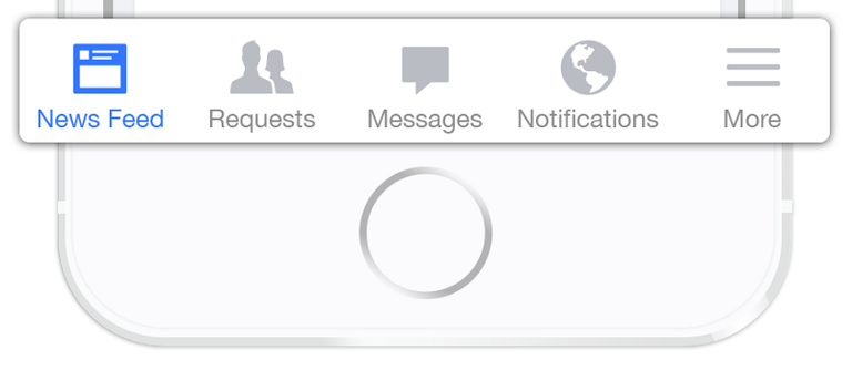
Many apps follow this rule and use the bottom navigation (a.k.a. tab bar) for the most important app’s features. Facebook makes main pieces of core functionality available with one tap, allows rapid switching between features.
3 Crucial Moments for Bottom Navigation Design
Navigation is generally the vehicle that takes users where they want to go. And bottom navigation should be used for the top-level destinations of similar importance. These destinations requiring direct access from anywhere in the app.
Good bottom navigation design follows these three rules.
- Show Only the Most Important Destinations
Use three to five top-level destinations in bottom navigation. If there are fewer than three destinations, consider using tabs instead.
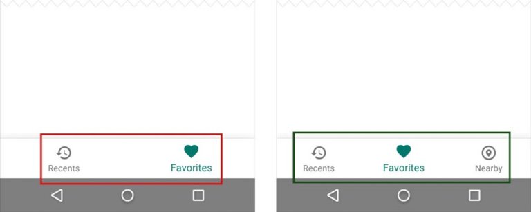
Avoid using more than five destinations in bottom navigation as tap targets will be situated too close to one another. Putting too many tabs in a tab bar can make it physically difficult for people to tap the one they want. And with each additional tab you display, you increase the complexity of your app.

If your top-level navigation has more than five destinations, provide access to destinations not covered in bottom navigation through alternative locations.
Avoid Scrollable Content
Partially hidden navigation is a pretty obvious solution for small screens — you don’t have to worry about the limited screen estate, just place your navigation options into a scrollable tab. But scrollable content is less efficient, since you have to scroll once before you’re even allowed to see the option you want.

Hi! I am a robot. I just upvoted you! I found similar content that readers might be interested in:
https://uxplanet.org/perfect-bottom-navigation-for-mobile-app-effabbb98c0f