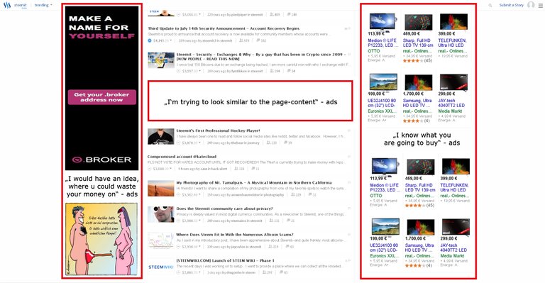
If we compare the layout of google and STEEMit, then there's a lot of space left on STEEMit.
To focus more on the topics or is the space left for a specific reason ?!
It works pretty good for google:

Is this going to be the next major step and this the future look of STEEMit ?

In my opinion, this is exactly a point where STEEMit is different and so much better then all the known social media portals.
There is no big company with dollar signs in their eyes behind the project.
Here it's the users who stay in focus.
STEEMit is all of us !
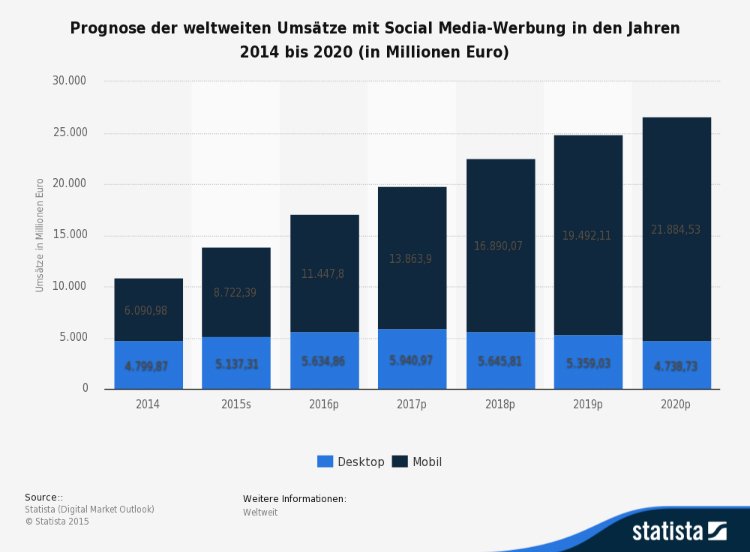
Considering the marketsize in social media advertising, there's no doubt that this could be a big deal for the currency itself.

What do you guys think about ?
STEAMads lol good one =P
+1
This one is too obvious to not ask for. Devs please answer !
I love that logo ! You made that yourself ?
Thank you ! And yes ... not much work ;)
any thoughts @dan ?