Sugar Steem - A more personalized Steem Experience
My Profile - Visual Design Update
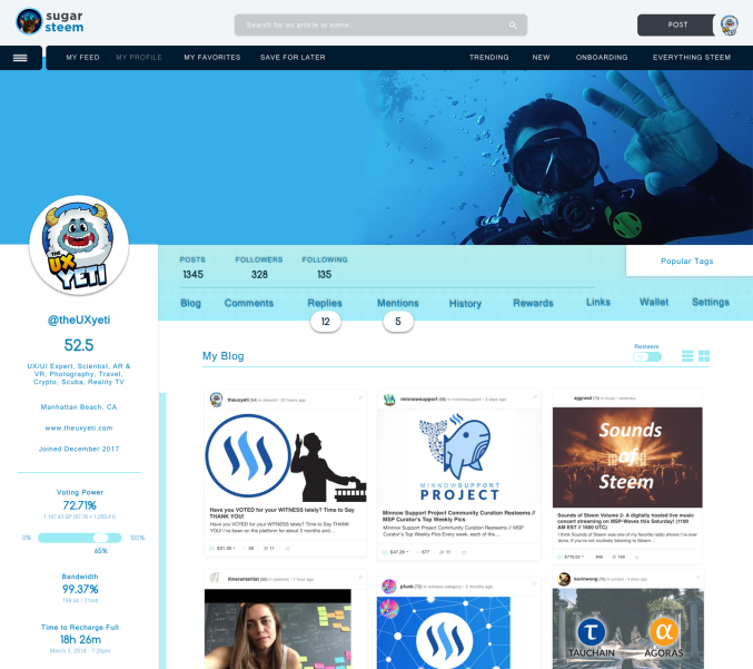
Check out the NEW iteration of the Visual Design for looking at YOUR profile. I wanted to get out a new update for you guys on the visual presentation of my UI SugarSteem.
My Profile - I am looking at my own profile


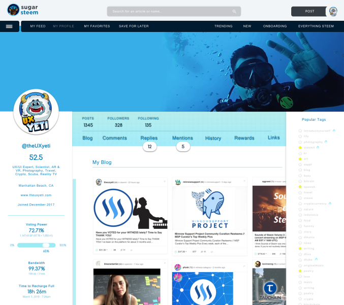
My Profile - Tags Expanded


THANK YOU

First off a BIG THANK YOU to my newest discovery for Design Talent and my sole helper in the Visual Design @itinerantartist.
- We are VERY aligned with creative and what a great discovery on the Steemit Platform for me to have found her. Solid design work, speed, direction and very sweet. We will be doing all of these final design installations together.
Thank You Steemians!
It’s you that use the UI and you are the voice that allows me to help shape this community. Thank you for your votes, your constructive comments, and your re-steems. your voice is being heard, scribed and translated into features for @SugarSteem.
Personal Shout Outs for your generousity to my UI Series. Truly grateful!
My Profile Pages - Thank you!
@cryptoctopus, @transisto, @donkeypong, @totolina, @arama, @analisa, @sykochica, @inquiringtimes, @demotruk, @timcliff, @z8teyb289qav9z, @fulltimegeek, @eroche, @ausbitbank, @drakos, @wesleybos, @bestbroplayer, @danielsaori, @whatsup, @ilanaakoundi, @hr1, @makerhacks, @davemccoy, @protegeaa
My Home Page Pages - Thank you!
@fabien, @drmake, @patrice, @sift666, @coffeex, @abh12345, @overkillcoin, @acidyo, @wackou, @therealwolf, @xaero1, @fredrikaa, @jerrybanfield, @lrock, @playitforward, @mod-tamichh, @noboxes, @aggroed, @kodaxx, @dbzfan4awhile, @teamhumble, @kimzilla, @scorer, @shawnvanderveer, @dshelton32, @yabapmatt, @carface, @slickwilly, @edwardlewis, @geofftk, @socky, @bbrewer, @etcmike, @austinhopper, @karencarrens, @alexis555, @bue, @techslut, @protegeaa, @fminerten, @steempty, @stephen.king989, @ma1neevent, @spydo, @dedicatedguy, @personz, @v4vapid, @totolina, @leeuw, @morseke1, @cryptocat, @mes, @poeticsnake, @princessmewmew, @spiritualmax, @edb1984, @remcovdpluijm, @eeks, @clayford08, @etcmike, @mattclarke, @datascience, @netuoso, @followbtcnews, @brandonp, @steempty, @fminerten, @shadowspub, @ammonite, @themarkymark,


PLEASE FOLLOW MY WORK!
@theUXyeti - Geek of all Trades, Master of Many! Built over 200 interfaces for Start ups to Fortune 500 companies across websites, mobile apps, mobile games, console games, VR/AR games, wearables, appliance UI, aerospace, military UI, ecommerce.
In my spare time I teach scuba as a dive master, play a lot of strategy games, love card games, and work on my current Steem UI project SugarSteem - follow @sugarsteem
How to find me
Steemit: www.steemit.com/@theUXyeti
Steemit: www.steemit.com/@sugarsteem
Discord: TheUXyeti or TheUXyeti#5698
Dlive Channel: https://dlive.io/@theuxyeti
IG: thetravelyeti
Wow, that looks great! Love the ideas and hope steemit will eventually update to a more user friendly style like yours
I’m building mine! Separate condenser! Unless steemit hires me lol
This is some very impressive work that you have here. it is a shame that we do not see anything as innovative as this reflected on the original steemit platform. Do you offer by chance a way to obtain this UI? You had me at the first picture when your blogs were neatly lined up having the information that one would check right there in your face unlike the current UI where you have to click a different link each time to get a piece of the most common information that everyone looks for. If we wished to use this and would pay for it (In steem, sbd or other crypto do you offer this?) I have to be honest, you make the developer(s) of the original UI look like amateurs (or at the very least.... a bit lazy) on this one! The larger profile picture... the rewards tab.... brilliant and with all the things I hear people arguing about to make steemit better, NONE OF THEM seem to have come up with "Maybe we should try making it easier to use so that we don't frustrate our newcomers while at the same time offer a fresh approach to our veterans" BTW- I laughed out load for real when I read your reply "I'm building MINE!" LOL... i KNOW THATS RIGHT.. more power to ya + upvote for all it's worth.
Yes! It’s been my career building improved UI’s and now this is my project this year. Stay tuned give a follow i try to produce 2-3 updates a week
I appreciate your work @theuxyeti
Will you be distributing your version for people to install on their local computer?
Will you be installing your version like busy?
I also had questions:
Does it have a referral program built in?
Will it use post beneficiaries feature?
Does it have a voting slider for minnows?
It will be accessible on the internet yes. It will not cost anything monthly. I will install my version. No referral program for now. Undecided on beneficiaries at this time - i definitely have to recoup my losses of time, money, hired teammates etc, - theres a voting slider on the ui for profile.
What about broader funding? How far is the loss- if you don't mind sharing? There are several major funding app initiatives coming out. If people knew about this more, they might be motivated to use your interface more and volunteer, delegate, donate, etc.
Right now, all the tools letting users set beneficiaries are taking a cut. 😷 And some of the other apps are taking a cut. I understand but it sucks when trying to use the platforms for things like charity.
If there was a way to add in a way for users to pay to do something like change their post stylesheet colors (server side using color pickers and boxes) I believe that could fund it for you.
If I could go into my profile and pay $10 USD/per year so that I could use google fonts, fontawesome, text sizes, colors, etc. that parsed and fell back when viewed on other interfaces, I would pay for that.
I'm sure there's ways to monetize it innovatively and raise funds. :)
sounds like you have an idea in the making. Sadly none of which is aligned with my goal this year. I dont have any desire to make this into myspace. I will be building out my UI. I wouldnt want to build anything that customized for each user. its not scalable for me.
As for building and how much its taken. well so far ive dedicated about 500 hours so far on all my iterations, time, design work, radio commitments etc. The UI is meant to improve many areas for the community but alike the creators that charge a beneficiary i completely agree with them and it makes total sense. Its for the hard work that very few truly put in.
I havent decided yet, though delegations to join the UI might be my route. Unsure. If you delegate to the UI you can use it etc. that might be what im doing im unsure. right now im trying to enjoy it without thinking about it.
Yes, I completely understand. It's great work. Congrats :)
seen most of your posts i really think your worth a follow
@theuxyeti
Haha! Thank you!!!
no thank you for the content you share with us and i hope to see more inspiring posts
@theuxyeti
The UI looks nice and clean love it... just discovering you so I still have to dig around your profile but I don't seem to see a mention of a website... which site is this profile a part of?
I’m building a separate UI @sugarsteem
Stellar as always. Any luck with the REACH info/help you needed? If not, I'm glad you're able to plug along with something at least while that's being resolved.
Yes! I’m still looking for developers to assist, but I’ll continue to build the ui forward! Won’t let ppl bring me down
What else is there to do but move forward, right? I hope you get what you need.
I'm not even remotely a developer and I don't even know anyone who is. My son is hoping to graduate within the next six months with a degree in web development and design, but there wasn't any instruction on blockchain interfaces. For that matter, I think he's mainly dabbled in javascript and Microsoft .NET stuff. He doesn't know PHP or Python, and only looked at the Cs for a little bit. Not sure all of what he's being taught kind of think of it.
The way those degrees work you spend way too much time with general or core classes that have nothing to to do with the major. Some of it is useful, but a lot of it isn't. So, in essence, you waste a lot of time you could have used developing your intended craft.
Sorry. You know all that. :)
i do, and building a UI on the blockchain sounded like a fun goal. so here i am lol
@theuxyeti, I hope you get the right developers to support this soon. I also hope some of the bugs can be fixed. I know eventually they will get fixed, I just would like sooner than later.
The design is looking great. You got a resteem!
Thanks man. Yes i am still trying to steem forward lol. hopefully itll start coming along soon on the dev side. so far i have one dilligent dev helping me
Excellent UI and very fortunate to have your talent on Steemit. RESTEEMED.
Looking good!
Can't wait to see it when it's released.
I have one dev and he says a few months so here’s hoping
Do you think your UI could be adapted for a SMT when they come out?
sounds like a promising idea. though i dont know too much about how SMT's work or anything