Not that long after the new Steemit design overhaul was first introduced via Steemitstage, Steemit's beta site received another design overhaul today and went green.
teased with.Best of this design overhaul may be the introduction of the new Steemit logo @ned recently
Whether the cat is out of the bag now, right in time for SteemFest, rests to be seen but the preview colliding with the biggest yearly Steem event is not necessarily a coincidence.
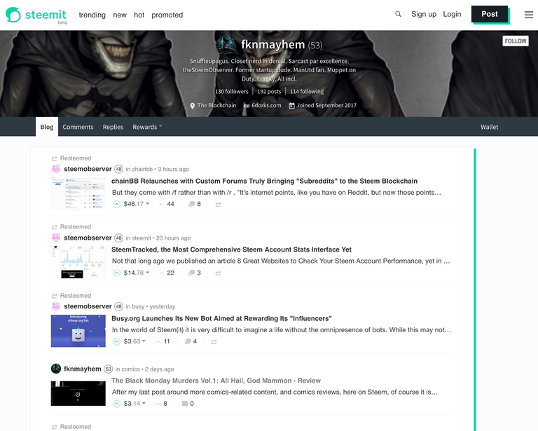
Until more is known, or the redesign is launched on the Steemit website, we leave you with two screenshots: the redesigned Steemit (beta) home page with your feed and how your blog looks.
There is no doubt that all that green will bring out both fans and haters. En force.
First tho, the possible new Steemit logo!

The redesigned home/feed page:

The colored up redesigned blog page:

Money still talks tho. But now with a flatter background.

Head over to Steemitstage.com to check it out for yourself!
Oh, and we like the new post button and the join button on the signup CTA! As well as the green hover effects, especially on the upvote button.
Let us know in the comments how you like the changes.
Update: The rdesign, complete with new logo, has been deployed to the main Steemit site. Also note that the new logo, and brand is copyrighted by Steem Inc.. The old, blue logo, continues to be the logo for the Steem blockchain and is licensed under CC0 license, thus available to used.
I love the new color scheme! SteemIt is making moves again :D
Thanks for sharing
Is not what i expected with this logo, but ia different and intresting:)
i dd not like it first day, after... I start likeing it
Good grief! Prediction come true................ Arggghhhhhhhh - that's tsu colour! 😳
Not that it will change anything, but I can't say I like the logo. It looks like one of those chatty phone apps ;) and has nothing to do with Steem now.
The colour is ok, though I still prefer blue.
That logo is one of those music app logo. I just can't recall which one... So that logo is not steemit logo...