Hundreds of companies go through a rebrand. The thing about Rebranding, is that it is often risky.
Steemit Beta, while not a total representation of the final product, we always knew that there was a possibility for big changes.
By rebranding, Steemit is taking a sort of risk, as for any rebrand move out there. You always risk alienating your audience by presenting an image that is unexpected, or just new.
Now, as of Nov 1 (The day I write this) I've noticed some changes to steemit's visual representation. This may change in the future, who knows (except the developers of course)?
Let's take a look at the very first change that we notice.
The color Scheme.

On one hand, we have the old color scheme which was a Navy blue, a light blue and of course white.
I was always a fan of how the website used this old color scheme. The way the website was in white and only a few elements where actually using the blues gave a sense of professionalism and commercial. The site felt very reliable, and very clean. It helped focus on what was most important, and that was user content. I also felt a sense of secureness. Reliability.
The new color scheme is slightly different, opting in for a deeply saturated blue, which is actually something that I've been doing lately for my compositions. It's a stand in for black, adding in a bit of flavor if you will. This is most likely the color they will be using in place of the old navy color, and it really inspires the feeling of modernism. The teal is also complementary to this color, and also instills a feel of Cutting edge. But again, major usage of white instills the feeling of minimalism and focusing on what's important. User content.
I actually support the change in the color scheme. Although there is a sense of "hipness" to it, will these be the colors steemit will be using down the line in 5 years? How about 10? When you opt into these more popular colors, you are not really contributing to one of the most important design principles. Timelessness.
For the time being though, it feels good. The site looks good, even though there aren't many changes. I do feel something from these colors. And it feels a bit more inspiring. It feels more modern.
The logo

Now, this is something that I think will be subject to skepticism and criticism.
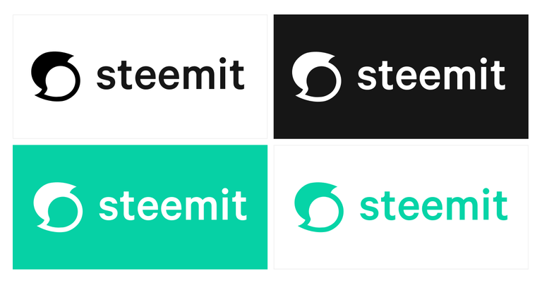
The new logo is very simple. Something that I feel makes the best logos of all time. It looks like a little ghost with a helmet or mohawk.
Or perhaps, thats a steam cloud formed into an S?
It's very hard to see how this graphic represents Steemit.
When I design my logos. I try to draft concepts that instill what the company is and what it does. I keep my logos simple for 2 reasons, 1 to keep things simple is a good design principle, 2 to help keep the logo easy to remember.
But perhaps this is a logo design that will define itself over time. There are plenty of logos out there that do not reflect what the company or project is about. One thing is certain, steemit will be using this logo for a long time to come. It's been trademarked already.
My main criticism for this logo: How does steemit fit into this graphic?
There some things that I really like about it though. I like the flat and minimal design flow it uses.
Conclusion
There will be people who will simply not like or understand these new changes. Be it the logo, or the design choices for the website. This will be always the case with a rebrand.
I personally do not understand the logo, but that's because I've been a steemit user for months. I'm still used to the only design. So my feeling of not understanding this logo, or what it has to do with steemit, will not be true for everyone else, especially new users.
It feels nice. I feel that posts and graphics that have flat design elements will feel really at home with the rest of the site. I know that I will be able to design some really interesting graphics that will harmonize well with the site.
It's good, I like it, an improvement. Now, when can we expect prices to rise on steem?
That's it for this post folks, tell me what you think.
What do you guys think? What are your thoughts on the changes to steemit?
rebranding is good, but now they must start working on marketing too in my opinion.
Finally an informed opinion on design. I agree with what you are saying. The rebrand and the new logo were necessities since people kept confusing the technology and a website built on it. Now at least, the messaging will be easier to do.
I also like that my logo fits with the new theme 😉
Exactly, and now I didn't mention it in the above post, but the old steemit logo was actually identical to a registered trademark. It was really obscure, but that logo is almost identical with that company's logo. I like the direction the design is going. And I agree, your identity fits really well with the new scheme. Although, I may have to push an update to you and remove the old steemit mark from your design to help fit it in perfectly. Message me on discord when you have a chance! :) Thanks for your thoughts!
Its all good. I'll keep the Steem logo since I'll use that across platforms.
It looks like 2 thought/word bubbles (or quotation marks) and is in the shape of an S for steemit. I think it totally represents what steemit is...a place for thoughts and conversation and discussion.
Looking at it now, it does kind of look like that now. Some people said it looked like a 69 haha.
I immediately saw the speech bubbles and thought it was quite fitting. I quite like it. It indicated discussion (Steemit's main activity) Give and take. While forming the Steemit 's'.
The more trendy green/blue is refreshing - the old blue color scheme seemed dated to me from the get go and is to closely reminiscent of Facebook's blue as well. Better kept for the tech end of the brand.
I agree!
Good riddins to the FB colours!
Did you get permission before using the logo on your post?
Actually design critiques, of public brands, are covered by the Fair Use doctrine. Even more so since @malicered does often write about design.
That he may earn from this article does not equate to commercial use either, not in the sense that taking the logo and put it in his avatar would be a potential Commercial use since he does occasionally provide design services (via Steemit even).
No permission required to post the logo's image file in this post. But he would have to ask if he were to change the logo in @cryptoctopus's avatar to the new Steemit logo.
Using a logo as part of a news update and design critique about a public brand: Fair Use. Even if earns from this and unsolicited analysis.
Branding himself with the new Steemit logo, in order to sell more avatar designs to Steemians: explicitly outlawed now.
What are the four important conditions for Fair Use:
Source: Copryright and Plagiarism specialist Jonathan Bailey
Thanks for the clarification!
Haha, I noticed that too. Good point. Now that it's steemits registered trademark, I technically need permission to use this logo on my posts. I mean, they did post about it as well right? I believe this constitutes fair use though as it's purely informational and so on and so forth.
Ha no idea I'm not a lawyer, but you did make money on this post. I have no idea how this works and don't think they care if you are using the trademark as information on steemit. I'm just erroring on the side of caution until some more information clears this up.
I like the new logo. The old logo colors were too traditional. The design was not fluid.
To me, the best, and most profitable logos are the ones that the average person can draw without lifting the pen or pencil. This logo accomplishes this trait.
Personally, I would use a dark green or gold for the words and background, instead of black or white. White is too static, and black gives too much contrast. And, most of all, I would add bright gold trim to both the logo and the letters to give the whole logo assembly some flair! Next, I would make the button dark green with gold letters and the teal outline. I hope they take my suggestions, and present me with some STEEM for them. Always the business person. STEEMIN ON!
I think I fall under the category of people who did not like the wholesale changes especially on the button. The button just looks wierdly exaggerated. For someone who does web design I sure hope they fix that.
https://steemit.com/steemit/@deniskj/what-is-happening-to-the-steemit-ui-bringbackthesteemlogo
they can't bring back the steem logo. The #1 issue Ned face on talk shows and interview was people confusing steemit.com and the steem blockchain.
I came to realize much later why they needed to change the logo for steemit. But I am all for the other changes I recommended in my post.
The logo looks like a Hurricane that weather channels use sometime. I like it
Change is good sometimes I would say!
Hm... I'm not a designer, but I don't feel comfortable with this color combination of black and one variation of green...
As long as it works, i'm fine with it. Please, no more spinning and transaction errors. Please. I'll even put up with TEAL. @ironshield
That's an amazing post thanks for share
It's definitely meant to represent two speech bubbles. And two speech bubbles overlaid like that suggests dialogue (or, alternately, an argument).
It's appropriate, but I'm thinking that the site may opt for another new logo some time down the road.
Congratulations @malicered! You have completed some achievement on Steemit and have been rewarded with new badge(s) :
Click on any badge to view your own Board of Honor on SteemitBoard.
For more information about SteemitBoard, click here
If you no longer want to receive notifications, reply to this comment with the word
STOP