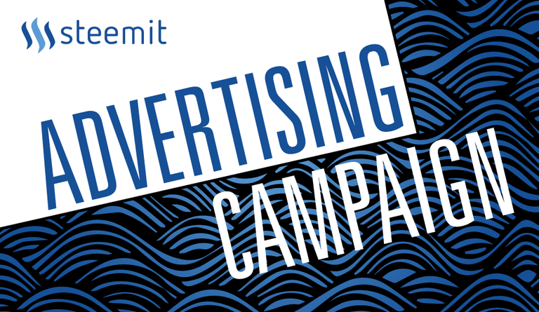
For the past few days I have been involved in a project initiated by @cryptohustlin in order to get some campaigns going. The crypto-wave is on the rise so we might as well ride it.
I will be designing some animated banners. I want to note here that I will receive (a reduced) payment for the upcoming designs but if enough amount is gathered through this post I will keep making more variations and designs for future campaigns.
A few more campaigns are on the way.

I preserved the original slogan (the one used last year). A small explanation about the concept: The first letters appear as being typed (blogging reference) while the "get paid" flashes more vividly. The transition that follows maintains the basic shape of the logo.
Keep in mind that the animation had to be optimized in many ways since most websites allow only a minimal size for animated banners.

I will be experimenting with vertical designs for side banners as well as different themes that would fit more appropriately for each specific campaign. If you want to use the banner for promoting Steemit yourself feel free to do so. if you need a smaller size please message me on Steemit chat and I will arrange it.
Edit: Version 2

Here are a few of our currently running campaigns. https://goo.gl/#analytics/goo.gl/DZ7a4j/month https://goo.gl/#analytics/goo.gl/K4b2ym/all_time https://goo.gl/#analytics/goo.gl/exNCJZ/all_time
Great design! My only issue is that I'm not a big fan of the word "blog" to sell it. That's what we have now, but I think it's going to change and that we'll see more diverse lengths/types of content be rewarded appropriately also. I think "Post" or "Post. Vote." might appeal to more people.
"Post. Vote." sounds more appropriate indeed. I can prepare a variation, no problem.
I think so as well, "Post.Vote" does seem better. But anyways, I like it! Concise and great design at the same time.
Great job guys!
thank you
I'm a curator, not a blogger, so I also prefer the variation suggested here for the wording.
Plus, "Blog. Get Paid" does seem somewhat like a writing job advertisement. The other suggestions do seem to better refect the unique content reward offerings of Steemit versus blogging elsewhere.
looks good man!
Nice sketches, digital art! Check out my works, would be honored to get followed by you. My recent post.
Your post was mentioned in my hit parade in the following category:Congratulations @kyriacos!
SLICK banner design, love it :D
thank you
Wow! That looks incredible! It looks like it has integrity too from its aesthetic. When I tell people about Steemit they feel like it's a scam or too good to be true. This helps everyone get the word out.
glad it sets a high standard then :) let's hope they do join
nice campaign, good work!
thank you
nice post.. ..well done!
Great work mate!
I have also sketched some great ideas about https://steemit.com/ and i will showcase on my next post.
Well done.
thank you
That GIF is so simple but it looks great!
Might start using it on different forums I go on
please do. if anyone needs smaller versions please let them contact me on chat.
The middle one (Blog - Get Paid) is awesome! Definitely think Steem should use that one. Great work
Thank you. That's the only one. The other is just an intro cover for the post
Very nice
thank you
Keep the good work my friend!!!
thank you
I believe i need your help-when you find little time sent me an email iceman5556@gmail.com
Thank you in advance!(Your friend from Greece)
Let's talk from Steemit chat. There is a dropdown on the top right corner of your screen.
I am in the chat now
upvote and follow yougood job. @kyriacos
upvote and follow me to
Thank you
Good work
thank you
Nice post....
I like it...
thank you
That banner looks great!
thank you
Good job
Upvote and resteem :-)
thank you
Nice! Middle one is my favorite one! Simplistic on the one hand but still stylish! ^^ Good job!
yeap. Just the middle one counts. The other one is a cover
Really is so great
Keep the good work
Happy to be one of your followers
Thanks for sharing
Have a great day
my pleasure. glad you liked it.
Thanks so much
You are so creative
I hope that I can use it
I used it here
https://steemit.com/steemit/@lordoftruth/hf19-are-you-ready-to-steem-on-after-the-hard-fork-19
Really is so great
great!
Great job! I like your design! #aggroed
thank you
I like the banner. Simple, to the point. Professional.
thank you
That's a great initiative and it's quite admirable that people are dedicating time, effort and resources to grow the platform as a whole.
Keeping in mind your drawing skills, I think you should try something more whimsical and cartoonish. Or will it take way too much time and effort?
thank you. Two things:
I think it might distract people due to the nature and placement of banners and the fact that steemit is still young. Perhaps if the identity was established we could play with more creative solutions.
Complicated animated details are not really favored when it comes to the size of the file. Website owners tend to be pretty strict with that. Detailed animations are also very time consuming indeed.
Yep, both points make a lot of sense. I didn't really mean animations, more like a face with an engaging expression or something, but yeah, clean and properly branded probably makes a lot more sense than what I was thinking about.
Wow, these are great! It gets your attention right away. I can definitely see these campaigns taking off :)
let's hope they do :)
I am thankful for the time and effort with which u had to come up with ( a beginners' guide like) this. Indeed it is at the very least informative, eye-opening and instructive. While I look forward to a great experience here at Steemit, I must say it would do me great pleasure to be one of your prodigies. That's if you would oblige me. GraciasHi @kyriacos
I am confused but strangely pleased
Great designs dude looking forward to the rest of the designs
Can you please check this out https://steemit.com/steemit/@thepsychguide/how-ai-came-about-and-how-it-will-affect-us-part-2
im a designer too!! would love to collab if could :)
sure. message me in chat
a bit new to steem, how do i message you?
on the upper right corner there is a dropdown. Find Steemit Chat. make an account. my screen name is the same as here.
I like the basic design, you can get away with a lot more. I normally get stuck with designs where you have a 600 x 300 with x3 full color images of properties.
I struggle to keep the size low enough but still keep good quality in the photos.
Any suggestions?
if you are working with photoshop animations try to play with the lossy setting when you output to gif. Also try to get rid off any duplicate frames.
Hi Kyriacos, I have x3 frames/slides and I have set my Lossy to about 18 and the file size is better but the quality in the images are... well.... Lossy. You end up getting these small dots all over the image. Just not always easy to please both Google and the big boss at the same time.
But hey, Google wins this time and I have to keep my file size as close to 150K as I can so Lossy it is!
Yeap, we always end up sacrificing size for quality. I remember myself spending hours tinkering these settings rather than designing. Very complex, especially with motion blur
Congratulations @kyriacos! You have completed some achievement on Steemit and have been rewarded with new badge(s) :
Click on any badge to view your own Board of Honnor on SteemitBoard.
For more information about SteemitBoard, click here
If you no longer want to receive notifications, reply to this comment with the word
STOPBy upvoting this notification, you can help all Steemit users. Learn how here!
You see, I needed one of yours for my latest post. It would have worked so well with the whole Steemit theme.
Love your work, resteemed it!
thank you
I like your blog/get paid banner. Simple and clean.
thank you
nice bro..
i followed your steemit account because of your supportiveness in steemit community please help me raise my steem power thanks ..
thank you
Hey @kyriacos, nice post. I am a relatively new Steemer who recently signed up. It would be great if you could check out my profile page and follow me if you enjoy my articles. Thankyou!
sure
Your skilled in design - i hope the projects so well
thank you
Very cool! I like the simplistic design and the clarity of the message. I think clarity should be the number one focus of all Steemit and Steem advertising campaigns because cryptocurrency scares people tbh. Resteemed and followed! Cheers mate
thank you
Upvoted, the more variations of everything that could be used to advertise the merrier. Everything you do is great! Thanks for being on steem, and for sharing all that you do!
You are too kind :)
13 points on How to make a STEEMIT post go trending and Make money with STEEMIT
https://steemit.com/steemit/@hussnainrazakhan/how-to-succeed-on-steemit
I am new here but this thing is evolving fast. Will turn into something more than a blog.
That looks really good!
Maybe only thing I noticed is it feels like the first text moves a bit fast after "get paid" pops up. Maybe I'm wrong, but I'm a fast reader, and it goes away quickly.
But the most important part is there. The Steemit text ;]
What program did you used to make them?
Nice banners!
screenflow and photoshop
thank you
Looks great! Would love to see more versions...
FYI I see some interpolation around the edges :)
I will create another version soon.
I actually added motion blur so I could have interpolation :)
That's really nice banner. This is what my friend designed.
https://giphy.com/gifs/l0Iy1ex4qTxx7qC4M/html5
it looks great!
Thanks!
Nice piece of article
You must check the potential of steemit -
https://steemit.com/steemit/@totalgyan/potential-of-steemit-how-can-you-earn-money-here-tip-for-newbies-and-steemers
Looks really good m9. Effectively conveys what happens on steemit as well. You more or less get paid to blog/post in general.
thank you
Good post
thank you
On the positive side, I like the minimalistic approach you took on the design. Although I would have figured out some elements that would emphasize the "Get paid" message, and so I get to the negative side.
You left the most important message, "Get paid", with the most potential for conversions, at the end, and some people might miss it, because there's nothing in the design to keep them engaged and interested.
its a simple message. not need to make the banner a carnival. you don't see apple "trying too hard" do you? good brands don't turn their advertising into flashy used car sales promos
anws. thank you for the critique. you can make your own really
I was trying to give you my opinion. I didn't say it's bad by any means.
i didn't say you said it was bad.
I perceived it that way for some reason... Nevermind :) Keep up the good work!
np
Nice banner!
thank you
Great!