Hi Steemers!
Here are my new mockups based on the feedback I received. They are a continuity of the previous themes that I have created last weekend (https://steemit.com/steemit/@dudutaulois/is-this-the-new-steemit)
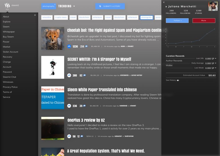
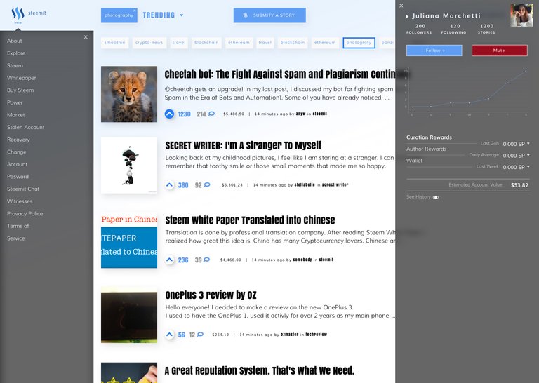
Since some people prefer compact layouts that allows to see more itens on the screen rather to have big images I moved some elements like the wallet to a hidden sidebar (just like the notifications bar on OS X). There is plenty of room there to include other things like recent replies and so on.
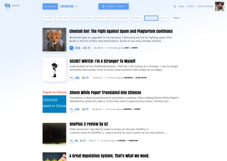
The header elements also got squeezed when the user scrolls downs the page. Thank @loewan for the suggestion.
These are small tweaks that I believe could bring a better experience using Steemit.
I also would like to create another complete different theme that I should post latter this week.
Dark Theme 2

Dark Theme 2 hover

Dark Theme 2 Header Squeezed

Bright Theme 2

Bright Theme 2 hover

Bright Theme 2 Header Squeezed

Yes, with the design and updates would be very pleased to work! cool if we can choose a theme and make yourself the one that like! cool idea! I think many of you will support!
Sorry but I much prefer the designs by etherdesign here:
https://steemit.com/steemit/@etherdesign/new-website-design-for-steemit
I want what's best for Steemit. His designs look far more professional.
Hahaha... you don't have to sorry. Everybody can try and bring something new.
What I've made was thinking about on how to make the current Steemit better without huge changes in their actual structure.
I have a more complex and impacting layout to be presented here soon. But thank you to point me to this suggestions I was struggling to find new ideas here.
Your project is interesting. See my, I added today:

https://steemit.com/steemit/@projekt/hello-everyone-i-created-a-new-website-design-for-steemit