While the markets are plummeting and the news are keeping their FUD-ish tone, let's take a step back and enjoy some good stuff: there is a new topbar on Steemit - probably added in the last couple of hours.
Here's how it looks:

The main sections are now in the center and the accent color (the "Medium" green) is under the selected link, while "Search" and "Post An Article" were iconified and moved near the account area.
It does look better, if you ask me. Maybe a bit confusing replacing the "Post" text with an icon, but not much of a big deal. It's even closer to Medium than it was before.
I'm a serial entrepreneur, blogger and ultrarunner. You can find me mainly on my blog at Dragos Roua where I write about productivity, business, relationships and running. Here on Steemit you may stay updated by following me @dragosroua.

Wanna know when you're getting paid?

|
I know the feeling. That's why I created steem.supply, an easy to use and accurate tool for calculating your Steemit rewards |
Agree with you, looks pretty cleaner now...hoping to see further improvements from now on 😜
I like it and I think it's more intuitive and from a mobile device it looks much better
You nailed it @dragosuoua.
While the markets are crashing and price is collapsing, development on the blockchain continues.
Is it a major change? Not in the least but I agree, it is an improvement. The top of the page looks a lot cleaner.
Plus we know incremental changes do add up.
That is why I say to long term HODLers is to ignore price action....it is not reflective of what is happening.
Yes very cool @dragosroua. I noticed it coming and going last night as it was being tweaked I guess. Looks like it is here to stay today. I like the new look. 🙂
Cool i didn't saw it until your post
It's not a bad thing, keeps the Steemit site looking different than the current phishing sites. Search still doesn't work ofc but who'd expect anything else.
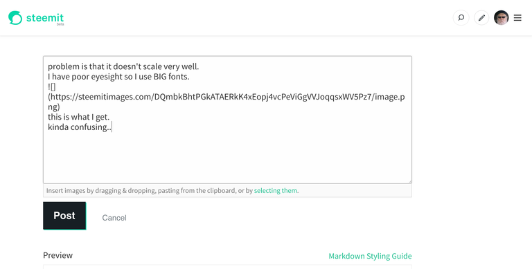
problem is that it doesn't scale very well.
 this is what I get.
I have poor eyesight so I use BIG fonts.
kinda confusing..
Yeah, looks good! Switched over for about 2 minutes yesterday morning. Been wondering where it had gone. :P
I just saw that too. Steemit Beta The aesthetics look more attractive. Good one from steemit Inc.
In steemit android apps the post button looks like that from beginning.I don't think it make any difference.Thank's for the post.@upvoted and resteemed
I wonder why steemit do not make release note post to update all the users about it
Because there are other users noticing it and writing about it? :)
Still i'm expect some kind of notification for users when there is a change in the UI this is basic
Also i think that they can make some kind of "pin" post about it
Good that we have you around ....
post a very good, I really liked it
Thanks for the information ,, I also have seen the new look my blog steemit was ,,
i just noticed this after seeing your post. nice notice. keep sharing @dragosroua
Continuing to improve the blockchain is really important when the market crashes and prices fall. wonderful post. .
I noticed these changes and rearrangements earlier today and I must say, the feeling I had about these was such an ethereal one. Steemit can only get better.
It is a good change.
Though I'm using busy.org now. It has better interface, notifications etc . You should give it a try if you haven't already
I hadn't even noticed until I saw this post...what with so much high-quality content to pour over, I guess I was in a zone! I like the small changes ok I guess, nothing wrong with a little tweaking every now and then, huh?

Noticed it an hour ago and i was surprised looking at the change. In-fact i even got confused for a moment. I thought my browser was misbehaving. The most beautiful change in this was the search icon and the post icon.
Oh good you the best post. I love you friends @dragosroua
arata destul de bine!
Yeah I love it...Seems cool to me!!!Wish Reluca a very happy Birthday from me...
I love the little changes we get to make the place look better
Well you must be one of the favoured ones @dragosroua, which indeed you are, 😁 because mine still looks the same with the trending etc on the left!
Oh, that is good to know. Seems like the new design didn’t make it on the mobile version yet but I’m sure it will come soon as well. Gonna check that out tomorrow on my desktop.
Well, this update is not even worth talking about in my opinion. Look at Busy.org if you are looking for an improved UI and UX.
I thought I was losing my mind lol. I'm not sure I like it but I will get used to it
Its a minor change, but I think it actually looks pretty neat! Hopefully the sign of a more modern UI!
Quite simple and easy now it looks great indeed :)
Noticed it today now it is making site look more attractive :)
such a nice change.first blog i have seen talking about this update.thank u.